Gallery: FloraPosted September 22, 2010157 views12 comments
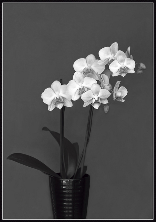
I wasn't very happy with the colors, so I de-saturated the whole thing for something different.
D300
105mm
1/320 sec, f/5.6
Mode: Av
Metering: Spot
Exp comp: +1/3
ISO: 640
White balance: Auto
Flash: TTL -3
Comments
12 comments
Comment posted by Ian Wolfenden on September 22, 2010 at 10:18 AM
It works for me, Sandy ! There's something about the composition I really like - the vase looks 1930ish and the whole thing has a sort of classical feel to it I think. Who needs colour ?!!!
Registered on May 18, 2007, 1108 Posts, 7647 Comments
Comment posted by Carol Hyman on September 22, 2010 at 10:27 AM
Beautiful still study in contrasts, Sandy. The whites are gorgeous.
Cheers,
Carol
Registered on January 18, 2007, 597 Posts, 8062 Comments
Comment posted by Mark Stahlke on September 22, 2010 at 12:41 PM
Very nice! Good choice for B&W. I like the tones and the composition. The highlights in the vase create a pleasing balance.
Registered on November 1, 2003, 97 Posts, 782 Comments
Comment posted by Nathan Buck on September 22, 2010 at 2:05 PM
The sharpness and simpleness works for me Sandy. I do think that a touch more lightness and a bit more contrast overall would help.
Nathan
Registered on November 1, 2003, 1101 Posts, 13589 Comments
Comment posted by Phil Pogledich on September 22, 2010 at 4:16 PM
I can't imagine it would look better in color. Very artistic shot. Nathan may have a good idea regarding contrast . . . it's a bit tough for me to judge since I'm not on a calibrated monitor right now, but it does seem that the contrast could use a small boost.
Registered on August 24, 2009, 123 Posts, 3099 Comments
Comment posted by jamie pringle on September 22, 2010 at 6:23 PM
I like the simplicity of the photo and agree that it has an older feel to it. I would tend to crop a little off the top because of how small the orchids are to bring back more focus to them. This is really a classic shot Sandy
Registered on August 10, 2005, 323 Posts, 1216 Comments
Comment posted by Morris McClung on September 22, 2010 at 6:24 PM
This is just high class art! The conversion is excellent.
Registered on May 7, 2007, 670 Posts, 19650 Comments
Comment posted by Pat Sampson on September 22, 2010 at 6:41 PM
Sandy for my tastes this is gorgeous. Love the tones and the composition. I would normally suggest a slight crop from the top but in this case I like it exactly as you posted it. Beautiful desaturation work and image.
Pat
Registered on May 19, 2007, 953 Posts, 15989 Comments
Comment posted by David W. Kelly on September 23, 2010 at 10:10 AM
Nice move Sandy. I think the BW was a great and artistic choice.
Registered on October 7, 2005, 883 Posts, 6590 Comments
Comment posted by Wayne Jones on September 23, 2010 at 12:16 PM
Sandy,
Gorgeous diagonal arrangement is so elegant and strong, I agree that no color is needed.
Comp is beautiful as presented, but something about this makes me want to tilt the camera down a bit to try a slight variation, too.
Registered on April 18, 2007, 953 Posts, 6435 Comments
Comment posted by Bill Fach on September 25, 2010 at 10:46 PM
Sandy: I like the comp and the overall quality of the conversion. If the vase and stems were just a bit darker it would suit me a bit better but this is pretty darn good as is. Nicely done.>=))>
Registered on November 1, 2003, 1805 Posts, 26981 Comments
Comment posted by Robert Dayton on September 26, 2010 at 11:47 PM
I agree with all of the previously made positive comments. This motivates
me to try some B&W. Well done, Sandy.
Registered on November 11, 2008, 281 Posts, 3958 Comments

Comments
12 commentsCheers,
Carol
Nathan
Pat
Gorgeous diagonal arrangement is so elegant and strong, I agree that no color is needed.
Comp is beautiful as presented, but something about this makes me want to tilt the camera down a bit to try a slight variation, too.
me to try some B&W. Well done, Sandy.