Autumn Leaves
by June Marie Wingert
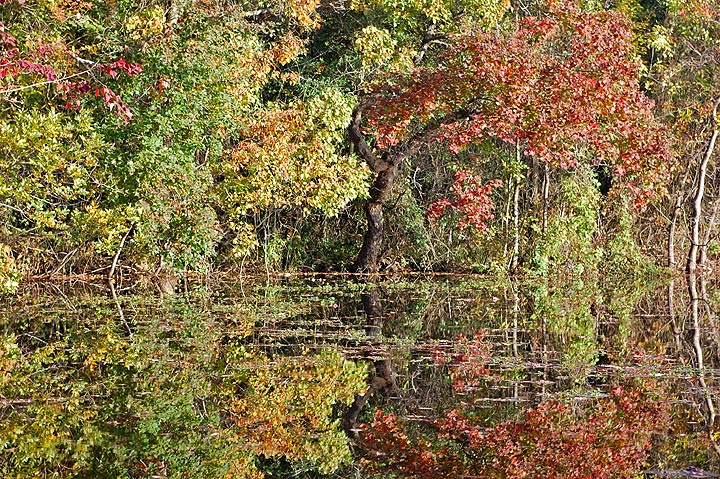
Just joined, and, my first post. Took this photo last year, my artist son said it "was visually assaulting". I told him I sent the pic to the weather station and it ended up being the background picture of the day. I guess the meterologist liked it. The picture is actually a tiny little pond about 40 feet wide. I believe I broke every rule in photography, my boss thought it would be a great pic to turn into a puzzle and give it to your favorite enemy. Other people thought it was some kind of impressionistic art. It looked like a New England autumn picture but the pic was actually taken in Willis, Texas just north of Houston.
Be brutally honest, this is "I like it" or "I hate it kind of pic". Looks really busy to me.

Comments
12 commentsNikon D40
70mm
F/6.3
1/160 sec
ISO-200
Aperture Priority
Welcome to NPN! These are interesting stories behind this image and I appreciate your request for brutual honesty. First off, I am on an uncalibrated monitor so I can't accurately comment on all the technical aspects of this image. While it is busy, there is order here especially with the trunk of the large tree (oak?) providing a visual anchor. Also, the reflection is crystal clear and the colors look beautiful. Overall, I like your composition very much.
Conversely, it appears you have some sharpening issues with this image for web presentation. It looks oversharpened to me, which is really easy to do with these kinds of dense foliage scenes. Here is an article that should help you:
http://www.naturephotographers.net/articles0408/jd0408-1.html
I hope this helps and welcome aboard!
Michael
As a fellow New Englander, I sure would have thought that this was taken in NE. I like this comp very much. I don't find it overly busy at all. The tree trunk does act as an achor point, despite being centered. My only nit is I would try toning it down a bit. perhaps with the brightness, exposure or something along those lines. Welcome. Great 1st post!!
Welcome to NPN and the ES&S Gallery. This is a wonderful first post. Now I'm not sure what "rules" you broke, honestly I don't see that you did - and the rules are there to be broken anyway. You do have a 50/50 composition top/bottom, but it's perfectly fine here because you have a reflection and symmetry; perfect time for a 50/50 comp. Busy? Of course, it's almost the point and yes, would make a killer puzzle.
For suggestions, I would tone down the highlights/brightness to reduce the effects of the bright sunshine. Just a little darker and the colors will really come out as well without having to play with the saturation. Now as has been mentioned the main tree trunk anchors the scene well and I would go so far as to say it's the main feature. To simplify this composition, you could crop to a square as an alternate. Eliminating the bright trunks on the right and the somewhat intruding red-branch on the left would really tighten this up - as an alternative. But with some brightness adjustments, I think this will look really nice.
Thanks for sharing and we look forward to your participation.
Lon
edit: With your permission I could post an example of the suggestions?
I would really really appreciate that.
Do I send you the picture or can you download it from here?
I don't know if you use PhotoShop, but that's what I've used for these adjustments. Actually, you could do this in Elements as well or most any other photo editing program.
Basically, I just dialed down the highlights and general midtones with a Levels adjustment layer. And then the crop is obvious. I think the result is interesting because not only does it seem less busy and random, but it now becomes an image about shapes and forms as well.
The compression and sharpening might not be great because I started out with such a small file.
Hope this helps, thanks for letting me play with it.
Lon
Welcome to the NPN. It's a great place for learning and networking.
Regarding autumn leaves, I would have guess New England, surprised that it's Willis. I agree with the impressionistic art idea.
Thanks to Lon for tweaking it in Photoshop, most interesting. Love the crop.
My first day here and I can't get enough.
If you can save this at full 720 pix at greater than 50% you win a prize!
I like the organized chaos here. I kind of like Lon's rework, but i think he cropped too much, i think the red on the lhs is a great addition, so id only crop enough to get rid of the trees on the extreme rhs, and the equal amount on the left side so the tree remqains centered. Welcome to NPN--look forward to more from you!