Nature Photographers Network
This is the preserved archive of the original Nature Photographers Network. The community continues at naturephotographers.network.
Together as One
‹ PreviousLandscape GalleryNext ›

Together as One

by Lon Overacker

Gallery: LandscapePosted June 14, 2010279 views25 comments
Time to give the water abstracts a rest. Thank you so much for all your comments. Now, back to your regularly scheduled program on trees....

I think I could be happy only being able to explore Yosemite for the rest of my life. Sure, if I had the means and opportunity I would love to see and photograph all the beautiful places around the world. But alas, I'll settle for home.

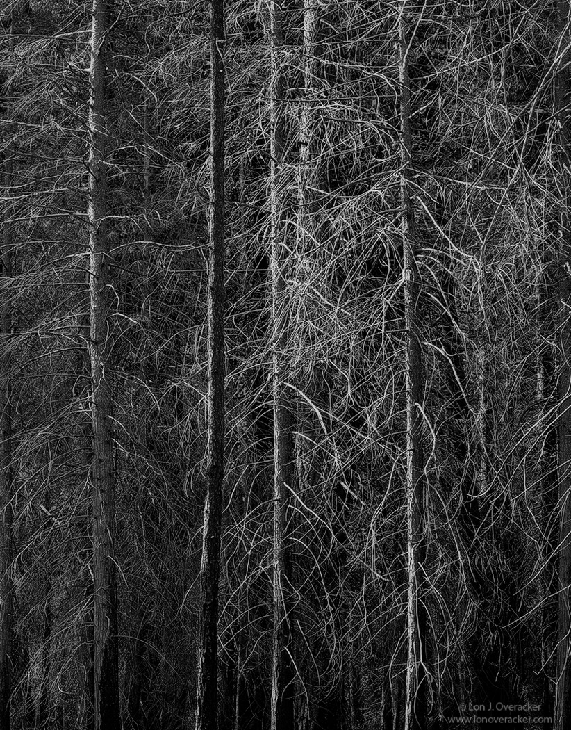
This image was captured during the same trip as all the recently posted images. My friend Kyle (perpetual Lurker!) and stopped at this area of burned out and dead pines along the Northside drive in Yosemite Valley. Even though I shoot with color transparency, I knew this was going to be a b&w image. Finding a comp proved quite difficult as I wandered this place for a good hour before capturing this. The color version is pretty un-impressive, but fortunately I think the b&w processing helped this out a lot.

Would love to hear your thoughts on this one. Both in subject matter and processing. I'm kinda unsure about the cluster of smaller branches at the center and wondering if they're a distraction or if they fit in the overall scheme of the image.

4x5, Nikkor 300mm, V100, f/45 @ 1/2s

Thanks folks!

Lon

Comments

25 comments
Comment posted by Matt Anderson on June 14, 2010 at 8:06 PM
Very nice. I like the details and the conversion. I would like to see a small darkening on the top to hold my eyes within.
Registered on September 6, 2007, 346 Posts, 2696 Comments
Comment posted by Dan Baumbach on June 14, 2010 at 8:22 PM
I know this place very well. I photographed it in 4x5 color on the trip I made a couple of weeks before out trip together. I'm not crazy about what I got here. I do like what you have however. I don't know if I like it as much as your recent posts from El Cap Meadow, but it has a very nice feel to it.

- Dan.
Registered on November 1, 2003, 473 Posts, 7980 Comments
Comment posted by Daniel Ewert on June 14, 2010 at 8:27 PM
I love the contrast in the trees. There is a mysterious and ghostly atmosphere in this one that I love. Well done!
Daniel
Registered on June 2, 2009, 103 Posts, 1500 Comments
Comment posted by Mitch Moraski on June 14, 2010 at 8:35 PM
Just lovin' it Lon!! It's works dude! The slight tint of highlights on the trunks....and more!! :toast: :toast:
Registered on August 3, 2008, 105 Posts, 590 Comments
Comment posted by Luis Argerich on June 14, 2010 at 9:02 PM
Hi Lon!

Really nice composition, I like how you isolated the elements in the photo and how everything works together for a very nice result. The B&W conversion seems excellent too.
I really like it!

Registered on December 22, 2009, 91 Posts, 1349 Comments
Comment posted by Mark Pelton on June 14, 2010 at 9:35 PM
beautiful, graphic detail in this tree portrait. Love the processing. I might try to lighten the left tree just a little, but not sure if thats neccessary.
Registered on November 25, 2003, 380 Posts, 4647 Comments
Comment posted by Chris Chamberlain on June 14, 2010 at 9:52 PM
Looks real nice! Is that reflected light, or direct light? I wouldn't have noticed the cluster of branches you mention if you had not. Either way, they're not an issue for me. I like this converted too, and the darker presentation.

Chris
Registered on March 13, 2007, 500 Posts, 8365 Comments
Comment posted by Nick Bristol on June 14, 2010 at 10:08 PM
I have been looking at this for a little while now. I think the processing looks great. I'm sure not an expert when it comes to that, but I do know when I like something and I like this. I also know your choice of b/w was a good one, but you knew that before you made this picture. The subject makes me think of my area here, not because of the burn but because we have lots of red pines that can have this look just because of all the branches. I understand how hard a good composition is to come up with. You did a great job getting this image. I like it and the cluster in the center works just fine imo. Not an easy picture to make but you made this one very well!

Nick Bristol
Lone Rock, Wi
Registered on February 1, 2004, 752 Posts, 14140 Comments
Comment posted by Vance Gese on June 14, 2010 at 11:26 PM
Lon, I am very glad that you posted this in spite of your previous reservations as I think this image is simply incredible. The tree branches just seem to have a wonderful glow against that dark background and your composition is exquisite. The b/w tones work so very well. A delicate forest tapestry to my eyes that I find stunning. And I still think it beats the pants off my attempt at a similar type image . :wink:
Registered on November 13, 2008, 298 Posts, 6629 Comments
Comment posted by Paul Breitkreuz on June 14, 2010 at 11:48 PM
Lon, not sure about your thoughts with regard to the color version, but this b&w conversion works very well. Maybe the tight knit meshing here along with the b&w seems to provide a great mystery mood overall. The larger version also provides excellent detail too. How was the compression, it would seem to be a challenge with this much detail going on?
Registered on February 25, 2006, 525 Posts, 8448 Comments
Comment posted by Lon Overacker on June 15, 2010 at 12:14 AM
Thanks for the comments and observations folks.

Matt - Good call. Don't have time to re-work this, but will definitely keep that in my back pocket for the next processing go'round.

Vance - thanks very much for the kind words. I guess we'll just have to agree to disagree on the two images. :cool:

Paul - I would never have considered this scene for color work - even though I only have color positive film. I figured the color version would be bad - and it is. The highlights are pretty much washed out and the background is a mix of green, brown and gray. The b&w turned those colors in to a neutral background and the highlights just made for a nice tonal range for b&w. As far as compression goes, I don't recall, but for the large version I probably had to use a 60 in the save for web dialogue. The other secret is NOT to use the full 1200px - this one is 1050. :wink:

Oh, and I use and recommend Tony's sharpening actions. They're basically an automated version of the Adamus method with actions allowing you to input the first and final image sizes. Another one of Tony's great actions!

Thanks everyone!

Lon
Registered on November 24, 2006, 521 Posts, 19147 Comments
Comment posted by Dietrich Gloger on June 15, 2010 at 1:16 AM
The different shades of grey and the subtle light distribution really work well here - and help a lot :wink: Not sure whether this would work less well as color version. The comp is fine, I do not see any problems with a particular area. I like the finer branches in the center as well - not an issue at all!
Registered on January 26, 2007, 360 Posts, 9876 Comments
Comment posted by Andreas Resch on June 15, 2010 at 2:06 AM
Very nice, Lon. I like the way the light creates a "pocket" behind that darker trunk and the huge amount of detail in there. Splendid.
Registered on November 14, 2007, 322 Posts, 6101 Comments
Comment posted by Kah Kit Yoong on June 15, 2010 at 4:35 AM
Love how the lighting gives definition and isolation to the edges of the trees. The conversion looks perfect.
Registered on September 27, 2006, 636 Posts, 10682 Comments
Comment posted by Kevin Trinkner on June 15, 2010 at 7:31 AM
I really enjoy this Lon, love the mono presentation, feels very fitting fro this scene. Nice light and comp.
Registered on June 30, 2008, 203 Posts, 2641 Comments
Comment posted by Bruno Silva on June 15, 2010 at 12:40 PM
well, you already know I´m a huge b&w fan, being so, this works nicely as is and I´m not saying this just beacuse I like b&w images. love the detail in the large version and trunk simmetries. I don´t know how a touch of light here would work, just a thought, though. this is very nice with lots to apreciate too. nice comp and b&w conversion!!!!
Registered on May 6, 2009, 132 Posts, 1406 Comments
Comment posted by Ron Richins on June 15, 2010 at 1:03 PM
Love the patterns all those branches make. It's quite mesmerizing.
Registered on March 6, 2008, 113 Posts, 1009 Comments
Comment posted by Steve Sieren on June 15, 2010 at 1:16 PM
I know I say this all the time but shit, the detail is fanstastic here! Seriously. :toast:
Registered on January 2, 2008, 360 Posts, 5321 Comments
Comment posted by Julian Barkway on June 15, 2010 at 3:04 PM
I like this. The mono conversion really brings out a melancholy feel.

Funnily enough, I took a very similar pic a few months ago in that gorge where I've been spending a lot of time recently - and also ended up converting to mono. I may put that one up next...
Registered on January 18, 2007, 344 Posts, 1961 Comments
Comment posted by Cory Freeman on June 15, 2010 at 5:22 PM
this one's coming across very somber to me because of the darker tones overall, that's not meant as a bad thing to me, just my take on it. the mesh of branches don't detract at all from the overall comp.
Registered on December 16, 2003, 107 Posts, 1341 Comments
Comment posted by Anthony Vincent on June 15, 2010 at 7:31 PM
Wow Lon I do really like this one. Has all the elements in a bw I enjoy. Silvery and moody.
Pure art Lon, pure art.
Love it.
Registered on February 5, 2009, 199 Posts, 2775 Comments
Comment posted by Eva McDermott on June 15, 2010 at 8:03 PM
I like this Lon.No, I love it! The bright cluster of small branches add to the scene IMO. I love the moodiness and of course the B&W treatment and its contrasts. Well captured and processed.
Registered on January 4, 2009, 1015 Posts, 13229 Comments
Comment posted by Justin Reznick on June 16, 2010 at 6:01 PM
The conversion is spot on, provides such fantastic contrast! Well seen as always Lon!
Registered on November 24, 2009, 79 Posts, 515 Comments
Comment posted by Tony Kuyper on June 17, 2010 at 9:39 PM
Just catching up from several days away visiting friends and trying to make a few comments on images that catch my eye as thumbnails. I really the the abstract quality of this, but also the sense of reality. The vertical trunks provide a sense of order here that is very helpful to the viewer. The right side of the image seems to lack this, though maybe that was intentional. Cropping to 2:3 aspect ratio (gasp!) might actually strengthen the comp a bit.
Registered on November 1, 2003, 364 Posts, 22328 Comments
Comment posted by Scott Schroeder on July 16, 2010 at 4:14 PM
Love it Lon!
Registered on November 1, 2003, 147 Posts, 518 Comments