Nature Photographers Network
This is the preserved archive of the original Nature Photographers Network. The community continues at naturephotographers.network.
Winter Ink
‹ PreviousLandscape GalleryNext ›

Winter Ink

by Anthony Vincent

Gallery: LandscapePosted May 27, 2010168 views17 comments
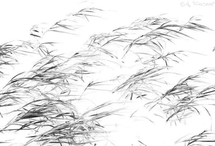
Thanks again for your comments and thoughts as Im filing through some images for my up and coming website. Giving the old yay or nay. This one was from a 70+ mph winter storm and I found these grasses pushed through the snow bending in the force of winter.
High key exposed in camera and further pushed an additional .75 in raw.

Simple and artistic but its neat how creative nature can be.
I added red contrast filter in ps upon conversion and thats it.

Thanks for looking

Canon 40D

Comments

17 comments
Comment posted by Kevin Trinkner on May 27, 2010 at 9:11 AM
This has a nice graphic feel to it, I like the high key processing, helps push the artistic side to the image. I think it's a yay for the website, something a little different...
Registered on June 30, 2008, 203 Posts, 2641 Comments
Comment posted by Eva McDermott on May 27, 2010 at 9:53 AM
Definitely artistic Anthony. Love the high key graphic nature of this image. Beautiful work.
Registered on January 4, 2009, 1015 Posts, 13229 Comments
Comment posted by Joshua Hardin on May 27, 2010 at 12:38 PM
Yay here too. I definitely like the high key treatment. Everyone needs something a little different for their portfolio.
Registered on July 29, 2006, 40 Posts, 414 Comments
Comment posted by Bill Chambers on May 27, 2010 at 12:58 PM
I think this is very nioe Anthony - love the hi key processing.
Registered on April 10, 2005, 753 Posts, 21216 Comments
Comment posted by Floris van Breugel on May 27, 2010 at 1:40 PM
Artistic, graphic, and emotive. Beautiful work Anthony, as usual!
Registered on December 19, 2008, 306 Posts, 4840 Comments
Comment posted by Dietrich Gloger on May 27, 2010 at 3:05 PM
Creative and different shot Anthony. Easy to say yay here!
Registered on January 26, 2007, 360 Posts, 9876 Comments
Comment posted by Guy Tal on May 27, 2010 at 3:55 PM
I like the minimalistic approach. Very interesting image and a real sense of motion in the grasses.

Guy
Registered on November 1, 2003, 566 Posts, 15507 Comments
Comment posted by Gabi Lach on May 27, 2010 at 4:23 PM
I love the B&W softness, Anthony. Messy grass patterns look beautiful here! Great eye and great presentation. Very well done.
Registered on May 1, 2007, 101 Posts, 3187 Comments
Comment posted by Steve Sieren on May 27, 2010 at 4:45 PM
Nice high key work and design elements Anthony!
Registered on January 2, 2008, 360 Posts, 5321 Comments
Comment posted by Stan Rose on May 27, 2010 at 7:03 PM
I like the artsy look here. Well done. Im kinda curious how it might work in color (since green or brown might contrast nicely with white)
Registered on September 15, 2005, 836 Posts, 17099 Comments
Comment posted by Chris Chamberlain on May 27, 2010 at 9:18 PM
Beautiful high key processing, Anthony! I think this is definately a yay, for an abstracts suite.

Chris
Registered on March 13, 2007, 500 Posts, 8365 Comments
Comment posted by Vance Gese on May 28, 2010 at 5:07 PM
Really like how your processed this Anthony with the high key b/w tones. Excellent work.
Registered on November 13, 2008, 298 Posts, 6629 Comments
Comment posted by Lon Overacker on May 28, 2010 at 5:35 PM
Anthony,

Most certainly a keeper and another positive vote for the high-key approach. Excellent!

Lon
Registered on November 24, 2006, 521 Posts, 19147 Comments
Comment posted by Morris McClung on May 28, 2010 at 8:05 PM
Another excellent vision from you. Again, from conception to capture. Keep 'em comin'.
Registered on May 7, 2007, 670 Posts, 19650 Comments
Comment posted by Bruno Silva on May 28, 2010 at 9:43 PM
man, I just love to look at this and keep looking! very a.vincent this one, very graphical and artistic. I like the sense of motion on the leaves and even that you captured to gracefuly. it will sure look nice on you´re website! great work ma friend.
Registered on May 6, 2009, 132 Posts, 1406 Comments
Comment posted by Dean Sauskojus on May 28, 2010 at 11:00 PM
Works for me Anthony. What I find intriguing is how the grass is leaning one way. They also have a pencil drawing look to them. Very artistic, a real keeper.
Registered on September 29, 2009, 137 Posts, 2659 Comments
Comment posted by Jimmy Gekas on May 31, 2010 at 1:45 AM
I love the high key/minimalist look of this image. The flow of the grasses is really nice, too. :toast:
Registered on July 26, 2007, 244 Posts, 2807 Comments