Nature Photographers Network
This is the preserved archive of the original Nature Photographers Network. The community continues at naturephotographers.network.
Rock Wall
‹ PreviousLandscape GalleryNext ›

Rock Wall

by Vance Gese

Gallery: LandscapePosted April 26, 2010281 views22 comments
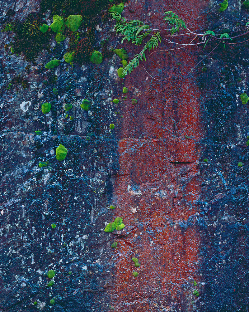
Was finally able to get out with the view camera a couple of weeks ago and made this image near a local trailhead in the Olympic Mountains. I was drawn to the contrasting colors of the red colored algae (I think that it is algae of some kind staining the rock), the green moss and cedar fronds, and the dark tones of the rock. Didn't use a polarizer as I wanted the glistening 'wetness' of the rock to be evident and hopefully that comes through. See what you folks think.
4x5, 210mm Sironar, 81C filter, Provia 100F, f32.6, 3sec. M1 scan, TK masks.

Large image provided for your evaluation.

Your thoughts, suggestions, ideas, comments are always appreciated.

I want to thank everyone for the kind comments on the last post. Really appreciate the feedback.
Thank you.

Comments

22 comments
Comment posted by Nick Bristol on April 26, 2010 at 8:15 PM
Wow, something to look at. It takes a little time to look at this (because it is very good). The colors are really nice and a very interesting view of this. The green moss looks like it is floating over the rock. I enjoyed this! Nice work, Vance.

Nick Bristol
Lone Rock, Wi.
Registered on February 1, 2004, 752 Posts, 14140 Comments
Comment posted by Dan Baumbach on April 26, 2010 at 8:31 PM
Very nice, Vance. Well seen and put together.

- Dan.
Registered on November 1, 2003, 473 Posts, 7980 Comments
Comment posted by Eva McDermott on April 26, 2010 at 8:59 PM
I love the simplicity as well as the color Vance. None use of the polarizer works well here. Beautiful image!
Registered on January 4, 2009, 1015 Posts, 13229 Comments
Comment posted by Rudy Ruberti on April 26, 2010 at 9:13 PM
Kind of looks like a tree in a dark forest. I like this a lot. Nicely done.
Registered on October 28, 2008, 179 Posts, 1875 Comments
Comment posted by Joseph Kayne on April 26, 2010 at 9:45 PM
Vance, looks like a tree thru a waterfall. Neat. Joe.
Registered on November 1, 2003, 573 Posts, 2619 Comments
Comment posted by Tony Kuyper on April 26, 2010 at 10:15 PM
What wonderful comp. Simple and intimate at one level, but complex with a lot to explore on another. This would have been easy to walk by and never see the possibilities. Good eye for finding this.
Registered on November 1, 2003, 364 Posts, 22328 Comments
Comment posted by Lon Sharp on April 26, 2010 at 10:46 PM
The illusion of 3-d depth, as already mentioned (like a tree behind a waterfall,) was one of my first impressions. This offers enough complexity along with strong graphic impact to hang on the wall, printed large! Very nice. Congrats.
Registered on December 9, 2007, 258 Posts, 9892 Comments
Comment posted by Stan Rose on April 27, 2010 at 12:03 AM
I think this is extremely cool! Its mostly abstract, but the inclusion of the branches up top grounds it and makes it both abstract and pure landscape all in one nice package. You wisely went with thirds too! :smile:
Registered on September 15, 2005, 836 Posts, 17099 Comments
Comment posted by Floris van Breugel on April 27, 2010 at 12:11 AM
Interesting abstract Vance, I love the minute but deliberate touches of green. Well seen and photographed!
Registered on December 19, 2008, 306 Posts, 4840 Comments
Comment posted by Dean Sauskojus on April 27, 2010 at 12:34 AM
Beautiful colors Vance. The red line is very unusual and something I have not seen in nature. People probably think I'm crop crazy, but cropping this to a horizontal would work well to. Nice image overall.
Registered on September 29, 2009, 137 Posts, 2659 Comments
Comment posted by Prashant Khapane on April 27, 2010 at 7:14 AM
yes, a simple but neat shot. Well seen.
Registered on November 1, 2003, 492 Posts, 4580 Comments
Comment posted by Matt Anderson on April 27, 2010 at 7:35 AM
Vance, this is quite an image.
Lovely texture, lovely color.
I think your composition works quite well.
I think my only critique is maybe adding a very slight bit of weight and yellow. Just a pinch.
:toast:
Registered on September 6, 2007, 346 Posts, 2696 Comments
Comment posted by Bill Chambers on April 27, 2010 at 9:37 AM
Oh, I really like this Vance! The wetness definitely comes through nicely. I would love to see this printed very large.
Registered on April 10, 2005, 753 Posts, 21216 Comments
Comment posted by Morris McClung on April 27, 2010 at 10:09 AM
Beautifully composed and captured. I think the inclusion of the branch makes this shot. Wonderful colors.
Registered on May 7, 2007, 670 Posts, 19650 Comments
Comment posted by Bill Chambers on April 27, 2010 at 11:33 AM
2nd Comment - I keep coming back to this; it seems to be stuck in my head. The more I think about the more I like it. I'm not so fond of the cedar fronds, but if I crop them out in my head, I go crazy about this. The combination of colors and the great texture, along with your comp make this true art IMO.
Registered on April 10, 2005, 753 Posts, 21216 Comments
Comment posted by Robert Dayton on April 27, 2010 at 5:01 PM
Remarkably unique, Vance. I like the inclusion of the branch at the top.
It adds some lines and texture that work. Great colors throughout.
Registered on November 11, 2008, 281 Posts, 3958 Comments
Comment posted by Vance Gese on April 27, 2010 at 5:10 PM
Thanks everyone for the great comments. Really appreciate it. Interesting that some of you could see a tree trunk set against a darker background. That is exactly what my wife said when she first saw this image; me well I just saw an abstract design that really captivated me. Thanks again.
Registered on November 13, 2008, 298 Posts, 6629 Comments
Comment posted by Bill Dark on April 27, 2010 at 5:42 PM
I have spent a good while studying this image, and the longer I look the better I like it. So much detail to enjoy, and the color is wonderful. Great eye in seeing this, Vance.
Registered on May 27, 2005, 148 Posts, 1121 Comments
Comment posted by Chris Chamberlain on April 28, 2010 at 1:26 AM
That's just odd! Makes for a great photograph though. It does look like an abstract of a tree. Nice work!

Chris
Registered on March 13, 2007, 500 Posts, 8365 Comments
Comment posted by Mel Ladewig on April 28, 2010 at 2:06 PM
I like this arangement of colors a great deal Vance. The only think I'm not sold on is the cedar branch. I think it takes away just a bit from an elegant intimate nature abstract. The choice not to use a polarizer is spot on though I think. It adds greatly to the texture of the rock.
Registered on July 24, 2005, 114 Posts, 1205 Comments
Comment posted by Bob McQuade on April 28, 2010 at 4:38 PM
Really like the image, agree with others on all the kudos. I do, however, wonder if the blue is a bit intense? Doesn't quite look natural, but does most certainly grab the eye.
Registered on October 8, 2009, 214 Posts, 432 Comments
Comment posted by John Williams on May 1, 2010 at 7:31 PM
What a great eye Vance; I'm sure I would have walked right by this! Nicely done.
Registered on September 6, 2007, 221 Posts, 5985 Comments