Gallery: FloraPosted April 7, 201067 views12 comments
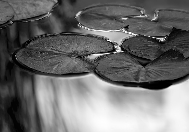
I just got a Mac and CS4 which I am upgrading from CS2. Just trying out B&W conversion.This is an image from a couple of summers ago.
Comments
12 comments
Comment posted by Amy Hopp on April 7, 2010 at 4:48 AM
Holy Cow, David - I LOVE this! Excellent vision and conversion...
Registered on October 18, 2007, 234 Posts, 655 Comments
Comment posted by Bill Chambers on April 7, 2010 at 1:25 PM
I like this a lot David - excellent conversion. I also like the somewhat diffused look.
Registered on April 10, 2005, 753 Posts, 21216 Comments
Comment posted by Wayne Jones on April 7, 2010 at 1:58 PM
Wow, that B&W conversion is beautiful. I like the unconventional comp, and the softness of the reflections gives this a wonderfully dreamy feeling.
Registered on April 18, 2007, 953 Posts, 6435 Comments
Comment posted by Phil Pogledich on April 7, 2010 at 4:08 PM
I really like that streaky reflection and the B/W conversion. Beautiful work.
Registered on August 24, 2009, 123 Posts, 3099 Comments
Comment posted by Larry Lynch on April 7, 2010 at 9:17 PM
Brilliant work David. Beautifully done.
Registered on September 16, 2006, 773 Posts, 9940 Comments
Comment posted by Morris McClung on April 7, 2010 at 9:24 PM
Quite striking! Very well done.
Registered on May 7, 2007, 670 Posts, 19650 Comments
Comment posted by Bill Fach on April 8, 2010 at 12:07 AM
David: Excellent conversion and a fine subject. I think I'm going to pull the trigger on CS5 and I'm really looking forward to the new possibilities. On this shot my first impression was that there was just a bit too much empty FG. I do think I would crop about 1/2 of it and then print it large. >=))>
Registered on November 1, 2003, 1805 Posts, 26981 Comments
Comment posted by Gary Yeoh on April 8, 2010 at 9:16 AM
David:
Excellent conversion. Love the silvery shadow!
Registered on September 1, 2009, 588 Posts, 8184 Comments
Comment posted by David W. Kelly on April 8, 2010 at 11:09 AM
Here is a Repost with Bill's suggestion on crop. Thanks Bill I think it helped.
Registered on October 7, 2005, 883 Posts, 6590 Comments
Comment posted by David W. Kelly on April 8, 2010 at 11:10 AM
Ops! I forgot to add the image.
I wish I would have added a border due to the fact that I brightened up the light areas a bit.
Registered on October 7, 2005, 883 Posts, 6590 Comments
Comment posted by Kathy Odiorne on April 8, 2010 at 3:13 PM
Excellent b&w conersion. Almost has a metallic look to it. I think I like the original - less bright version better.
Registered on November 1, 2003, 211 Posts, 1471 Comments
Comment posted by Wayne Willison on April 8, 2010 at 6:09 PM
Love it. Really do. I prefer the original, though. Seems more balanced.
Registered on April 10, 2009, 292 Posts, 3967 Comments

Comments
12 commentsExcellent conversion. Love the silvery shadow!
I wish I would have added a border due to the fact that I brightened up the light areas a bit.