Gallery: LandscapePosted December 27, 2009122 views12 comments
Comments and opinions very welcome
Comments
12 comments
Comment posted by Andreas Resch on December 27, 2009 at 4:02 AM
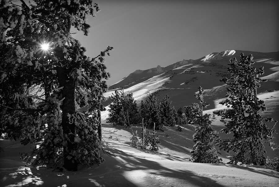
The image really works well in the monotone version. Snow shots in daylight are always a challenge but you cleverly mastered this one.
Registered on November 14, 2007, 322 Posts, 6101 Comments
Comment posted by Eva McDermott on December 27, 2009 at 9:06 AM
I really like the light and shadows here Cezar and it works very well in B&W.
Registered on January 4, 2009, 1015 Posts, 13229 Comments
Comment posted by Doug Roane on December 27, 2009 at 4:10 PM
very beautiful and looks great in mono. The comp is ok, but I find it a little left side heavy.
Registered on December 12, 2008, 213 Posts, 2226 Comments
Comment posted by Stan Rose on December 27, 2009 at 7:53 PM
Nice one, Cezar--i really like the B&W treatment here. I agree with Doug about the left side--in fact i prefer this with that side cropped, even w/o the sunstar.
Registered on September 15, 2005, 836 Posts, 17099 Comments
Comment posted by Elliot Johnston on December 27, 2009 at 8:38 PM
Wish the sky had a little more drama. Other than that it looks good. Nice wintery scene
Registered on November 11, 2009, 23 Posts, 288 Comments
Comment posted by Cezar Mart on December 27, 2009 at 9:29 PM
Stan and Doug, there is no composition theory that says the image has to be mathematically balanced.
Example: Doug's very own "Sandbridge Beach Sunrise", which is excellent and brilliant, but how unbalanced! In fact, because it is unbalanced it offers much more than if it were balanced.
Registered on January 31, 2007, 65 Posts, 444 Comments
Comment posted by Tony Kuyper on December 27, 2009 at 9:30 PM
Really well controlled tones and the sunstar the perfect focal point in the darker part of the frame. I like it.
Registered on November 1, 2003, 364 Posts, 22328 Comments
Comment posted by Daniel Rappaport on December 28, 2009 at 1:30 AM
Well done. Perfect dark B&W tones. I like that the only perfect white is the sunburst.
Registered on September 9, 2009, 294 Posts, 2006 Comments
Comment posted by Stan Rose on December 29, 2009 at 12:54 AM
Cezar, if my opinion is "very welcome", you're not allowed to disagree with it--that's in the rules!
Seriously, since i completely agree that photos need not be "mathematically balanced" (aesthetic balance is much more important!) allow me to elaborate a bit: I find the right 2/3 of this shot very appealing. The light is fantastic, and the scene is very unusual due to sparse trees and unique landscape. The 'openess' and the play of light and shadow makes it very engaging. On the other hand, to me, the left 1/3 is dark and confined, which puts it at odds with the openess of the right 2/3. It looks like your standard "in the snow-covered trees" fare and even has the cliched sunstar to boot. For me, it clashes with the right 2/3. Obviously, many people will disagree with that analysis, i'm just telling you what it does for me, that's all.
Since you brought up "Sanbridge Sunrise", which i personally think is an exceptional photo (not so coincidentally, it won an EP in the Gallery that i moderate) i think that is a perfect example of a "balanced" photo, because of the way it is composed. The fence sets off the right side where there is darkness and mystery, but it also reflects the open sunlight from the left side, and the fence is a strong diaganol leading line towards the sunset. In contrast, there is very little connection in your photo between the two parts, nothing to make me ponder why you composed it the way you did. If your goal was to show the majesty of the right side, then i feel you should have stuck with that side. If your goal was to integrate the shelter of the forest scene, then i have to say you didnt succeed for me; maybe if you had shot from the interior of that forested space, looking out, rather than having it delegated to the side here, that might have worked. But, as always, you have to be your own toughest critic: if you are happy with the results, ignore my comments and don't even tempt me to respond
Registered on September 15, 2005, 836 Posts, 17099 Comments
Comment posted by Cezar Mart on December 29, 2009 at 1:35 AM
I look at the image again and I start to agree with you, Stan. The thing is that I was so very reluctant to get rid of the left 1/3 because I spent enough time in that place trying to get the best sunstar effect, and as a result, my mind got stuck in that concept.
I agree that the light on the right 2/3 is good and defines the photo, but somehow I was afraid to focus the image entirely on that. I was trying to accomplish the contrast effect. Two sides contrasting each other, offering two different aspects, but at the same time complementing each other.
Well, nothing is perfect. If I could improve the photo now, I would rather try to find a way to reduce the chaos on the left side. I still like the sunstar, even though you call it "cliche", which probably it is, but so what, but I agree that the left side has chaos. And that chaos for me is the biggest problem of the photo.
Very good input Stan. It changed the way I look at it now. It helped me a lot.
Registered on January 31, 2007, 65 Posts, 444 Comments
Comment posted by Doug Roane on December 30, 2009 at 2:39 PM
Thanks for the positive reference to my photo, Cezar and Stan. I suppose the ancient Greeks could define 'balanced' in an image using a mathmatical formula, but I sure can't But, as Stan says, asthetical balance in an image is a different thing (which is why we have the 'rule of thirds' rather than the 'rule of halves'). Sometimes I have a hard time deciding what makes a given image feel 'balanced', but when an image feels 'unbalanced', I find the problem easier to define. I'm not claiming to be an expert, but what we perceive as 'balanced' includes the distribution of darkness and light in an image as well as the elements present in the compostion. Just as our eyes are drawn strongly to bright (especially 'blown out') parts of an image, they are also drawn to larger areas of blackness (I liken it to a celestial 'black hole') - when one area of an image has alot of it, folks will often refer to it being 'heavy' on that side, because it draws the eyes. I apologize for being so vague in my initial critique, but my intent was constructive, and, of course, just one opinion.
Registered on December 12, 2008, 213 Posts, 2226 Comments
Comment posted by Cezar Mart on December 30, 2009 at 3:36 PM
Thank you, Doug, so much. Input from you and Stan, in the form you presented it, is a true inspiration for me.
Registered on January 31, 2007, 65 Posts, 444 Comments

Comments
12 commentsExample: Doug's very own "Sandbridge Beach Sunrise", which is excellent and brilliant, but how unbalanced! In fact, because it is unbalanced it offers much more than if it were balanced.
Seriously, since i completely agree that photos need not be "mathematically balanced" (aesthetic balance is much more important!) allow me to elaborate a bit: I find the right 2/3 of this shot very appealing. The light is fantastic, and the scene is very unusual due to sparse trees and unique landscape. The 'openess' and the play of light and shadow makes it very engaging. On the other hand, to me, the left 1/3 is dark and confined, which puts it at odds with the openess of the right 2/3. It looks like your standard "in the snow-covered trees" fare and even has the cliched sunstar to boot. For me, it clashes with the right 2/3. Obviously, many people will disagree with that analysis, i'm just telling you what it does for me, that's all.
Since you brought up "Sanbridge Sunrise", which i personally think is an exceptional photo (not so coincidentally, it won an EP in the Gallery that i moderate) i think that is a perfect example of a "balanced" photo, because of the way it is composed. The fence sets off the right side where there is darkness and mystery, but it also reflects the open sunlight from the left side, and the fence is a strong diaganol leading line towards the sunset. In contrast, there is very little connection in your photo between the two parts, nothing to make me ponder why you composed it the way you did. If your goal was to show the majesty of the right side, then i feel you should have stuck with that side. If your goal was to integrate the shelter of the forest scene, then i have to say you didnt succeed for me; maybe if you had shot from the interior of that forested space, looking out, rather than having it delegated to the side here, that might have worked. But, as always, you have to be your own toughest critic: if you are happy with the results, ignore my comments and don't even tempt me to respond
I agree that the light on the right 2/3 is good and defines the photo, but somehow I was afraid to focus the image entirely on that. I was trying to accomplish the contrast effect. Two sides contrasting each other, offering two different aspects, but at the same time complementing each other.
Well, nothing is perfect. If I could improve the photo now, I would rather try to find a way to reduce the chaos on the left side. I still like the sunstar, even though you call it "cliche", which probably it is, but so what, but I agree that the left side has chaos. And that chaos for me is the biggest problem of the photo.
Very good input Stan. It changed the way I look at it now. It helped me a lot.