Nature Photographers Network
This is the preserved archive of the original Nature Photographers Network. The community continues at naturephotographers.network.
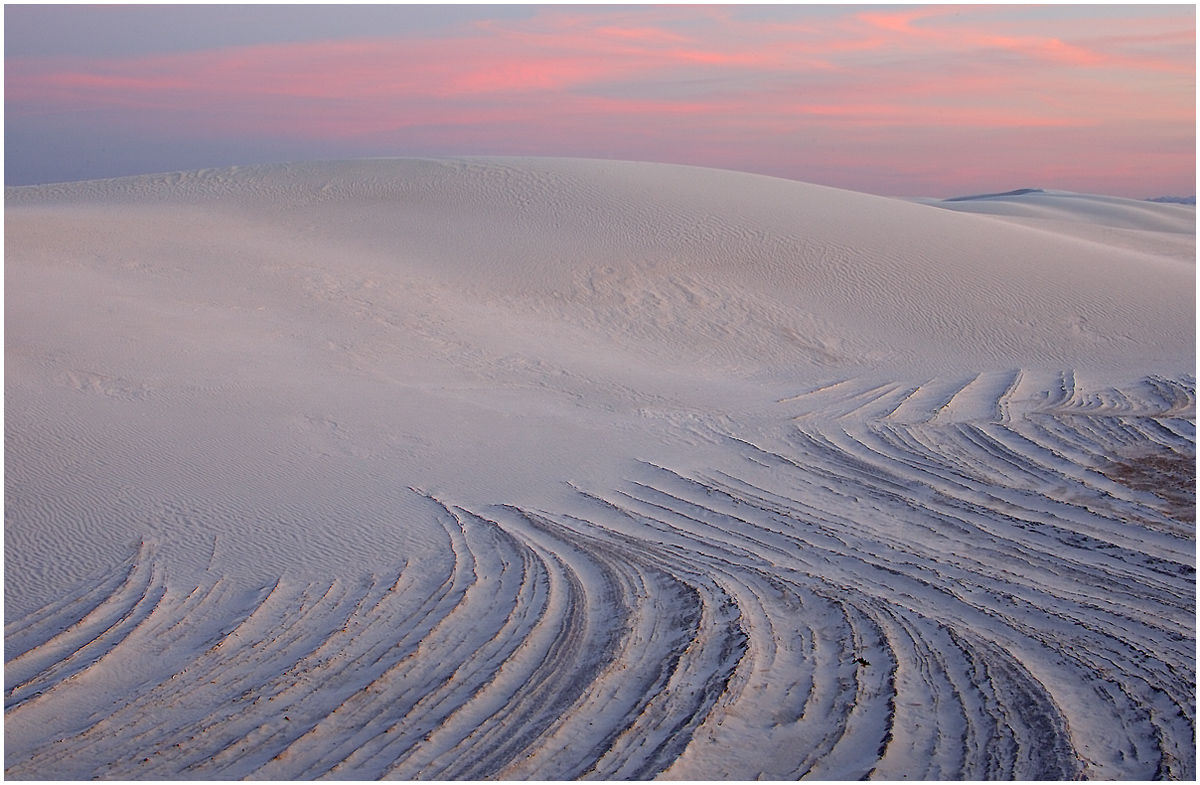
White Sands Dusk #2
‹ PreviousLandscape GalleryNext ›

White Sands Dusk #2

by Roman Kurywczak

Gallery: LandscapePosted December 19, 2009417 views8 comments
I'm a bit torn on this one but would appreciate your opinions. I tried to keep this one a bit softer. Do you feel the MG is too detailless compared to the FG?
Canon 1D Mark III with the 28-135mm lens at 38mm for .8 sec. at f22 and ISO 400 all tripod mounted. Slight crop off right and bottom....where ripples were darker.

Comments

8 comments
Comment posted by denise ippolito on December 19, 2009 at 2:12 PM
Roman, This is beautiful! The colors are soft and lovely. The curved lines in the FG are special. :biggrin:
Registered on December 17, 2009, 202 Posts, 1529 Comments
Comment posted by Robert Dayton on December 19, 2009 at 3:22 PM
Great colors and graphic lines, Roman! No suggestions for improvement.
Registered on November 11, 2008, 281 Posts, 3958 Comments
Comment posted by Cory O'Neill on December 19, 2009 at 10:20 PM
I think the larger version really shows great detail throughout. Love the soft lighting and textures. Great capture!
Registered on October 4, 2008, 28 Posts, 273 Comments
Comment posted by Andreas Resch on December 20, 2009 at 6:15 AM
Very nice, Roman. The curves sure are something special and you also got a great sky. The small brown area on the right gets some attention - overall the image would be simpler without it. Minor observation.
Registered on November 14, 2007, 322 Posts, 6101 Comments
Comment posted by Paul Marcellini on December 20, 2009 at 6:29 PM
I think a portrait emphasizing the lines flowing in might have been stronger. This does kind leave me wanting an anchor in the middle left. Great light though. Would love to get out here one day.
Registered on November 27, 2007, 250 Posts, 2468 Comments
Comment posted by Bill Chambers on December 20, 2009 at 6:32 PM
Nothing to be torn about wih this - very pretty indeed.
Registered on April 10, 2005, 753 Posts, 21216 Comments
Comment posted by Albert Darmo on December 21, 2009 at 11:32 AM
Hi roman :wavey: I like the color and the detail of this beautiful scene ...... Its too bad the composition could not include more lines on the F.G.
Albert Darmo Canada
Registered on November 25, 2008, 1386 Posts, 11978 Comments
Comment posted by Cliff Dodge on December 21, 2009 at 11:42 PM
I like the way the foreground lines lead you into the whole scene. :smile:
Registered on March 25, 2006, 125 Posts, 507 Comments