Nature Photographers Network
This is the preserved archive of the original Nature Photographers Network. The community continues at naturephotographers.network.
Growing on the Rainbow + crop
‹ PreviousLandscape GalleryNext ›

Growing on the Rainbow + crop

by Paul Marcellini

Gallery: LandscapePosted December 6, 2009530 views28 comments
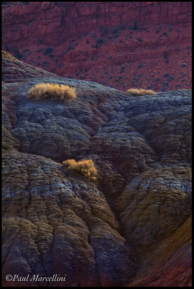
A moment of sunlight on a mainly overcast day backlit these grasses and I loved the color contrast. In the Land of Sleeping Rainbows still.

Please view large

Thanks for the comments on the last,
Paul

5d2, 100-400
Lens (mm): 340
ISO: 200
Aperture: 13
Shutter: 1/160

Comments

28 comments
Comment posted by Abdullaziz Bin Ali on December 6, 2009 at 10:19 PM
Wow Paul, What abeautiful scene
I really like it
the light is killing :)
Registered on May 31, 2009, 112 Posts, 1590 Comments
Comment posted by Younes Bounhar on December 6, 2009 at 10:25 PM
Very cool and original. Love the colours and textures here. well spotted!
Registered on November 25, 2007, 81 Posts, 1234 Comments
Comment posted by Younes Bounhar on December 6, 2009 at 10:25 PM
Very cool and original. Love the colours and textures here. well spotted!
Registered on November 25, 2007, 81 Posts, 1234 Comments
Comment posted by Patricia K. Buys on December 6, 2009 at 10:36 PM
Paul, the color combination is absolutely captivating. Nice shot! Thanks for posting.
Pat
Registered on November 12, 2009, 7 Posts, 13 Comments
Comment posted by Stan Rose on December 6, 2009 at 10:46 PM
I love the comp! The colors are a nice combo, though the blues seem a bit unaturally blue to me--course there are all sorts of funky colors out there.
Registered on September 15, 2005, 836 Posts, 17099 Comments
Comment posted by Tony Kuyper on December 6, 2009 at 11:17 PM
I love this, Paul. It's hard to convince folks these blues are real, but they are, aren't they? The backlit grasses are perfect focal points among these great colors.
Registered on November 1, 2003, 364 Posts, 22328 Comments
Comment posted by Joseph Campisi on December 6, 2009 at 11:19 PM
I can see why you were attracted to the color contrast here Paul. Cool and original shot.
Registered on November 24, 2008, 304 Posts, 3211 Comments
Comment posted by Vance Gese on December 6, 2009 at 11:40 PM
What I find astounding about this image is the multitude of subtle colors intermixed with the more obvious. An absolutely stunning image Paul, that many would have passed by. Beautiful.
Registered on November 13, 2008, 298 Posts, 6629 Comments
Comment posted by Lon Overacker on December 7, 2009 at 12:07 AM
Paul,

This is fabulous! The colors are soft, yet deeply rich and highlighted clusters of grass make for a wonderful composition; especially as a grouping of 3 - great balance. Personal preference, but I might consider a slight crop from both the top and the bottom to help emphasize that trio of grass clusters. But even as presented, this is a great find and beautifully crafted.

Lon
Registered on November 24, 2006, 521 Posts, 19147 Comments
Comment posted by Daniel Ewert on December 7, 2009 at 12:17 AM
Great comp of this colorful and beautiful scene.
Registered on June 2, 2009, 103 Posts, 1500 Comments
Comment posted by Carlos Molina on December 7, 2009 at 1:14 AM
Fantastic image Paul. The array of colors is beautiful. The backlit grasses are very attractive points in the capture. This is a great series you got going here. Very, very nice work Paul :toast:
Registered on March 17, 2009, 40 Posts, 393 Comments
Comment posted by Dean Sauskojus on December 7, 2009 at 1:19 AM
Great colors here and the bushes are cream on the top. Beautiful!
Registered on September 29, 2009, 137 Posts, 2659 Comments
Comment posted by Julian Barkway on December 7, 2009 at 2:55 AM
Wonderful image! I agree with Lon's cropping suggestion, though.
Registered on January 18, 2007, 344 Posts, 1961 Comments
Comment posted by Matt Anderson on December 7, 2009 at 8:11 AM
Paul, the dark dreaminess is great.
Beautiful palette of colors.
Registered on September 6, 2007, 346 Posts, 2696 Comments
Comment posted by Igor on December 7, 2009 at 8:20 AM
This is a really nice image. I would crop a little bit off the bottom, though, to emphasize the brush and change the frame proportions.
Registered on February 22, 2009, 12 Posts, 618 Comments
Comment posted by Paul Marcellini on December 7, 2009 at 8:33 AM
Thanks guys,

Stan it is that blue. =)

Here's a crop, I agree again. Why you guys always gotta be wanting less of my photos though? I have a problem when I go on a trip of trying to process as much as possible and not fine tune each image to the max first. So, sorry for my sloppiness and thanks for the good critiques.

Registered on November 27, 2007, 250 Posts, 2468 Comments
Comment posted by Kevin Trinkner on December 7, 2009 at 9:06 AM
Very cool Paul, love the colors and textures. Nice capture.
Registered on June 30, 2008, 203 Posts, 2641 Comments
Comment posted by Jay Patel on December 7, 2009 at 10:19 AM
I like the composition, colors and textures of the image, but the image seem to have a blue cast to it particularly in shadow and midtone areas. Highlights seem to be fine.

Good work Paul.

-Jay
Registered on August 28, 2008, 87 Posts, 566 Comments
Comment posted by Floris van Breugel on December 7, 2009 at 11:11 AM
Very cool Paul, the light and color palate are wonderful.
Registered on December 19, 2008, 306 Posts, 4840 Comments
Comment posted by Reed Bowman on December 7, 2009 at 12:17 PM
very nice Paul... the balance of colors is perfect and absolutely complemented by the gorgeous light on the shrubs... I prefer that cropped image. Ain't the desert cool? Especially for us Florida boys...
Registered on March 2, 2009, 166 Posts, 1058 Comments
Comment posted by Eva McDermott on December 7, 2009 at 1:22 PM
I love the blues, olive, and red Paul but especially the light on the grasses. Beautiful work!
Registered on January 4, 2009, 1015 Posts, 13229 Comments
Comment posted by Albert Darmo on December 7, 2009 at 1:39 PM
Hi Paul :wavey: I think the crop helps, because it intensives the superb detail and color of the stone. The clusters of grass are very subjective. Again, these colors are to die for :toast:
Albert Darmo Canada
Registered on November 25, 2008, 1386 Posts, 11978 Comments
Comment posted by David Chauvin on December 7, 2009 at 6:45 PM
Very nice, Paul. The soft light brings out some neat textures and subtle color.
Registered on August 5, 2004, 1007 Posts, 5595 Comments
Comment posted by Chip Phillips on December 7, 2009 at 8:23 PM
Nice work Paul. I love all the elements, and the way they are positioned.
Registered on November 26, 2007, 128 Posts, 1436 Comments
Comment posted by Roger Hayden on December 7, 2009 at 9:08 PM
I like the way the blue/gray stone contrasts with the red BG, and how the splashes of the sunlit yellow vegetation adds interest. Nice abstract.
Registered on November 21, 2009, 41 Posts, 201 Comments
Comment posted by Paul Marcellini on December 8, 2009 at 12:31 PM
Thanks to all for the comments and critiques. Always appreciated.
Registered on November 27, 2007, 250 Posts, 2468 Comments
Comment posted by Jimmy Gekas on December 8, 2009 at 3:35 PM
Cool image, Paul. The crop is a bit nicer to me and I do believe you about those blues! Ask Tony :smile:
Registered on July 26, 2007, 244 Posts, 2807 Comments
Comment posted by Rick Gomez on December 8, 2009 at 8:35 PM
Wow! Love it! :toast: :jump:
Registered on March 3, 2007, 206 Posts, 1853 Comments