Nature Photographers Network
This is the preserved archive of the original Nature Photographers Network. The community continues at naturephotographers.network.
Yosemite Autumn #6
‹ PreviousLandscape GalleryNext ›

Yosemite Autumn #6

by Lon Overacker

Gallery: LandscapePosted December 6, 2009414 views29 comments
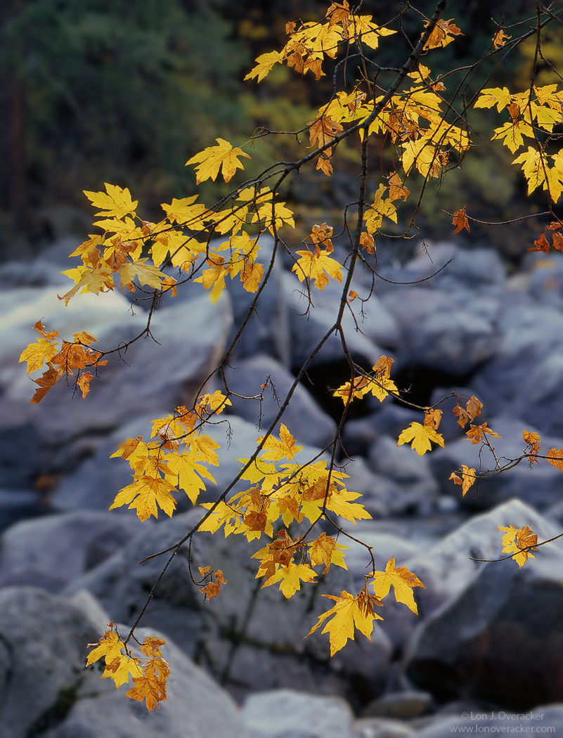
Took a little break from the series figuring there was too much orange going around. So I'll switch to yellow.

This was captured on my way home from my last visit to Yosemite. The river is of course quite low and what remains are all the bare, granite boulders and the last stages of fall along the Merced River. I wanted to isolate the leaves with a shallow DOF, but even still, in full disclosure, I added some additional blur to the background for effect. Unfortunately, the shallow dof, longer ss and intermittent breeze caused motion in the leaves and the original tranny isn't tack sharp throughout, but hopefully the light and isolated big leaf maple leaves make up for it.

As always, your comments and critiques are always welcome.

Chamonix 4x5, Nikkor 300mm, V100f, f/11 @ 1/2s
Tony's Stuff as always.
Larger version included although doesn't really improve anything I don't think

Lon

Comments

29 comments
Comment posted by Ron Niebrugge on December 6, 2009 at 8:47 PM
That is really cool. This limited DOF really makes this image, but you can make out just enough to understand the environment. I like it!
Registered on November 1, 2003, 12 Posts, 250 Comments
Comment posted by Bret Edge on December 6, 2009 at 8:51 PM
Perfect example of selective focus in successful landscape photography. The warm/cool combo is lovely. I'm really digging the delicate branches against the bold stones in the background. :toast:
Registered on November 1, 2003, 711 Posts, 6363 Comments
Comment posted by Tony Kuyper on December 6, 2009 at 8:51 PM
Talk about signature like, Lon. I knew this was yours even before I saw the copyright. Intimate and perfectly lit . . . your trademark style. What a great comp from such simple elements.
Registered on November 1, 2003, 364 Posts, 22328 Comments
Comment posted by Bruno Silva on December 6, 2009 at 8:56 PM
beautiful comp, lon. focus and dof here work nicely. sweet color on the leafs. the image has a very pleasent and intimate feel. beautiful.
Registered on May 6, 2009, 132 Posts, 1406 Comments
Comment posted by Philip Hodgkins on December 6, 2009 at 9:06 PM
A good study in contrasts, between the sharp as tacks maple leaves and the OOF rocks. Excellent composition. I like this as is.
Registered on July 24, 2006, 2741 Posts, 12349 Comments
Comment posted by Chris Chamberlain on December 6, 2009 at 9:24 PM
Expertly executed as usual! Not tack sharp huh? Looks pretty sharp to me, in all the places that are supposed to be. Knew this was yours as soon as I saw it.

Chris
Registered on March 13, 2007, 500 Posts, 8365 Comments
Comment posted by Rick Goldwasser on December 6, 2009 at 9:38 PM
Not usually a big fan of these dof blurs but this works really well. The leaves really pop the way they stand out against that blurred bg - I definitely learned a lesson here!
Registered on May 10, 2009, 127 Posts, 970 Comments
Comment posted by Albert Darmo on December 6, 2009 at 10:00 PM
Hi Lon :wavey: I see both harmony and contrast in these splendid colors. The dof works so well in this fine composition. simple and alluring :toast:
Albert Darmo Canada
Registered on November 25, 2008, 1386 Posts, 11978 Comments
Comment posted by Albert Darmo on December 6, 2009 at 10:01 PM
Hi Lon :wavey: I see both harmony and nice contrast in these splendid colors. The dof works so well in this fine composition. simple and alluring :toast:
Albert Darmo Canada
Registered on November 25, 2008, 1386 Posts, 11978 Comments
Comment posted by Paul Marcellini on December 6, 2009 at 10:12 PM
I have to admit, it is still in between dof for me. I love the idea and color contrast, but I want it a touch shallower. The boulders still take my eye off the leaves too much. But I may be a minority, others like it, and I do, just not as much as I like just about every other shot you take.
Registered on November 27, 2007, 250 Posts, 2468 Comments
Comment posted by Paul Marcellini on December 6, 2009 at 10:14 PM
On second thought, what about bringing down just the highlights in the rocks?
Registered on November 27, 2007, 250 Posts, 2468 Comments
Comment posted by Stan Rose on December 6, 2009 at 10:49 PM
I have a differring view (shocking, i know): I love the DOF, but i wish there wasnt the divisive break in colors in back. If i crop the top 1/3 here, for me the bottom 2/3 is mind-blowing amazing. With the full bg its just a pretty shot.
Registered on September 15, 2005, 836 Posts, 17099 Comments
Comment posted by Ned Fenimore on December 6, 2009 at 11:39 PM
Really nice image, Lon... the leaves look great against that background...
Registered on November 1, 2003, 467 Posts, 2803 Comments
Comment posted by Vance Gese on December 7, 2009 at 12:37 AM
Gorgeous image Lon. The diagonal of the branch, and the wonderful floating autumn leaves really are superb. While I might strive for a bit more blur of the background (have no idea as to how this would be done in PS) or maybe a decrease in the background highlights as Paul suggested, I still think this is beautiful. Love it.
Registered on November 13, 2008, 298 Posts, 6629 Comments
Comment posted by Dean Sauskojus on December 7, 2009 at 1:25 AM
Love the slightly out of focus blue background. Makes the yellows pop. Great image Lon.
Registered on September 29, 2009, 137 Posts, 2659 Comments
Comment posted by Igor on December 7, 2009 at 1:30 AM
Lon, you are the master of trees and foliage.
Registered on February 22, 2009, 12 Posts, 618 Comments
Comment posted by Lon Overacker on December 7, 2009 at 1:32 AM
Thanks for the comments folks!

Paul M - Can't really argue with you as I wish the dof was shallower. Combination of any number of things. The LF lens used wide open is only f/9. I chose f/11 because supposedly in general optical qualities are better in the middle apertures and I didn't want to shoot completely wide open. Subject distance plays a role too as does the relative brightness of rocks. I think darkening the rocks some more is probably the ticket, although quite a bit of "painting" was done already. But, ultimately, I understand your impressions

Stan - I actually considered that and could easily crop this to isolate to just the rocky background. I actually have a horizontal exposure as well with less up top. But in the end and at least for this presentation, I was thinking along the lines of Ron's first comment in that I like the broader view and to show a bit of context of the environment where these leaves were hanging out.

Vance - Blurring via PS is pretty simple. I duplicated the background layer and applied a small amount of gaussian blur. Drop a layer mask on top of it, you can hide-all or reveal-all, and then I simply painted back in the leaves and branches. Haloing just like in exposure blends is a challenge, but fortunately the background was already soft, so any imperfections in the painting aren't noticeable.

Thanks again everyone.
Registered on November 24, 2006, 521 Posts, 19147 Comments
Comment posted by Julian Barkway on December 7, 2009 at 3:00 AM
Sharpness isn't everything and a bit of blur can be an effective tool - but I'm sure you don't need me to tell you that. :wink:

The colour combination of yellow against pale grey is what make this, of course. My only nit is that the green of the foliage introduces an unnecessary third element to the image. I know how tough it is to get a clean background for this sort of thing but just the leaves against the pale rocks would have made for a stronger image, imo.

EDIT: I see now you've addressed this point above. As you were. :smile:

(Note to self: read all the comments before posting... :rolleyes: :smile: )
Registered on January 18, 2007, 344 Posts, 1961 Comments
Comment posted by Dietrich Gloger on December 7, 2009 at 5:17 AM
The blue yellow combination works great Lon. Your style definitely. The leaves due to their shape and backlit nature provide a lot of extra appeal. I really like the blurred rocks as backdrop so much I wonder whether the dark greenish upper third adds to the appeal or not? It is not distracting, but in terms of "composition-purity" and essential elements it might be that the green upper part is not crucial. Just trying to analyze.... :wink:
Registered on January 26, 2007, 360 Posts, 9876 Comments
Comment posted by Cory Tardiff on December 7, 2009 at 8:43 AM
This came out really great Lon. The backgrounds soft focus and the sharpness of the leaves really makes it stick out and pleasing to the eye. Well done.

Cory
Registered on December 22, 2008, 18 Posts, 47 Comments
Comment posted by Morris McClung on December 7, 2009 at 10:31 AM
Really nice light, and the hint of blue in the rocks is very complimentary to the yellow leaves. Beautiful!
Registered on May 7, 2007, 670 Posts, 19650 Comments
Comment posted by Paul Breitkreuz on December 7, 2009 at 10:48 AM
This works very nicely throughout, Lon. Absolutely the natural backdrop, the short DOF exposure in the field, as well as post processing blur, all add to keenly isolating the main FG subject perfectly. I also feel the contrasting colors makes the scene look and feel very fall seasonal as well. Very exceptional capture with a somewhat simplistic composition overall.
Registered on February 25, 2006, 525 Posts, 8448 Comments
Comment posted by John&Patty Benway on December 7, 2009 at 11:33 AM
You know I like it Lon, to tell you the truth, I was going to post one similar till I came across this, and as soon as I saw the thumb nail I knew it was yours, I think I will wait till you clear the page. Anyway beautiful work Lon, I do love it.
John
Registered on May 12, 2006, 626 Posts, 8700 Comments
Comment posted by Dan Baumbach on December 7, 2009 at 12:07 PM
Classic Overacker. Nice composition, great color. Well put together.

- Dan.
Registered on November 1, 2003, 473 Posts, 7980 Comments
Comment posted by Jimmy Gekas on December 7, 2009 at 1:17 PM
This screams Lon! I love the simplicity of the scene that the shallow DOF provides. Of course, the color is outstanding as always. :toast:
Registered on July 26, 2007, 244 Posts, 2807 Comments
Comment posted by Harley Goldman on December 7, 2009 at 6:44 PM
I like it. I was going to say that I would like to see the background a little more out of focus, but looking at the large size, it looks more OOF than in the small. Just a function of the image size or did you process it different? I definitely like it.
Registered on November 19, 2003, 586 Posts, 11271 Comments
Comment posted by Rafael Rojas on December 8, 2009 at 2:40 AM
Tridimensional, lovely colour contrast and delicious subtlety and delicacy...Well done Lon!
Registered on March 1, 2009, 56 Posts, 623 Comments
Comment posted by Hamed Musharbak on December 8, 2009 at 6:15 AM
powerful colors Lon

i like the composition here

very well done

Hamed :wavey:
Registered on June 1, 2009, 372 Posts, 2282 Comments
Comment posted by Anthony Vincent on December 9, 2009 at 6:06 PM
Better late than never, right? Couldn't pass up this beauty Lon

I love the depth of field you've chosen and it reminds me to keep that in mind more often, Thank you
Great image.
Registered on February 5, 2009, 199 Posts, 2775 Comments