Nature Photographers Network
This is the preserved archive of the original Nature Photographers Network. The community continues at naturephotographers.network.
Snake River Dawn
‹ PreviousLandscape GalleryNext ›

Snake River Dawn

by Chip Phillips

Gallery: LandscapePosted April 15, 20083,388 views62 comments
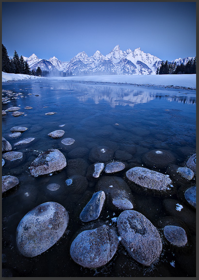
This is a shot that I was going for on a recent trip to the Tetons. I snowshoed down to the snake river and set up, but all three of my batteries died shortly after this shot. It was 1 degree. I had also hoped for some cloud cover. I have posted a shot taken the morning before, with some alpenglow and a different comp. Do you like either of these, if so, which one? (I have quite a few blue sky mountain shots...) :confused:
Thanks for looking. Chip
Canon 5D
Canon 16-35 f2.8L II
I kept the white balance cool to reflect what I was feeling at the time-extreme cold!!

Comments

62 comments
Comment posted by Chip Phillips on April 15, 2008 at 3:48 PM
Registered on November 26, 2007, 128 Posts, 1436 Comments
Comment posted by Wade Hardy on April 15, 2008 at 3:57 PM
Good Lord Chip! 2 incredible shots - i personally like the vertical the best. Excellent!
Registered on May 2, 2006, 121 Posts, 1824 Comments
Comment posted by Joseph Rossbach on April 15, 2008 at 3:58 PM
Both are amazing man. I like the cold feeling of the first. The second with the apenglow is so striking and beautiful. :toast:
Registered on November 25, 2005, 484 Posts, 1377 Comments
Comment posted by Younes Bounhar on April 15, 2008 at 4:13 PM
I am really glad you posted the vertical one. It's got a very unique mood. Just love it (That's not too say that the 2nd is bad, just that the 1st stands out).
Registered on November 25, 2007, 81 Posts, 1234 Comments
Comment posted by Chip Phillips on April 15, 2008 at 4:17 PM
Thanks guys!
Younes-Your comment on P.net is the reason I posted it. Glad you like it, and thanks for the helpful comments.
Registered on November 26, 2007, 128 Posts, 1436 Comments
Comment posted by Peter Carroll on April 15, 2008 at 4:21 PM
I love them both but for me the vertical is on another level. It has a a higher level of what I would call purity - limited colour range, classic composition, clear message etc. Personally I'd reduce the top corner vignetting because I don't think the shot needs it to focus the viewer's attention. Lovely work Chip.
Registered on August 19, 2005, 132 Posts, 983 Comments
Comment posted by Giovanni Russello on April 15, 2008 at 4:25 PM
Chip,
I think that the vertical one stands really out. The composition is much more powerful.
The second one is nice, but just because of the alpenglow.
A pity that you changed composition when the alpenglow appeard...and didn't have enough juice for keeping the camera going.

gio
Registered on January 21, 2007, 95 Posts, 1617 Comments
Comment posted by Jim Greenwood on April 15, 2008 at 4:32 PM
I'm going against the trend thus far, because I prefer the horizontal composition with the beautiful alpenglow, with more of the shoreline on the left in frame. Although, I do like that more of the reflection is visible in the vertical. It seems like the horizontal was taken from a lower vantage point. Also, the vignetting effect in the upper corners in both shots is a little distracting to me. It's more noticeable in the vertical.
Registered on November 9, 2003, 229 Posts, 1523 Comments
Comment posted by Benjamin Glatt on April 15, 2008 at 4:33 PM
This just about out does any Teton shot I have seen-- and I am a huge fan of the Tetons. I would love a print of that first image. :toast: :toast: :toast:
Registered on July 15, 2007, 171 Posts, 3566 Comments
Comment posted by Bud Reed on April 15, 2008 at 4:37 PM
Both are great shots but I prefer the first
Registered on July 15, 2007, 53 Posts, 618 Comments
Comment posted by Bret Edge on April 15, 2008 at 4:39 PM
Both images are beautiful Chip, but I'm partial to the vertical. It has a tremendous feeling of depth and the overall blue tones really impart the feeling of a cold winter morning.
Registered on November 1, 2003, 711 Posts, 6363 Comments
Comment posted by Chip Phillips on April 15, 2008 at 5:08 PM
Thanks for all the helpful comments so far. The second one(horiz.) is actually from my first visit to this location the day before the vert. I prefer the vertical comp as well, and was anxious to try it out on the morning my batteries died. Forecast had called for incoming cloud cover, and I was happy to see that a small section of the river was still un-frozen for the reflection. The shot I came back with is growing on me though. Sometimes I have something in my mind that I want, and when I don't get it, I think everything else is just no good-I have to stop that!....Thanks for your kind comments and opinions!
Registered on November 26, 2007, 128 Posts, 1436 Comments
Comment posted by Kurt Budliger on April 15, 2008 at 5:11 PM
Absolutely STUNNING! I prefer the vertical comp., very strong and the mood created by the blue tones. But I also love the warmth of the alpenglow in the second. Both are superb, well done :toast:
Registered on June 11, 2006, 113 Posts, 2116 Comments
Comment posted by Larry F. Lowell on April 15, 2008 at 5:28 PM
Wow, both images are stunning. It would be hard to choose between the two because each one makes a different statement about the scene. I love the depth and color of the first. I love the color and warmness of the second. Both are fantastic images. Thanks for sharing! Larry
Registered on March 28, 2008, 24 Posts, 258 Comments
Comment posted by Jeremy Kessler on April 15, 2008 at 5:36 PM
Both are very nice shots. I think I prefer the vertical composition but they are both lovely. Nice to see a new perspective of the Tetons that I haven't seen before.
Registered on September 13, 2007, 36 Posts, 1283 Comments
Comment posted by Ann Badjura on April 15, 2008 at 5:39 PM
Wow, this is an amazing shot with beautiful light, great colors and great details! I love your POV with the rocks in the foreground which create beautiful depth. The reflections on the water only add to this image! Excellent work!

Greetings,
Ann :smile:
Registered on April 3, 2008, 7 Posts, 58 Comments
Comment posted by Peter Gordon on April 15, 2008 at 5:48 PM
Both very striking images but I prefer the horizontal. I prefer the warmer foreground tones and that alpenglow is stunning..
Registered on May 31, 2007, 224 Posts, 1490 Comments
Comment posted by Mel Ladewig on April 15, 2008 at 5:52 PM
Chip, These are both great. Throw the battery in the river, you got what you came for! :toast:

Mel-
Registered on July 24, 2005, 114 Posts, 1205 Comments
Comment posted by Zack Schnepf on April 15, 2008 at 5:59 PM
Still love the vertical blue version, great work.
Registered on November 1, 2003, 403 Posts, 2528 Comments
Comment posted by Jack Brauer on April 15, 2008 at 6:00 PM
That first shot is awesome!!! It's nice to see something that unique from there. Love the blue colors, and the comp is great with all those circular rocks.
Registered on September 12, 2005, 40 Posts, 627 Comments
Comment posted by Kartik Venkatarama on April 15, 2008 at 6:00 PM
The first is a killer image! Love the almost 2-tone look to the image, and it is a more compelling comp than the horizontal. But I do love the alepnglow in the 2nd one.
Registered on July 27, 2007, 197 Posts, 830 Comments
Comment posted by scott lanz on April 15, 2008 at 6:13 PM
Both are great, but the vertical is fantastic.
Registered on November 14, 2003, 840 Posts, 12902 Comments
Comment posted by Ron Pullen on April 15, 2008 at 6:47 PM
Both are great, I do like the alpine glow in the horizontal but I'm partial to a vertical comp. also. Ron
:toast:
Registered on December 18, 2005, 74 Posts, 1413 Comments
Comment posted by Benjamin Glatt on April 15, 2008 at 6:52 PM
Chip, question: Where did you descend to get down to the water. Did you just park in the snake river overlook lot, and then hop the wall?
Registered on July 15, 2007, 171 Posts, 3566 Comments
Comment posted by Matt Anderson on April 15, 2008 at 6:56 PM
Monty, I'll take door number one... beautiful. Chip, this is one heck of a shot. WB setting was a brilliant choice.
Registered on September 6, 2007, 346 Posts, 2696 Comments
Comment posted by Brian Rasmussen on April 15, 2008 at 7:58 PM
I tend slightly toward the alpenglow version but agree that the vertical comp is sweeter... both are great Chip!
Registered on July 26, 2005, 121 Posts, 1884 Comments
Comment posted by Stan Rose on April 15, 2008 at 8:19 PM
Theyre both killer. I prefer #1 for its mood (and blue :wink: ) but the 2d has more commercial appeal.
Registered on September 15, 2005, 836 Posts, 17099 Comments
Comment posted by Kent Mearig on April 15, 2008 at 8:38 PM
Even though the alpenglow looks great, I prefer everything in the first post. Composition is much stronger, and I think the mood is more engaging. The burning of the top edge could be blended better, but other than that, I see no flaws. Nice work.
Registered on September 4, 2006, 237 Posts, 4748 Comments
Comment posted by Guy Tal on April 15, 2008 at 8:39 PM
Both are superb, Chip! You could have stashed one of the batteries under your coat to warm it up for a few minutes, which would have gotten you a couple more shots (and you can keep rotating them as you work).

Guy
Registered on November 1, 2003, 566 Posts, 15507 Comments
Comment posted by Kari Post on April 15, 2008 at 8:53 PM
Very pretty. I love the colors and round rocks. The depth of this composition is very nice. This is quite a pleasing image!
Registered on January 27, 2007, 13 Posts, 195 Comments
Comment posted by William Vrolyk on April 15, 2008 at 9:04 PM
Chip, both images are very striking, but the first one rises above. :smile:

Will
Edmonton, Alberta
Canada
Registered on November 1, 2003, 278 Posts, 3524 Comments
Comment posted by arend jan schennin on April 15, 2008 at 9:23 PM
awsome images both are gr8 my pick is the first one aj
Registered on January 23, 2007, 51 Posts, 164 Comments
Comment posted by Catherine Reilly on April 15, 2008 at 9:34 PM
Wow, now this is a tough pick! Both are stunning shots. The vertical shot I will choose because of the mood and the masterful depiction of freezing cold. With this hung on my living room wall, I would freeze to death in front of my blazing fireplace!
Registered on August 16, 2006, 603 Posts, 9192 Comments
Comment posted by Kerry Leibowitz on April 15, 2008 at 9:38 PM
Chip, I think the comp of the vertical is just exquisite. The alpenglow of the horizontal is captivating...but if I had to pick one or the other, I'd go for the vertical. Can't say enough about how nicely composed that is.
Registered on November 1, 2003, 167 Posts, 5800 Comments
Comment posted by Winnie Ho on April 15, 2008 at 9:40 PM
Both awesome, Chip! I almost wish you could space out your posts so I can savour them a bit longer. Back to your question, I prefer the first post. The alpenglow in the second one is prettier, but the first one is a stronger comp that sucks the viewer in, and the cool tones really work here. :toast:
Registered on January 6, 2008, 93 Posts, 1788 Comments
Comment posted by Rick Lundh on April 15, 2008 at 9:48 PM
The vertical one with half the sky cropped out really sings. Nice shot! Love the blue...
Registered on April 28, 2004, 774 Posts, 4351 Comments
Comment posted by Adam Kavalunas on April 15, 2008 at 10:28 PM
I like the vertical comp. better, but the light in the second one is great.
Registered on June 22, 2006, 73 Posts, 464 Comments
Comment posted by Mitch Erwin on April 15, 2008 at 10:37 PM
Chip,

My vote is for the vertical too! Both are outstanding!
Registered on April 24, 2006, 98 Posts, 656 Comments
Comment posted by Chip Phillips on April 15, 2008 at 10:46 PM
Thanks very much for all the comments on this!!
Benjamin-I parked a few miles south of there, and walked down the road a ways, then descended down the hill.
Guy-I tried warming them in my inside pocket. In fact, I kept one in my pocket during the 45 min. snowshoe trip back and still had no juice when I got back to the car. I was nervous that my camera was broken but it started back up again after a while.
Registered on November 26, 2007, 128 Posts, 1436 Comments
Comment posted by Gabi Lach on April 15, 2008 at 11:23 PM
Both are beautiful, vertical is even better. Love it! Excellent work. :toast:
Registered on May 1, 2007, 101 Posts, 3187 Comments
Comment posted by Ed Cooley on April 16, 2008 at 12:00 AM
Chip,

I like this image. The detail in the water really adds to the interest of the shot. I like the first image much better than the alpenglow version but both are nice.


Registered on August 22, 2007, 45 Posts, 547 Comments
Comment posted by Richard Wong on April 16, 2008 at 12:17 AM
I love the vertical image. while the horizontal is pretty, it is a standard landscape in sunrise lighting. The vertical image however is unique and tells a story. The story being it is damn cold!
Registered on February 2, 2006, 79 Posts, 2629 Comments
Comment posted by Dietrich Gloger on April 16, 2008 at 1:07 AM
Chip this is stunning. I love it! Taking rocks in the fg, a lake and a mountain-range is surely not the most innovative idea, but this works so extremely well here and that's the reason why this type of composition has it's justification - it delivers some awesome images. It is also a new and fresh view of the tetons. I like the blue cold feeling, the tetons look excellent back there. The vertical beats the horizontal! Great work!
Registered on January 26, 2007, 360 Posts, 9876 Comments
Comment posted by Dorin Bofan on April 16, 2008 at 1:33 AM
Both are superb, each one in its own way. While the horizontal one stands out due to the alpen glow, the vertical one really gives you chills due to the extreme weather you experienced. Of course, like everyone said, the vertical is a lot stronger, mainly because of the comp. Superb photography!
Registered on April 30, 2007, 122 Posts, 3086 Comments
Comment posted by Eric Good on April 16, 2008 at 2:31 AM
The horizontal version is quality work, but that vertical image is stunning work IMO. What separates the two is the vertical image's ability to trigger a much greater emotional response from me. I feel like I want to be there... even though it looks freakin' cold. Beautiful work!
Registered on March 17, 2007, 116 Posts, 4764 Comments
Comment posted by John Lehmkuhl on April 16, 2008 at 3:04 AM
Chip #1 is really stunning and a very unique shot from an overshot place. What an awesome perspective and it truly looks like it's 1 degree out there !!
Registered on May 22, 2005, 165 Posts, 2008 Comments
Comment posted by Marsel van Oosten on April 16, 2008 at 3:57 AM
The vertical for sure - very pretty. I'd crop off 2/5 of the sky though. The distortion of the trees is horrible, but I'm learning to ignore it. :smile: Very well done! :toast:
Registered on March 9, 2004, 285 Posts, 2277 Comments
Comment posted by Andreas Resch on April 16, 2008 at 5:39 AM
Two excellent shots here. I also prefer vertical version to the wider one. I like the emphasized depth in there and they way the vignetting makes the rock glow.
Registered on November 14, 2007, 322 Posts, 6101 Comments
Comment posted by Etienne Corten on April 16, 2008 at 7:56 AM
Pure beauty, :toast: :toast:
Registered on December 10, 2007, 86 Posts, 1158 Comments
Comment posted by Roger Rouch on April 16, 2008 at 8:28 AM
The vertical is the one for me! Refreshing view of a great scene. You extra effort to get the photo was well rewarding by my eye.
Registered on November 1, 2003, 159 Posts, 1014 Comments
Comment posted by Steve France on April 16, 2008 at 9:59 AM
Wow, what an amazing scene. I love the FG. The blues are wonderful and convey the coldness so well. Great depth to this shot. A bit from the top just to keep my eye from floating up and this is one amazing photo. Great stuff.
Registered on September 26, 2007, 89 Posts, 1477 Comments
Comment posted by Kah Kit Yoong on April 16, 2008 at 10:58 AM
It certainly explains why your batteries died. Excellent depiction of a stark winter.
Registered on September 27, 2006, 636 Posts, 10682 Comments
Comment posted by Ned Fenimore on April 16, 2008 at 11:20 AM
Great images - love the second one..
Registered on November 1, 2003, 467 Posts, 2803 Comments
Comment posted by Jimmy Gekas on April 16, 2008 at 12:46 PM
Excellent images, Chip. I prefer the comp and coolness of the first one. Whoa, this indeed looks cold.
Registered on July 26, 2007, 244 Posts, 2807 Comments
Comment posted by Prashant Khapane on April 16, 2008 at 2:42 PM
Amazing. What a wonderful image.
Registered on November 1, 2003, 492 Posts, 4580 Comments
Comment posted by Marc Adamus on April 17, 2008 at 5:30 PM
I feel the composition is stronger in the first version. The chopped off mountain reflections bother me a little in the second. The faint mist in the first is the best emotional element in either shot. Without it, the scene would loose a lot of impact for me. Nice use of the rocks in both shots.
Registered on September 17, 2005, 780 Posts, 8091 Comments
Comment posted by Michael Anderson on April 17, 2008 at 8:27 PM
Chip,

The cool blue colors capture the feeling of this spectacular place IMO better than the warmer version. Excellent composition and processing as usual!
Registered on January 31, 2006, 228 Posts, 3072 Comments
Comment posted by Thomas Creel on April 18, 2008 at 1:05 AM
Both are great, but I prefer the 1st. I can feel that it is only 1 degree without you even telling me on that one!

Excellent work!
Registered on November 1, 2003, 104 Posts, 852 Comments
Comment posted by Winnie Ho on April 21, 2008 at 9:14 PM
Congratulations on the EP, Chip! Cheers :toast:
Registered on January 6, 2008, 93 Posts, 1788 Comments
Comment posted by Charlie VanTassel on April 22, 2008 at 12:32 AM
Congratulations, Chip! Beautiful work... :toast: :toast:
Registered on October 18, 2006, 644 Posts, 4801 Comments
Comment posted by Rick Gomez on September 8, 2008 at 8:52 PM
I absolutely love both of these! :toast:
Registered on March 3, 2007, 206 Posts, 1853 Comments
Comment posted by Dan Legere on August 13, 2009 at 4:15 AM
Amazing, like the coolness and the rocks are interesting, at first I thought they where bubbles, then realized they're rocks. I prefer the the first one.
Registered on December 13, 2008, 9 Posts, 23 Comments