Nature Photographers Network
This is the preserved archive of the original Nature Photographers Network. The community continues at naturephotographers.network.
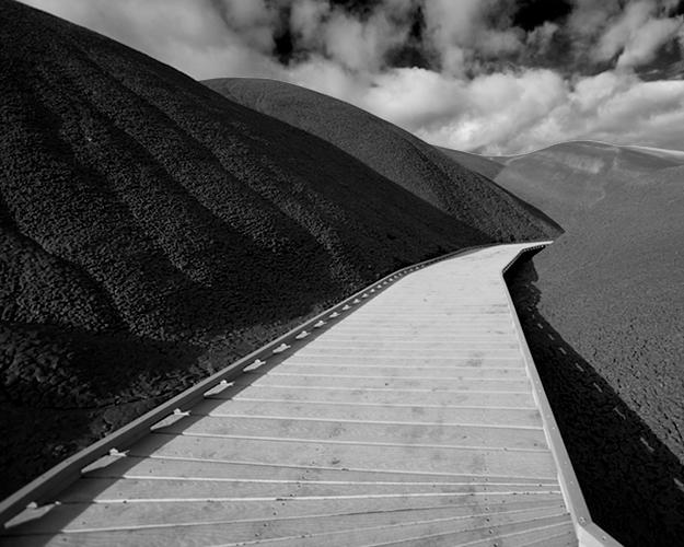
Raised Walkway/Painted Hills
‹ PreviousMan & Nature GalleryNext ›

Raised Walkway/Painted Hills

by Ryan DesJardins

Gallery: Man & NaturePosted January 4, 20071,368 views10 comments
Well, the Painted Hills in Oregon are usually known for their color, but after applying a b&w treatment to this shot in CS3, I felt compelled to share it (it got a good response on the PNWNP forum).

Canon 20D 10-22mm Lens

Comments

10 comments
Comment posted by Jerry Roseburrough on January 5, 2007 at 12:24 AM
Ryan, I didn't get to comment at PNWNP, but I like this a lot. :jump: I still have to make my first trip to the painted hills. Maybe spring, Have to take my grand kids rockhunting down that way. :jump:
Registered on February 21, 2006, 53 Posts, 151 Comments
Comment posted by Vincent Grafhorst on January 5, 2007 at 2:45 AM
Great image Ryan, I like the sense of depth, the contracting straight line of the walkway with the round shapes of the hills and the white clouds above. :jump: :toast:
Registered on February 24, 2006, 504 Posts, 7203 Comments
Comment posted by Michael Handley on January 5, 2007 at 12:27 PM
This is a very striking and compelling composition. Very nice.

Michael
Registered on April 1, 2004, 38 Posts, 1301 Comments
Comment posted by Tien-Chien Chen on January 5, 2007 at 2:25 PM
I love the lines/shapes and the feel of depth here. Nicely done!
Registered on September 2, 2005, 34 Posts, 225 Comments
Comment posted by Pete D on January 5, 2007 at 11:17 PM
It needs a woman in a red jacket on the boardwalk. Ok, maybe not red, but the idea would be to cause a pause part of the way along the walk. This is a nice B&W conversion.

Pete D.
Registered on November 1, 2003, 590 Posts, 1794 Comments
Comment posted by Kent Staubus on January 6, 2007 at 1:33 AM
Very striking images. I think shooting in B&W really emphasized the important things--the lines and curves. Interesting mix of elements--straight, curved, light, dark. It seems to have them all but in an organized way.


Kent in SD
Registered on November 11, 2003, 121 Posts, 2098 Comments
Comment posted by Kah Kit Yoong on January 6, 2007 at 6:21 PM
I like the walkway disappearing behind the corner in the distance. The geometric shapes are really well brought out by the B&W conversion.
Registered on September 27, 2006, 636 Posts, 10682 Comments
Comment posted by William Brozy on January 8, 2007 at 9:59 AM
Well done Ryan - the three contrasting elements really work in harmony here. Congrats on this weeks EP!
Registered on November 9, 2003, 559 Posts, 2929 Comments
Comment posted by Philip Kuglin on January 8, 2007 at 2:52 PM
Ryan,
I remember a color version close to this which I also thought was excellent. This also sings in B&W. Great drama and emotion.
Registered on April 19, 2004, 68 Posts, 389 Comments
Comment posted by Wayne Rhodus on January 12, 2007 at 9:27 AM
Beautiful tones and detail Ryan, I see why they liked it. There is a ton of stuff to look at here and the comp moves you seemlessly through the image. Great shot and good choice for the B/W.

Congrats on the EP! :toast:
Registered on November 16, 2003, 157 Posts, 3326 Comments