Nature Photographers Network
This is the preserved archive of the original Nature Photographers Network. The community continues at naturephotographers.network.
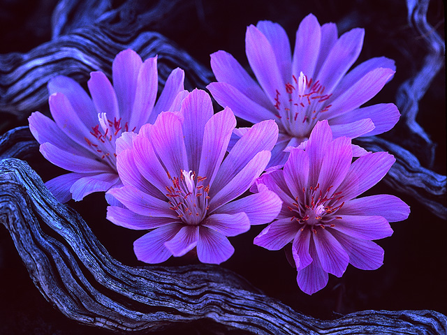
Bitterroot Beauties
‹ PreviousFlora GalleryNext ›

Bitterroot Beauties

by Mearle Gates

Gallery: FloraPosted June 25, 20062,584 views19 comments
This was actually on a brilliantly sunny afternoon, but my assistant kindly lent her shadow for the sake of art. I love the blue color tones that resulted, so don't bother to suggest I remove, reduce, or tweak the blue the slightest little bit. Are we clear on this? :cool:
Canon EOS-3, 35mm Velvia 100

Comments

19 comments
Comment posted by Jim Salge on June 25, 2006 at 12:57 PM
This has a bit of a blueish... Sorry, couldn't resist :wink:

This is really nice, very sharp, good DOF. Kind of an abstract in a way, because you include some of the environment, but it is unclear what that envrionment is! :toast:
Registered on February 23, 2006, 269 Posts, 2210 Comments
Comment posted by Mearle Gates on June 25, 2006 at 1:33 PM
Here is what real world Bitterroot habitat looks like. Not pretty. Therefore the tight crop to the essense of these flowers.
Registered on September 30, 2005, 50 Posts, 36 Comments
Comment posted by Dominic Rossetti on June 25, 2006 at 1:44 PM
Yep, a little blue, which, IMO, is exactly what makes this image SOOOO appealing. The cool tones of the weathered wood are brilliant. Well done. :toast:
Registered on October 17, 2005, 54 Posts, 300 Comments
Comment posted by David W. Kelly on June 25, 2006 at 2:16 PM
Mearle my only nit "the blue" :eek: JUST KIDDING. I actually love the blue and the comp is excellent. I wouldn't change a thing. :toast: A very artistic expression....

David Kelly
Registered on October 7, 2005, 883 Posts, 6590 Comments
Comment posted by Barb Hansen on June 25, 2006 at 4:33 PM
Terrific........I love the blue/s. Well Done :toast: :toast:
Registered on May 16, 2005, 380 Posts, 5157 Comments
Comment posted by Mike Maples on June 25, 2006 at 5:39 PM
EXTREMELY NICE!!!!!
Registered on January 4, 2005, 285 Posts, 731 Comments
Comment posted by Bill Fach on June 25, 2006 at 6:08 PM
Mearle: Intriguing image with a lot to look at and like. Nicely done>=))>
Registered on November 1, 2003, 1805 Posts, 26981 Comments
Comment posted by Tim Goodspeed on June 25, 2006 at 8:13 PM
Mearle, I like the blue tone here. Adds a great mood to the shot. The detail is excellent. :toast:
Registered on December 19, 2005, 75 Posts, 382 Comments
Comment posted by Alice Scoggins on June 25, 2006 at 8:47 PM
Reminds me of the effect of those black lights from the 60's....quite psychadelic! Awesome look, almost eerie. I like it! :toast:
Registered on February 21, 2005, 430 Posts, 5959 Comments
Comment posted by Mearle Gates on June 25, 2006 at 9:47 PM
Alice - This brings up an important point. The color gamut of this RGB file which has an .icc color profile for my Samsung monitor can display richer blues and pinks than can be actually printed. I have been loading .icc printer profiles for various Epson/Canon printer/paper combinations and converting this photo to each printer profile. It's very very enlightening to see the colors shift with each profile. So far the Canon i9900 with Moab Kokopelli Photo Satin paper wins hands down in coming close to matching these intensities of color. Actually the blue in the dry wood goes a bit over the top, so I'll tone that part down before I print. If I print. The fact is, I do not yet own a color printer. Anyone want to volunteer their i9900 for a 12X16 print?
6/30/06 Have a new Canon i9900 on the way. And paper. And Ink refills. Man! photography as a hobby can be expensive!
Registered on September 30, 2005, 50 Posts, 36 Comments
Comment posted by Bill Dark on June 25, 2006 at 10:11 PM
Outstanding Merle! Nice depth control, and the bluish cast enhances the wood. Great light on the blooms too. Very nice!
Registered on May 27, 2005, 148 Posts, 1121 Comments
Comment posted by David Weber on June 26, 2006 at 12:24 AM
Stunning :eek: ! Sharp :cool: ! Intriging :smile: !
Registered on February 7, 2005, 296 Posts, 2737 Comments
Comment posted by W. Tracy Parnell on June 26, 2006 at 10:12 AM
Beautiful shot! :eek:
Registered on March 4, 2004, 27 Posts, 1638 Comments
Comment posted by Nathan Buck on June 26, 2006 at 12:14 PM
Very cool Mearle...from your 'blue period'...:wink: I love it. The centers just seem to glow!

Nathan
Registered on November 1, 2003, 1101 Posts, 13589 Comments
Comment posted by Christine Adams on July 1, 2006 at 11:24 PM
Hi Mearle!! This is a VERY pretty shot although for me, sorry, the blue is a bit overpowering. Otherwise, nice!!!
Registered on January 24, 2006, 119 Posts, 1871 Comments
Comment posted by Anil Rao on July 3, 2006 at 8:07 PM
Fascinating image, Mearle! Congratulations on the EP.
Registered on November 15, 2003, 234 Posts, 4923 Comments
Comment posted by Doug Benner on July 10, 2006 at 6:12 AM
Beautiful.
Registered on December 8, 2003, 482 Posts, 1868 Comments
Comment posted by Michael Anderson on July 11, 2006 at 2:43 AM
Stunning. As a digital guy now I can say this shot reminds me of how much I miss the deep saturated blues and reds of Velvia.

Mike Anderson
www.lightscapephoto.com
Registered on January 31, 2006, 228 Posts, 3072 Comments
Comment posted by Lorna Taylor on January 5, 2011 at 9:41 PM
Wonderful composition, Beautiful colours!
Registered on November 12, 2010, 254 Posts, 3083 Comments