Nature Photographers Network
This is the preserved archive of the original Nature Photographers Network. The community continues at naturephotographers.network.
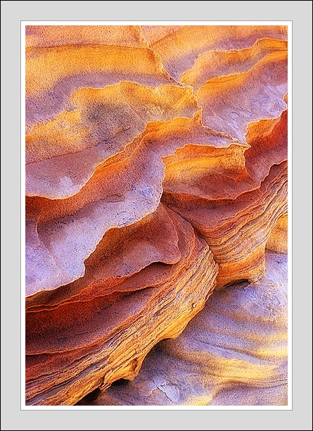
Sandstone Detail--in color
‹ PreviousLandscape GalleryNext ›

Sandstone Detail--in color

by Tony Kuyper

Gallery: LandscapePosted September 1, 20053,419 views25 comments
This is the color version of the black and white negative that I posted last week. In many ways I find them to be quite different pictures. I like the colors in this version but don't find it to be as mysterious as the negative version.

I think I remember Professor Weaver telling me that the protruding fins are calcite intrusions. Otherwise, I think it's mostly sandstone.

You opinions and recommendations are always appreciated.

Nikon FM2, 50-135 mm zoom, 81A, Velvia 100F.

Comments

25 comments
Comment posted by Timothy Swope on September 1, 2005 at 11:25 PM
I am really enjoying the sandstone photos. This is very different in color and I like it for different reasons. To me this really is somewhat about the light or glow. It leads they eye around this pic nicely.
Registered on November 1, 2003, 21 Posts, 155 Comments
Comment posted by Mark Windom on September 2, 2005 at 12:31 AM
Another terrific sandstone abstract. I agree it's not as mysterious as the negative version but I think I actually prefer this version...the colors are incredible.
Registered on November 1, 2003, 176 Posts, 2302 Comments
Comment posted by Gary Gulash on September 2, 2005 at 1:02 AM
Magnificent exposure, beautiful light.
Registered on January 28, 2005, 879 Posts, 12098 Comments
Comment posted by Juza on September 2, 2005 at 2:52 AM
Tony,
I love it, and I ditto the other comment about colors, incredible! :toast:
Registered on November 1, 2003, 374 Posts, 10466 Comments
Comment posted by Rodney Dugmore on September 2, 2005 at 4:29 AM
Tony

This is beautiful
The colours are Outstanding and the composition faultless

Excellent
Registered on January 3, 2004, 76 Posts, 1028 Comments
Comment posted by Jody Grigg on September 2, 2005 at 8:44 AM
I like the textures and the variety of muted colors.
Registered on February 7, 2004, 165 Posts, 1227 Comments
Comment posted by Jess Lee on September 2, 2005 at 9:18 AM
Great vision as usual Tony
Registered on November 1, 2003, 114 Posts, 929 Comments
Comment posted by Alice Scoggins on September 2, 2005 at 10:54 AM
Certainly not as mysterious, but quite beautiful. The colors and light are wonderful. :toast:
Registered on February 21, 2005, 430 Posts, 5959 Comments
Comment posted by Pete D on September 2, 2005 at 11:16 AM
Hey, that's one of my favorite lenses! Mine was a well used one that has an unfortunate propensity to "auto zoom." I had a machinist friend make a zoom locking ring for it.

Anyhow, very nice photograph. I like the arrangement of shapes and the colors. Of course all that is bias by my love of the subject. I wonder how someone who didn't know what it was would react.

Pete D.
Registered on November 1, 2003, 590 Posts, 1794 Comments
Comment posted by Guy Tal on September 2, 2005 at 1:01 PM
Whoa! This is one of your better sandstone detail images, in my opinion, and it's fascinating to see the effects of a color vs. a B&W presentation.
Here it's easy to tell this is a vertical formation. The B&W version could have been facing just about any direction.

Guy
Registered on November 1, 2003, 566 Posts, 15507 Comments
Comment posted by Nathan Buck on September 2, 2005 at 1:21 PM
This one is all about the glow for me Tony. Very cool.

Nathan
Registered on November 1, 2003, 1101 Posts, 13589 Comments
Comment posted by Harley Goldman on September 2, 2005 at 6:38 PM
Tony,

Excellent image. Great light, colors and composition. Sweet.
Registered on November 19, 2003, 586 Posts, 11271 Comments
Comment posted by Doug Dolde on September 2, 2005 at 8:51 PM
Cake frosting? Looks very tasty.
Registered on November 1, 2003, 305 Posts, 3900 Comments
Comment posted by Dan Baumbach on September 2, 2005 at 9:15 PM
Both the color and b&w versions are beautiful. I'll take a print of each. :)

- Dan.
Registered on November 1, 2003, 473 Posts, 7980 Comments
Comment posted by Rick Dunn on September 2, 2005 at 11:03 PM
This is something else. The black & white was interesting, even though the negative version didn't really resonate with me. It, too, was interesting, but not nearly as impactful as this color version. The colors, shapes and textures are all exceedingly strong. There's nothing here that weakens the image or distracts - it's all eye candy!
Registered on February 22, 2004, 35 Posts, 1311 Comments
Comment posted by Eric Fredine on September 2, 2005 at 11:04 PM
All your interpretations of this feature are interesting in their own way Tony - they speak to your fascination and insight in to these formations.

Ulimately, I'd pick the colour version - partly because the colours in your photographs are just so damned beautiful - but also because it has continuity with your other work. And I guess also because I'm just a colour photography kind of guy.
Registered on November 1, 2003, 148 Posts, 1464 Comments
Comment posted by Nye Simmons on September 2, 2005 at 11:11 PM
Apples and Oranges, both fruit, both sweet :jump:
Registered on December 12, 2004, 112 Posts, 1111 Comments
Comment posted by Dane Glueck on September 3, 2005 at 9:46 AM
Agree with both Eric and Nye - both versions are wonderful, but my propensity is toward the color version. Love the glow.
Registered on November 10, 2003, 193 Posts, 1748 Comments
Comment posted by Kenneth Kijewski on September 3, 2005 at 11:15 AM
A Splendid array of colors and layers!!!
Registered on February 17, 2004, 166 Posts, 3390 Comments
Comment posted by Anil Rao on September 3, 2005 at 5:35 PM
The light is just magical in this one. Of the three versions that you have shown us so far, I like this one the best.

Regards.
Registered on November 15, 2003, 234 Posts, 4923 Comments
Comment posted by Daniel McKeehan on September 4, 2005 at 9:54 PM
Per your request....
Not working for me although not a bad image. :wavey:
Registered on July 31, 2005, 99 Posts, 590 Comments
Comment posted by INGOMA on September 4, 2005 at 10:54 PM
Tony, this is great. But I prefer the black and white. The range of tonalties there appealed very much to me.
Regards,
Cristoph
Registered on July 2, 2004, 231 Posts, 3110 Comments
Comment posted by Joseph Kayne on September 5, 2005 at 11:26 AM
Hi Tony, Real nice image. I know you like saturation but I would suggest a minor decrease here....Still, one of my favorites of yours.

Thanks.

Joe.
Registered on November 1, 2003, 573 Posts, 2619 Comments
Comment posted by Robert Ludwick on September 5, 2005 at 9:24 PM
Tony,

I figured out your original "negative" abstract so I should get a print as a prize. LOL

Great as B&W and color. Congrats on the EP.

Bob

PS. I agree with Joe, cut back the saturation a touch.

Registered on November 8, 2003, 51 Posts, 407 Comments
Comment posted by Lyrinda Snyderman on August 8, 2007 at 9:22 PM
Truly haunting. God is in the details. But where is this place?!? I want to visit it.
Registered on August 8, 2007, 0 Posts, 3 Comments