Nature Photographers Network
This is the preserved archive of the original Nature Photographers Network. The community continues at naturephotographers.network.
Lifted.
‹ PreviousLandscape GalleryNext ›

Lifted.

by Ronald Murphy

Gallery: LandscapePosted March 28, 20182,103 views7 comments
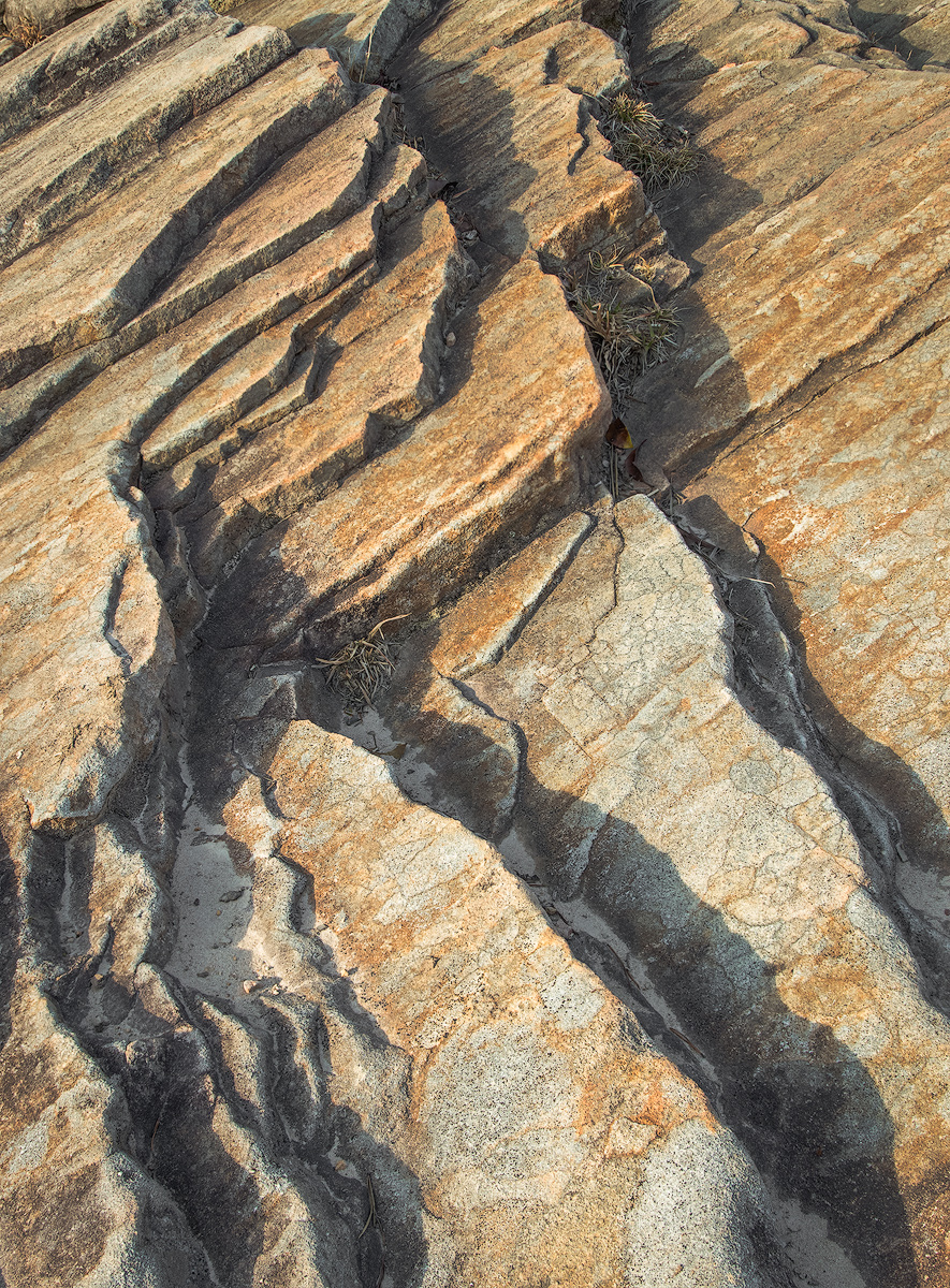
Caught in some low, warm light. Breaks Interstate Park, VA. 

Canon 80D, 1/30 s, f/8, ISO 200, EF 24-105mm f/4 @ 24 mm, CPL. 
Three Raw exposures for DOF, hand blended in PSCC, processed in LRCC.
TK resize/sharpening for web.

Seeking any and all advice and comments. Thanks in advance. 

Please view the large image! 

 

Comments

7 comments
Comment posted by John Williams on March 28, 2018 at 12:52 PM
Lovely colors and vivid lines. In the larger version, the little piles of needles provide a nice contrast to the rest of the image.
Registered on September 6, 2007, 221 Posts, 5985 Comments
Comment posted by Nick Bristol on March 28, 2018 at 5:05 PM
Ronald, I'm really enjoying this image! Wonderful shapes, lines and textures throughout. The light and shadows working great together helping define the shapes. Very nice work!

Nick Bristol
Lone Rock, WI.
Registered on February 1, 2004, 752 Posts, 14140 Comments
Comment posted by Brian Schrayer on March 28, 2018 at 11:12 PM
I like the graphic lines in the image and the way that they keep my eye moving throughout the frame.  The subtle color and texture works well here as well.  Overall, I would recommend increasing the contrast as it just looks a bit flat to me.  Nicely done overall. 
Registered on May 28, 2004, 114 Posts, 2890 Comments
Comment posted by Ed McGuirk on March 29, 2018 at 8:28 AM
Ronald, I like the diagonal framing here, this is a very dynamic composition. I also like the earth tone colors in the rocks, they are very pleasing. In terms of processing, I think your mid-tones look good, but I agree with Brian, I would add some contrast and darken your shadow areas a bit, they look a little flat as presented.
Registered on November 29, 2017, 19 Posts, 260 Comments
Comment posted by Harley Goldman on March 30, 2018 at 11:25 AM
Real nice rock abstract. These are tough to compose and pull off and you have done it quite nicely.
Registered on November 19, 2003, 586 Posts, 11271 Comments
Comment posted by Igor Doncov on March 30, 2018 at 11:58 AM
Lovely image. I really appreciate the natural colors of the stone, which in this light are quite beautiful. There are other comps in here that make for stronger  comps, but the way the top gets narrower gives a good sense of what we are seeing.
Registered on November 22, 2014, 189 Posts, 2733 Comments
Comment posted by Jim Zablotny on March 30, 2018 at 6:27 PM
Hi Ron,

I like what you have produced here.  The transition from less to more diagonals makes this comp very nice.  Well done...............Jim
Registered on January 17, 2004, 705 Posts, 3594 Comments