Nature Photographers Network
This is the preserved archive of the original Nature Photographers Network. The community continues at naturephotographers.network.
Spring has sprung
‹ PreviousFlora GalleryNext ›

Spring has sprung

by Ry Birge

Gallery: FloraPosted March 12, 20181,114 views7 comments
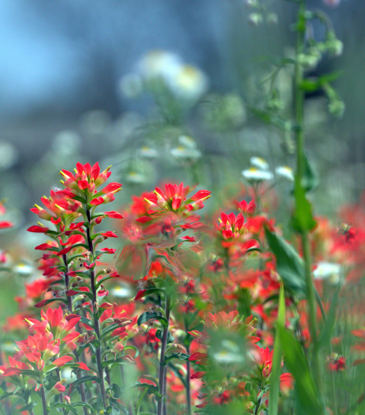
I found a field of wildflowers this morning creating a sea of color in the field by my house. I got down on my stomach and spend an hour taking pictures trying to capture the collage of colors which was overwhelming. I decided to keep most of the picture out of focus with only a few flowers clearly defined in an attempt to try to re-create the sea of colors  All feedback is greatly valued  Ry.
PS  Appreciate the initial feedback on this posting in the wee bit embarrassed that I slipped and posted a sloppy version by mistake. I've reposted an image with the feedback I've received in consideration. Thanks much-Ry
Canon EOS 7D Mark II
LENS EF100-400mm f/4.5-5.6L IS II USM
ISO 1000
FOCAL LENGTH 263.0 mm (415.0 mm in 35mm)
APERTURE f/9
EXPOSURE TIME 0.00031s (1/320

Comments

7 comments
Comment posted by Bill Leggett on March 12, 2018 at 8:39 PM
Certainly some nice color here, Ry. The framing could be better if you shifted left to exclude the tall stalk in the right FG, and cropped a fair bit off the top to emphasize the nice red. But with that said, it seems that your method of post processing needs to be addressed. You left some obvious smears and blotches which make it appear unnatural. Would be interesting to see the original for comparison.
Registered on July 21, 2004, 706 Posts, 3233 Comments
Comment posted by Philip Southard on March 12, 2018 at 9:46 PM
In the collage of colors, I can see what drew you to this.  I'm getting a hint of Monet.  As such, I'm wondering what the image would look like if the sharply focused areas were softened a bit.  And I do agree with Bill regarding the crop suggestion and avoiding the stalk in the foreground.
Registered on July 15, 2007, 258 Posts, 3892 Comments
Comment posted by Ry Birge on March 12, 2018 at 10:50 PM
Registered on September 23, 2017, 118 Posts, 278 Comments
Comment posted by Steve Kennedy on March 12, 2018 at 11:50 PM
The repost is much improved Ry.  You might want to change the title to reflect the repost - Bill and Phil may comment on the report.

The red blooms are fantastic.  I would still crop to a square format, eliminating some of the top.  I think that would make a much stronger image.
Registered on March 9, 2009, 79 Posts, 676 Comments
Comment posted by Philip Southard on March 13, 2018 at 1:36 PM
Thanks for the repost, and it is much improved.  I'm still thinking that cropping out around half of the background or more brings more focus to the sweet colors in the foregound.
Registered on July 15, 2007, 258 Posts, 3892 Comments
Comment posted by Philip Hodgkins on March 14, 2018 at 5:18 PM
The repost is headed in the right direction. I agree on cropping most of the top, giving the eye just enough to tell it where to stop.
Registered on July 24, 2006, 2741 Posts, 12349 Comments
Comment posted by Bill Fach on March 14, 2018 at 10:39 PM
Ry: Another vote for the repost and cropping some from the top. I love paintbrush and hoping to find some in the next few weeks here in Texas. >=))>
Registered on November 1, 2003, 1805 Posts, 26981 Comments