Gallery: LandscapePosted February 27, 20181,907 views10 comments
<div>Please click on the image above or the expansion symbol under it for a much better view.
</div>
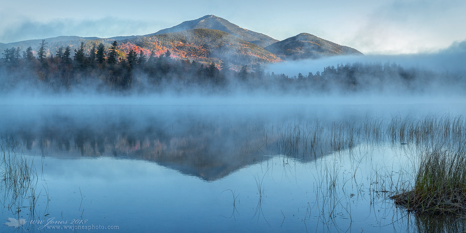
<div>This is a crop of a larger composition I posted a couple of days ago, HERE. In this crop I concentrate more on the colorful sunrise on the mountain. In addition, I tried to correct the super-cyan cast of the original post (a problem I have had before).
</div>
<div>I have two questions:
1. Do you prefer this tighter crop?
2. Is this an improvenemt in the color?</div>
<div> THANKS
Canon 5D Mark III, Canon 50mm. f/1.4
1/30 sec. @ f/16
part of a 15-frame panorama stitched in PSCC</div>
Comments
10 comments
Comment posted by Harry Lichtman on February 27, 2018 at 8:45 PM
The cyans look a bit better - my tendency would be to go a little farther. Regarding the crop, feels too tight at the top. If I were going to crop on the sides - I would take more off on the right side to somewhat match the amount of reeds on the left to create balance.
Registered on September 17, 2010, 304 Posts, 3507 Comments
Comment posted by Wayne Jones on February 27, 2018 at 9:19 PM
Thanks Harry. That's one of my other crops -- a 16x9 (this one is 2x1). I was just about to delete this because I realized I had failed to get the cyan under control as soon as I posted it. Every time I change the color, the image gets brighter, even using the color blending mode in PS. So I bring down the brightness and the cyan comes back. Maybe I just need to stop being so timid in Photoshop, and go for bolder changes. (In addition, my eyesight does not help. People have told me for years that I am color blind because we often disagree about what's green and what's blue.)
Registered on April 18, 2007, 953 Posts, 6435 Comments
Comment posted by Kathy Barnhart on February 28, 2018 at 12:01 AM
I prefer this crop because I found the clumps of grasses in the lower right a little distracting. The star of the show, IMO, is the bright sun on the far mountain, and then the fog. I might even consider a crop off the right, just leaving the delicate grasses and no clumps. The color looks good on my monitor...a little blue looks nice with the orange and red trees. The image has a lovely fall feel to it.
Registered on November 11, 2011, 404 Posts, 1639 Comments
Comment posted by Igor Doncov on February 28, 2018 at 1:22 AM
I think this is about as good a crop as you can get from the previous image. The problem with any further crop from the right is that the background requires a wide format due to those wonderful horizontals, which includes the horizontal layer of reeds on the right. The color was good from the start for me. Dawn is usually bluish.
Registered on November 22, 2014, 189 Posts, 2733 Comments
Comment posted by Harley Goldman on February 28, 2018 at 2:48 PM
Wayne, yes and yes. I would agree with Harry about the top being a little tight, but certainly not an image breaker. I much prefer this one. Real nice image!
Registered on November 19, 2003, 586 Posts, 11271 Comments
Comment posted by Nick Bristol on February 28, 2018 at 4:24 PM
Wayne, I prefer this one as well. Yes, a bit tight up top but not really to the point of hurting the image much. Still a little too much cyan I think so taking it a little farther might be even better...worth a try anyway. I like this comp and the light on the hill side is really nice and especially with that fall color showing up. This has a very nice feel.
Nick Bristol
Lone Rock, WI.
Registered on February 1, 2004, 752 Posts, 14140 Comments
Comment posted by Kah Kit Yoong on March 1, 2018 at 9:35 AM
Still probably a touch cyan but I wouldn't reduce it too much, I like the contrast with the coloured foliage. A beautifully serene image.
Registered on September 27, 2006, 636 Posts, 10682 Comments
Comment posted by Ed Lowe on March 1, 2018 at 4:23 PM
I too prefer the crop in this version, Wayne. You still have the wonderful mood with the fog and the warm light on the BG peaks. I could see going just a bit further with the cyan reduction, but it is all subjective. Either way this is gorgeous.
Ed
Registered on February 7, 2004, 414 Posts, 7115 Comments
Comment posted by Mark Seaver on March 3, 2018 at 4:17 PM
Wayne, I really like the crop/comp. here. It lets the touch of color on the mountain stand out more from all of the blue both due to color and due to position in the frame. To me, that bit of drama is the key. I also really like the foreground reeds and how there's an opening in them for the mountain's reflection.
Registered on January 23, 2011, 1103 Posts, 17270 Comments
Comment posted by Preston Birdwell on March 4, 2018 at 11:09 AM
I agree with the 'too tight at the top' comments, Wayne. I am also on the fence with the clump of grass on the right. The cyan is a little too heavy--perhaps reduce that and add a touch of blue to retain the mood. Like Kathy mentioned, The mountains and the fog are the stars of the show.
--P
Registered on November 1, 2003, 471 Posts, 5188 Comments

Comments
10 commentsNick Bristol
Lone Rock, WI.
Ed
--P