Gallery: LandscapePosted January 18, 20183,581 views21 comments
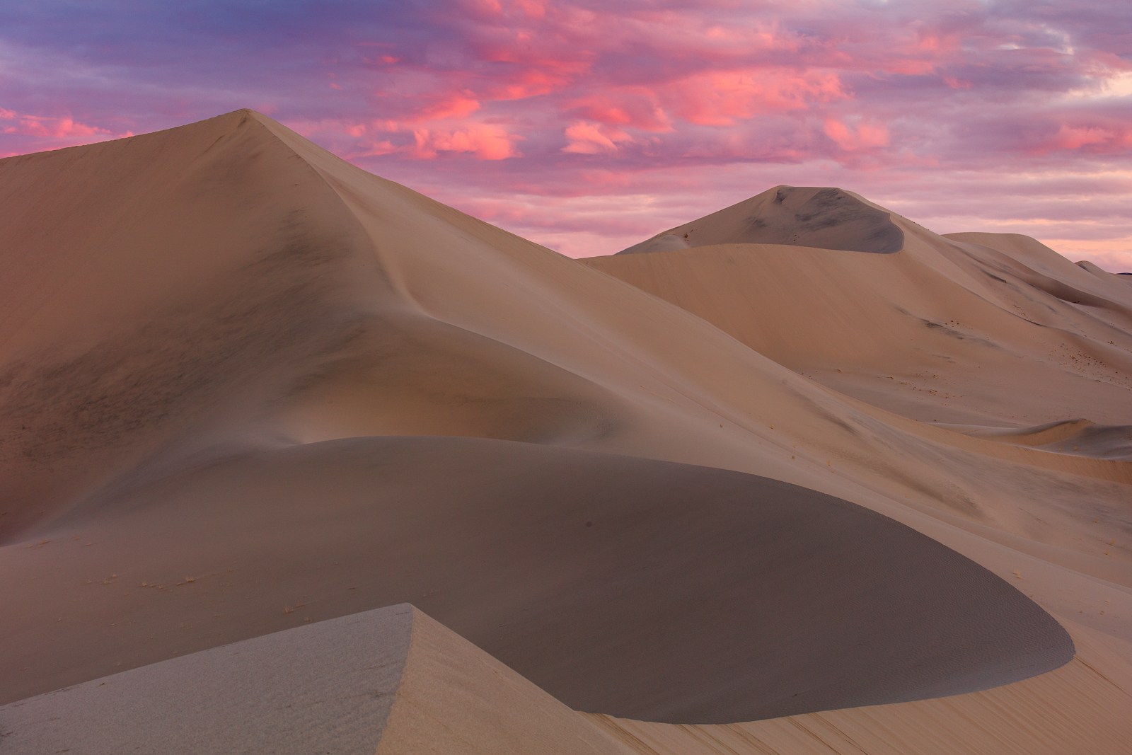
Another from my time at the dunes with Harley. C&C appreciated.
5DSR, 70-200 f/4 IS L
Comments
21 comments
Comment posted by Preston Birdwell on January 18, 2018 at 11:58 AM
Wonderful light and beautiful color in the sky, Dave. The dunes appear to need a touch more contrast to bring out more texture there. I love the shapes and the curves.
You and Harley had some truly epic light and clouds during your trip to DV!
--P
Registered on November 1, 2003, 471 Posts, 5188 Comments
Comment posted by Igor Doncov on January 18, 2018 at 12:43 PM
This one isn't working for me, Dave. The sky is wonderful and the composition is strong. However, these dunes come to life with sunlight, even just around the edges.
Registered on November 22, 2014, 189 Posts, 2733 Comments
Comment posted by Dave Dillemuth on January 18, 2018 at 2:11 PM
Preston, Igor,
Thanks for the helpful critique. I raised the blacks and increased the contrast in the dunes. It is a bit more "stylized" rendition but I think I prefer this version.
Registered on December 10, 2015, 104 Posts, 1112 Comments
Comment posted by Harley Goldman on January 18, 2018 at 3:09 PM
Excellent shapes and great sky. I like the direction of the repost, but for my money, I would take it even further to get more contrast on the dunes.
Registered on November 19, 2003, 586 Posts, 11271 Comments
Comment posted by Preston Birdwell on January 18, 2018 at 4:13 PM
I like the direction of the repost, but for my money, I would take it even further to get more contrast on the dunes.
Yep. Dave, if you use TK's masks, try using one of the more restrictive mid-tones masks. Be sure to 'paint' out the sky in the mask--it looks great.
--P
Registered on November 1, 2003, 471 Posts, 5188 Comments
Comment posted by Dave Dillemuth on January 18, 2018 at 4:51 PM
Preston, Harley,
Thanks for very helpful suggestions. It's interesting that I didn't perceive the weak contrast until you pointed it out. I added a TK mid-tone adjustment with the sky masked as suggested.
How is this... not enough, too far?
Registered on December 10, 2015, 104 Posts, 1112 Comments
Comment posted by Harley Goldman on January 18, 2018 at 5:01 PM
The second repost works for me. Much more depth to my eye. thumbs up here.
Registered on November 19, 2003, 586 Posts, 11271 Comments
Comment posted by Ian Cameron on January 18, 2018 at 5:12 PM
A gorgeous picture Dave. Love the soft light. I am keenest on your second image. I think that is perhaps a tad colourful but the contrast seems just right.
Registered on August 6, 2004, 1125 Posts, 3318 Comments
Comment posted by Igor Doncov on January 18, 2018 at 5:13 PM
You're a miracle worker, Dave. Both reposts look better than original. I may like the 1st repost more but it's a matter of taste now. How much contrast do you like? The colors are stronger in the 2nd, to match that sky. Yeah, I guess the 2nd is better.
You could fade the sky reds a bit in the 1st repost to match the mellow mood of the dunes. I like the 1st repost because it doesn't have the 'scream factor' of the other one. But it's a personal preference.
Registered on November 22, 2014, 189 Posts, 2733 Comments
Comment posted by Nick Bristol on January 18, 2018 at 5:42 PM
Dave, I like the first repost best... It is just right for my taste. Beautiful image and work!
Nick Bristol
Lone Rock, WI.
Registered on February 1, 2004, 752 Posts, 14140 Comments
Comment posted by Preston Birdwell on January 18, 2018 at 6:08 PM
Repost #2 looks much better. You were able to pull some texture that, as Harley says, adds to the depth.
Thanks for taking the time to do the tweaks, Dave.
--P
Registered on November 1, 2003, 471 Posts, 5188 Comments
Comment posted by Dan Kearl on January 18, 2018 at 8:16 PM
I like the first repost best.
Amazing work, simply beautiful...
Registered on September 2, 2013, 209 Posts, 1514 Comments
Comment posted by Chris Chamberlain on January 18, 2018 at 8:46 PM
Gorgeous scene with a strong/powerful comp. I think I lean toward the last repost. But the first one is nice too. The added contrast does seem to give it more interest or presence. Nice!
Registered on March 13, 2007, 500 Posts, 8365 Comments
Comment posted by Aaron Feinberg on January 19, 2018 at 2:05 AM
Good work with the reposts. Definitely more dynamic and 3d. Gotta love dunes!
aF
Registered on October 26, 2009, 399 Posts, 2789 Comments
Comment posted by Ed Lowe on January 19, 2018 at 9:04 AM
Hard to pick a favorite, but I am leaning toward the last repost, Dave. The shapes and lines are just fantastic as are the colors in this landscape. I think the added contrast has given the image just a little pop and created some lovely textures. Beautifully done.
Ed
Registered on February 7, 2004, 414 Posts, 7115 Comments
Comment posted by Harry Lichtman on January 19, 2018 at 5:00 PM
Beautiful scene, great curves and your reposts do the trick to brig the dunes alive. The 2nd post is my favorite. Some sky! Big dust spot near the center in the dune.
Registered on September 17, 2010, 304 Posts, 3507 Comments
Comment posted by Richard Teller on January 19, 2018 at 6:36 PM
I second what everyone has said about this image. Great image. I think I like the second one best. I have been enjoying you images from the dunes at Death Valley.
Registered on August 23, 2010, 1162 Posts, 6692 Comments
Comment posted by Mark Seaver on January 20, 2018 at 2:17 PM
The dunes look great, Dave, and the sky is awesome. I was about to suggest some more contrast in the dunes, but I see you've taken care of that in the reposts. The extra gold in the final repost looks good also.
Registered on January 23, 2011, 1103 Posts, 17270 Comments
Comment posted by Lon Overacker on January 21, 2018 at 2:43 PM
Dave,
A beautiful dune image. Love the colors and soft light. And because of that I almost prefer the original, although the first repost I think is best. The 2nd one goes to far I think and the processing no longer matches the soft, subtle and gentleness of the colors and contrast.
I don't know if this has been mentioned, but more than any color or contrast, I'm wishing for a bit more room all the way around, but mostly along the bottom. While the sweeping curve along the bottom is key to the composition, I'm just wishing for a little more room at the bottom. It's such a grand and beautiful scene, I'm wishing it was more expansive... but then I suspect there were constraints that you didn't want to include.
Lon
Registered on November 24, 2006, 521 Posts, 19147 Comments
Comment posted by Bill Fach on January 21, 2018 at 4:41 PM
Dave: Just a wonderful scene and fabulous light. I appreciate your processing efforts and think I prefer the first repost. I love shooting dunes and you guys are making me want to head that way or to Great Sand Dunes NP in the near future. Marvelous image.>=))>
Registered on November 1, 2003, 1805 Posts, 26981 Comments
Comment posted by Bill Chambers on January 24, 2018 at 11:18 AM
Late to the party here, but I think it's a beautiful composition and I prefer the third iteration best. Looks like you and Harley had a great time!
Registered on April 10, 2005, 753 Posts, 21216 Comments

Comments
21 commentsYou and Harley had some truly epic light and clouds during your trip to DV!
--P
Thanks for the helpful critique. I raised the blacks and increased the contrast in the dunes. It is a bit more "stylized" rendition but I think I prefer this version.
--P
Thanks for very helpful suggestions. It's interesting that I didn't perceive the weak contrast until you pointed it out. I added a TK mid-tone adjustment with the sky masked as suggested.
How is this... not enough, too far?
You could fade the sky reds a bit in the 1st repost to match the mellow mood of the dunes. I like the 1st repost because it doesn't have the 'scream factor' of the other one. But it's a personal preference.
Nick Bristol
Lone Rock, WI.
Thanks for taking the time to do the tweaks, Dave.
--P
Amazing work, simply beautiful...
aF
Ed
A beautiful dune image. Love the colors and soft light. And because of that I almost prefer the original, although the first repost I think is best. The 2nd one goes to far I think and the processing no longer matches the soft, subtle and gentleness of the colors and contrast.
I don't know if this has been mentioned, but more than any color or contrast, I'm wishing for a bit more room all the way around, but mostly along the bottom. While the sweeping curve along the bottom is key to the composition, I'm just wishing for a little more room at the bottom. It's such a grand and beautiful scene, I'm wishing it was more expansive... but then I suspect there were constraints that you didn't want to include.
Lon