Nature Photographers Network
This is the preserved archive of the original Nature Photographers Network. The community continues at naturephotographers.network.
Elemental Conflict . .
‹ PreviousLandscape GalleryNext ›

Elemental Conflict . .

by Bill Fach

Gallery: LandscapePosted November 30, 2017234 views5 comments
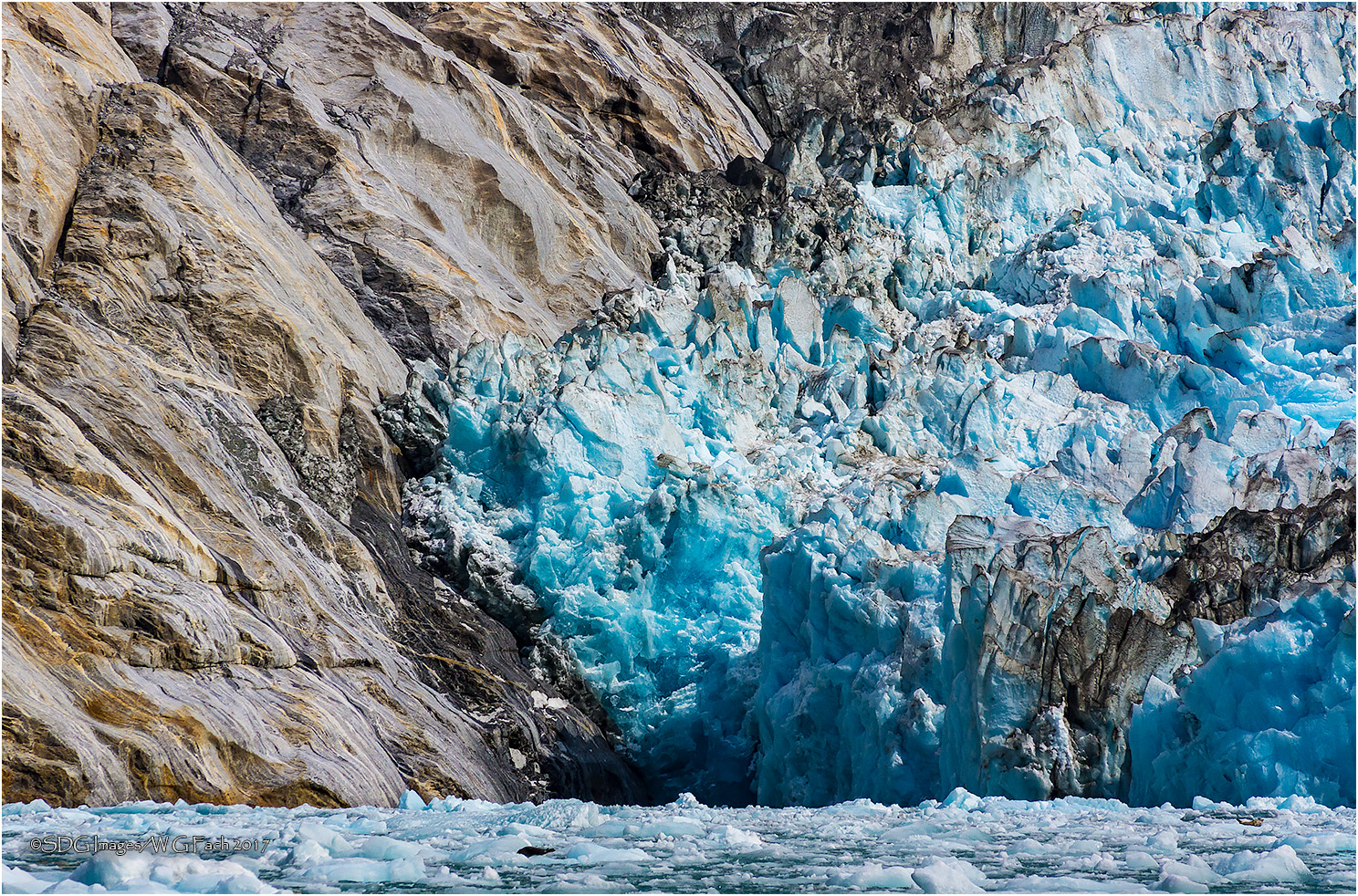
. .or, The Irresistible Force vs The Immovable Object
Sony A77
Sony 55-200 @ 140mm
ISO 400, 1/1600 @ f11
Dawes Glacier, Endicott Arm, Alaska
Taken from a RIB on an up close look at the glacier. Hard to imagine the forces at play. We were lucky enough to see some iceberg calving but not lucky enough to capture it. Still a marvelous experience. Please view large. All comments welcome.>=))>

Comments

5 comments
Comment posted by Ed McGuirk on December 1, 2017 at 2:24 PM
Bill - I really like the abstract presentation of the textures and shapes in this image. I also really like the contrast here between the warm and cool tones. I think you definitely need to include the waterline in the comp, and you left the right amount of space below the waterline. I see lots of triangle shapes in this image, which creates dynamic tension. Exposure and processing are good in my book. I can almost here the glacier grinding on the rocks here !!!
Registered on November 29, 2017, 19 Posts, 260 Comments
Comment posted by Lon Overacker on December 1, 2017 at 6:05 PM
Bill,

This is quite impressive of course - despite the lack of scale.  Like Ed, I think the inclusion of the bay and floaters is real important in provide context, a sense of place and for helping to tell the story.

I also like the warmth of the rock contrasting with the cool blues of the glacier - the colors interestingly representing those massive opposing forces.

Well done - no nits or suggestions

Lon
Registered on November 24, 2006, 521 Posts, 19147 Comments
Comment posted by gary phillips on December 1, 2017 at 9:11 PM
I love the inclusion of the ice in the bay.  It’s quite hard to get a fix on the scale here and that’s a very good thing. Had to have been an awesome sight up close.  Very nice.
Registered on October 24, 2013, 185 Posts, 4136 Comments
Comment posted by Jim Zablotny on December 2, 2017 at 7:49 AM
Hi Bill,

This is fun to look at.  The blue colors are vibrant, but not overbearing  and the overall color patterns make for an interesting abstract presentation. Well done......................Jim
Registered on January 17, 2004, 705 Posts, 3594 Comments
Comment posted by Mark Seaver on December 2, 2017 at 10:10 AM
Bill, this definitely needs to be viewed large.  The three "sections" make for a fine abstract including lots of dramatic shapes/textures.  I amazed at the strength of the blue in the glacier.
Registered on January 23, 2011, 1103 Posts, 17270 Comments