Nature Photographers Network
This is the preserved archive of the original Nature Photographers Network. The community continues at naturephotographers.network.
Tongue and Groove & Re-Post
‹ PreviousLandscape GalleryNext ›

Tongue and Groove & Re-Post

by Harry Lichtman

Gallery: LandscapePosted November 27, 20174,116 views9 comments
Large View Recommended

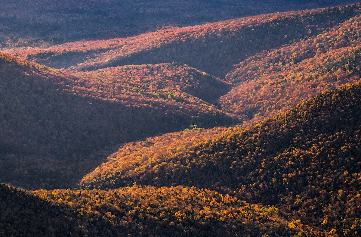
I had different plans for an image at sunrise from atop NH's Franconia Ridge this fall, but things didn't turn out like I had hoped.  Clouds cleared over night and the alpine foliage I was hoping for as a FG didn't pan out - way past its peak.  So, I zoomed in for a tight view of the ravines in the Pemigewasset Wilderness as the sun grazed the trees that were near peak in the valley.

This is the type of images that has looked crunchy in the past on upload, so I'd be interested to see if anyone feels it is over sharpened.  On my monitor it look fine.

Comments

9 comments
Comment posted by Harley Goldman on November 27, 2017 at 9:36 PM
Love the layering, lines and colors. No suggestions here, looks great to me. 
Registered on November 19, 2003, 586 Posts, 11271 Comments
Comment posted by Dan Kearl on November 27, 2017 at 10:01 PM
I like the "dune" look a lot, very nice curves..
I might try a tad more contrast to the upper slopes to pop them just a tad more for me.
Registered on September 2, 2013, 209 Posts, 1514 Comments
Comment posted by Anil Rao on November 28, 2017 at 5:41 AM
Lots to love about this image. The light especially as it shows off those gentle curves in the hills. And, some very nice color to go with it.
Registered on November 15, 2003, 234 Posts, 4923 Comments
Comment posted by Mark Seaver on November 28, 2017 at 11:20 AM
The colorful zig zag of the ridges fading into the distance looks great, Harry.  A fine "switch of plans".
Registered on January 23, 2011, 1103 Posts, 17270 Comments
Comment posted by Dave Dillemuth on November 28, 2017 at 11:31 AM
Very nicely composed, Harry. The zig-zag of the land contours add some great depth and visual interest. I think the shadows are opened up just enough to provide detail but still retaining contrast. Processing looks good to me.
Registered on December 10, 2015, 104 Posts, 1112 Comments
Comment posted by Harry Lichtman on November 28, 2017 at 2:35 PM
Click Image for Larger View
Thanks for the observations.  I boosted the contrast in the upper shadow areas that looked a little hazy per Dan's suggestion, and added a little vibrance to those areas as well.

Thanks!
Registered on September 17, 2010, 304 Posts, 3507 Comments
Comment posted by Doug Koepsel on November 28, 2017 at 3:10 PM
In comparing the two side by side, I think the darker shadows of the repost are better and give a little better depth to the image.  Nice intersecting diagonals of color in your image.
Registered on April 1, 2010, 196 Posts, 1592 Comments
Comment posted by gary phillips on November 29, 2017 at 2:03 AM
My kind if image, Harry.  I really like it.  No sky, no problem for me.  Excellent.
Registered on October 24, 2013, 185 Posts, 4136 Comments
Comment posted by Lon Overacker on November 29, 2017 at 2:42 PM
Harry,

By definition, photography is all about light.  To make it artistic, we add the choices of design, composition, etc.  You've done a masterful job with the light and shadow in designing this image by your isolation and selection of the elements.  This is a wonderful image.

I must say though, that the repost is even better! Great job making some adjustments. The color, contrast and even saturation look terrific.

Love this image.  Oh, sharpening looking great too!

Lon
Registered on November 24, 2006, 521 Posts, 19147 Comments