Nature Photographers Network
This is the preserved archive of the original Nature Photographers Network. The community continues at naturephotographers.network.
Twilight's Embrace + Repost
‹ PreviousLandscape GalleryNext ›

Twilight's Embrace + Repost

by Dave Dillemuth

Gallery: LandscapePosted November 26, 20174,451 views16 comments
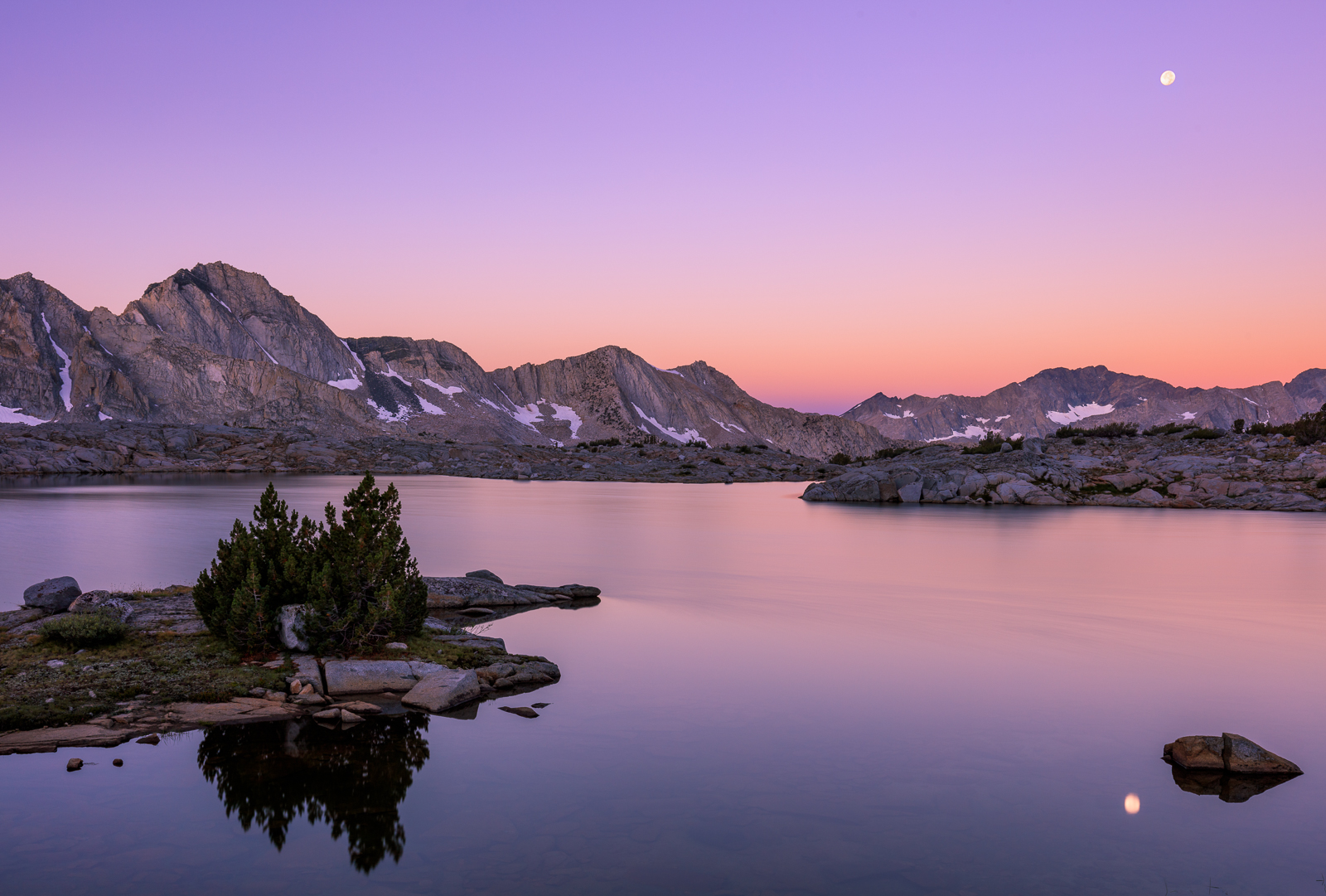
Twilight glow illuminates an unnamed lake in the Sierra backcountry. I utilized a 6 stop ND to smooth the water and a .75 GND to manage the dynamic range. Appreciate any comments, critiques or suggestions.

5DSR, 16-35 f/4 IS L @ 35mm

Comments

16 comments
Comment posted by Dan Kearl on November 26, 2017 at 2:06 PM
Love the water and the comp. I think the moon reflection is a bit distracting and I could see cloning it out.
Registered on September 2, 2013, 209 Posts, 1514 Comments
Comment posted by Harley Goldman on November 26, 2017 at 2:09 PM
Beautiful colors and tranquil scene. My first thought agrees with Dan's on the reflected moon. I find it to be an eye magnet in the image. Otherwise, very sweet high country peace and quiet. 
Registered on November 19, 2003, 586 Posts, 11271 Comments
Comment posted by Lon Overacker on November 26, 2017 at 2:40 PM
Dave,

I guess it's still possible to make photographs after the sun goes down... might not have recognized this as yours... enlightened

Indeed tranquil as Harley commented. No great drama here, but still just as beautiful as your late afternoon images with great light and clouds.

This works beautifully as presented - I mean how often does one get the chance to watch a moon rise over a High Sierra alpine setting?

I could entertain the thought of not having the moon reflection as well. A bit torn on that. And for that matter the boulder next to it.  What I would love to see - and I have no idea if you had the vantage point to pull it off, would be just a pano image of the range with the graduated colors of the earths shadow; with or without a moon.  But that may just be a wish.

Thanks for sharing these.  It's been way to many years since I've been in the Sierra back country.

Lon
Registered on November 24, 2006, 521 Posts, 19147 Comments
Comment posted by Harry Lichtman on November 26, 2017 at 3:00 PM
The lighting looks wonderful here.  The comp doesn't feel as unified as some of your other Sierra shots. The large area of water in the center seems where there should be some elements.  The rocks coming in from the left start to mingle with the back mnts. Intetesting elements, just not in the right places for me.
Registered on September 17, 2010, 304 Posts, 3507 Comments
Comment posted by Dave Dillemuth on November 26, 2017 at 3:12 PM
Hmmm... Here's a version with the moon and right boulder cropped out. Not sure if this is still balanced, compositionally?
Registered on December 10, 2015, 104 Posts, 1112 Comments
Comment posted by Lon Overacker on November 26, 2017 at 3:33 PM
Hmmmm, is right. ;-)  Seriously though, this version is still about tranquility - perhaps even more so. Color is emphasized more since the eye doesn't have to contend with the moon.  I think the color and smoothness in the open was is enough interest and I think balances out enough. Of course makes me want that pano even more. angel

Ultimately, you'll probably be happiest with your original - after all that's what counts.

Thanks for taking the time on the repost. I think it works beautifully too.

Lon
Registered on November 24, 2006, 521 Posts, 19147 Comments
Comment posted by Harley Goldman on November 26, 2017 at 3:37 PM
I would like the middle of the two, rock back and no moon. But that is me and many may prefer the moon. Nice image any which way you slice (or clone) it. 
Registered on November 19, 2003, 586 Posts, 11271 Comments
Comment posted by Igor Doncov on November 26, 2017 at 3:42 PM
To be honest, Dave, I think the repost is stronger compositionally than the original. I had difficulty with the promontory and the island at opposite ends of the canvas with a lot of space in between.

For me the best part of this image is the lighting and the dawn colors. I really like that. And you seem to have the skill to always show those distant mountains at their best. They always have the right amount of contrast to glow a bit yet look so real. They're more real than real.
Registered on November 22, 2014, 189 Posts, 2733 Comments
Comment posted by Dan Kearl on November 26, 2017 at 3:47 PM
At first look I thought you should leave the rock in, but after a few looks, I prefer the repost.
The crop off the right side makes the island more prominent and looks nice for me.
Registered on September 2, 2013, 209 Posts, 1514 Comments
Comment posted by John Neukirch on November 26, 2017 at 9:28 PM
I like the first version better. This image has to look killer printed large hanging on a wall I'll bet!
Registered on July 9, 2012, 207 Posts, 1476 Comments
Comment posted by Mark Seaver on November 27, 2017 at 6:49 PM
Love the colors throughout and the moon here, Dave.  There's a great sense of serenity.  I like the moon and the rock.
Registered on January 23, 2011, 1103 Posts, 17270 Comments
Comment posted by Anil Rao on November 28, 2017 at 5:20 AM
Such an amazing sight. The soft twilight colors, the smooth water surface and those glowing mountains in the background make for a swell composition. I think the moon is a nice touch too, acting as a good counter-point in the scene.
Registered on November 15, 2003, 234 Posts, 4923 Comments
Comment posted by Craig Moreau on November 28, 2017 at 11:57 AM
Dave, I like the original post better. The moon and reflection do grab attention, but I think that they are well-balanced with the heavier mountains and island on the left. The overall color of this is wonderful. A very peaceful scene.

I have two comments on this. First, it feels to me like it needs a slight CCW rotation. I'm guessing this is one of those cases where it's not really rotated, it just feels that way (and maybe it's just me!) The other is that the moon and its reflection don't line up. The reflection is quite a bit further left than the moon.
Registered on April 21, 2015, 64 Posts, 584 Comments
Comment posted by Doug Koepsel on November 28, 2017 at 12:09 PM
Dave, nice colors and reflection.  My preference is the original as to me the rock, peninsula, and moon create a nice triangle.
Registered on April 1, 2010, 196 Posts, 1592 Comments
Comment posted by gary phillips on November 29, 2017 at 1:25 AM
I like the original, Dave. I should qualify that by saying, I like the original without the moon reflection.  I tend to find moon reflections distracting as a general rule.  I love the expansive feel  and the pastels are to die for.  Excellent.
Registered on October 24, 2013, 185 Posts, 4136 Comments
Comment posted by Ed Cordes on November 29, 2017 at 10:13 AM
I really like the repost better without the Moon.  Very moody and tranquil.  The moon draws my eye competing for two different locations.  the repost is much more calming.  Just my $0.02
Registered on November 1, 2003, 451 Posts, 3366 Comments