Nature Photographers Network
This is the preserved archive of the original Nature Photographers Network. The community continues at naturephotographers.network.
Time to Reflect +crop
‹ PreviousLandscape GalleryNext ›

Time to Reflect +crop

by Lon Overacker

Gallery: LandscapePosted November 19, 20179,095 views17 comments
First, thank you so much for your thoughts on my previous image. Wide variety of responses and reactions showing how much we all differ in our vision, experiences and perceptions.  Cool stuff.

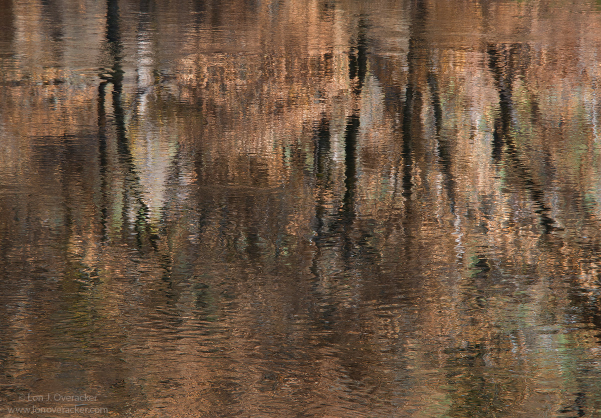
Lame title I know.  Thought I would mix these up a little bit and post this one - although it happens to be next chronologically.  This was taken less than 30 min after the previous image.  As what usually happens in the valley as the sun rises and the valley warms, the fog and mist begin to dissipate; and by now the sun is way to hot on El Cap to be including it in any frames.  So I turn to the Merced and reflections.  These are the same brown-leaved black oak trees reflecting in the river that were part of the previous image.

I'm curious as to your thoughts on this one.  I'm a bit unsure about thinking there isn't really something, or enough to keep one interested or engaged for very long.  As always, your honest comments, critiques and suggestions welcome.

Lon 

Comments

17 comments
Comment posted by Silvia Richter on November 19, 2017 at 3:31 PM
Lon, I can imagine it was hard to resist capturing this picture as presented by nature. There are enough focal points to keep my attention. I just think about a different framing, as the main elements appear a bit weighted to the right in my opinion. Maybe cropping from the left closer to the darker trunks would make for a better balance. Just a thought. I understand it is difficult to sacrifice a single pixel of this amazing color palette.

Silvia
Registered on February 27, 2011, 18 Posts, 167 Comments
Comment posted by Harley Goldman on November 19, 2017 at 4:16 PM
Real nice color and scene.  I am liking Silvia's suggestion. I might take off about 1/3 of the left side left of the first dark reflected tree, if that makes sense.  I am thinking this one is quite engaging and like it!
Registered on November 19, 2003, 586 Posts, 11271 Comments
Comment posted by Preston Birdwell on November 19, 2017 at 4:49 PM
The abstract nature of this works very well. The ripples in the river give the trunks a nice look, and the reds give this a warm look. I do agree with the previous comments regarding a crop from the left. I like this one.
--P
Registered on November 1, 2003, 471 Posts, 5188 Comments
Comment posted by Lon Overacker on November 19, 2017 at 4:58 PM
Thanks for the comments so far and the suggestion of a crop.  Interestingly I considered a slight crop off the left.  But I guess I'm not clear how much is being suggested.  The best way I can ask is: Are you talking about a crop that eliminates the first dark trunk (that spits in to two)? or just cropping closer to that dark trunk from the left edge.

Or, asked another way, are you suggesting 1/3 off the entire frame from the left? Or 1/3 the distance between the edge and the first dark trunk?

The good news is that with an abstract like this, you could do any number of crops and still have an abstract remaining.  So honestly any crop suggestion is a valid one!  ;-)

Thanks!
Registered on November 24, 2006, 521 Posts, 19147 Comments
Comment posted by Silvia Richter on November 19, 2017 at 5:37 PM
So many possibilities! I meant to keep the first dark trunk, just left from "O" from "Overacker", if that makes sense ;-)

Silvia
Registered on February 27, 2011, 18 Posts, 167 Comments
Comment posted by Lon Overacker on November 19, 2017 at 8:51 PM
Got it. Thanks for the clarification Silvia and Harley too.  Here's a repost.  I also came up from the bottom a little as well to help keep a similar format ratio.  Also ended up cloning a little where the black spot was.

Small and subtle changes, but an effective crop, I think.  thanks for the suggestion!

Lon
Registered on November 24, 2006, 521 Posts, 19147 Comments
Comment posted by Kathy Barnhart on November 19, 2017 at 10:27 PM
Lon,
This is really gorgeous and I prefer the cropped version. The colors are so much of what I saw in Yosemite this fall, just a pale hint of rust. The greens mixed in make this a very appealing scene. I might even try bumping them up a bit, along with the blues, but ever so subtly. The softness, almost pastels, in contrast with the dark trunks is what appeals to me. Just lovely.
Registered on November 11, 2011, 404 Posts, 1639 Comments
Comment posted by Vance Gese on November 19, 2017 at 11:49 PM
Exquisite image, Lon.  As much as I liked the original post, the repost with the cropping makes for a much stronger image, in my opinion, with the design of the tree trunks a bit bolder amongst the wonderful splash of color.  I could see pushing the color a little but that is purely a personal preference.  Outstanding seeing as usual and another superb image.
Registered on November 13, 2008, 298 Posts, 6629 Comments
Comment posted by Jim Erhardt on November 20, 2017 at 4:03 AM
I'll be the contrarian and say I like the original better.  IMO, the ripples on the surface of the water add "fine texture" to the original, where that is somewhat lost on the cropped version. Also, I like the reflection in the ULC, which gets cut in the cropped version. I just don't think there's anything in the original composition that is worth losing.

In any case, I wouldn't kick either out of my portfolio
.  enlightened

 
Registered on November 1, 2003, 245 Posts, 2421 Comments
Comment posted by Balan Vinod on November 20, 2017 at 4:05 AM
Lon ...very well seen, and love the fine art in here. While silvias suggestion is good ..i like this as is too. very well seen

Balan Vinod
Registered on March 20, 2006, 889 Posts, 2312 Comments
Comment posted by Igor Doncov on November 20, 2017 at 5:01 AM
I like them both. I think the original may be a tad better overall. Well no, not really. They both have their strong points. I can see why one would like one or the other.
Registered on November 22, 2014, 189 Posts, 2733 Comments
Comment posted by Harley Goldman on November 20, 2017 at 7:46 AM
The crop works for me. Nothing wrong with the original, but I prefer the tighter composition. 
Registered on November 19, 2003, 586 Posts, 11271 Comments
Comment posted by Norma Tareila Matl on November 20, 2017 at 8:55 AM
Lon, nice to look at both versions.  If I saw either framed and hung on a wall I would walk over to look closer, they call my visual attention. Now I have to look at the previous image. Nice work!
Registered on October 27, 2016, 229 Posts, 393 Comments
Comment posted by Bill Fach on November 20, 2017 at 9:43 AM
Lon: The crop looks good to me. Beautiful scene superbly rendered.>=))>
Registered on November 1, 2003, 1805 Posts, 26981 Comments
Comment posted by Ed Lowe on November 21, 2017 at 11:17 AM
I think you nailed it with the repost, Lon. The slightly tighter crop places even more of a focus on the abstractness of the scene. I think this is a very engaging image with the earth tones and the ripples in the water have created some wonderful pockets of color and textures. Great eye to spot this one.

Ed
Registered on February 7, 2004, 414 Posts, 7115 Comments
Comment posted by Anil Rao on November 25, 2017 at 1:46 PM
An interesting and mysterious image Lon. Really captures my interest. Photos like this one stir the mind and I have to say I enjoy the process of taking it all in. 

Look forward to seeing more of your new work.
Registered on November 15, 2003, 234 Posts, 4923 Comments
Comment posted by Marylynne Diggs on November 25, 2017 at 1:59 PM
Wonderfully impressionistic image, Lon.  The crop works!
ML
Registered on December 14, 2010, 122 Posts, 1034 Comments