Gallery: LandscapePosted November 15, 201710,584 views11 comments
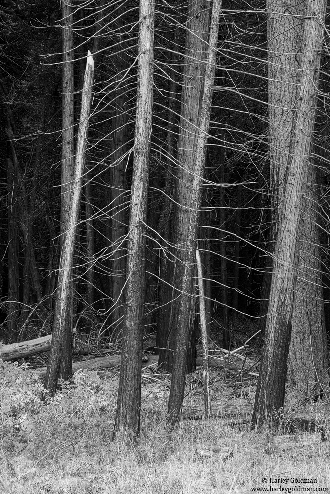
This is another from Yosemite valley while hanging out with Lon and Kyle. At least it is not another bark close-up (although I may post one more of those before I am done).
D810, 70-200mm
Comments
11 comments
Comment posted by Bill Chambers on November 15, 2017 at 1:23 PM
Fantastic Harley. This is perfect for B&W. Love the sharp details and the lovely tones. I think I would rather see this more centered however as the blackness on the left attracts my eye and the tightness on the right does the same. If there were equal doses on blackness that would be great, but the scene may not have allowed that, of course. Either way, an attractive scene and great processing.
Registered on April 10, 2005, 753 Posts, 21216 Comments
Comment posted by Preston Birdwell on November 15, 2017 at 2:29 PM
Beautiful tones and textures, Harley. I agree with Bill's comment, but cropping the dark area does not work well. How about experimenting with bringing up the detail in the very dark areas? I love the leaning trees.
--P
Registered on November 1, 2003, 471 Posts, 5188 Comments
Comment posted by Ian Wolfenden on November 15, 2017 at 3:25 PM
I like the lattice work effect of the branches, Harley, and the hints of the distant trees deep in the forest. Excellent tonal range too.
Registered on May 18, 2007, 1108 Posts, 7647 Comments
Comment posted by Lon Overacker on November 15, 2017 at 3:54 PM
Harley,
Great and obvious choice with the b&w. Nice balance of tones with the lights of the grass, mid tones of the trunks and the darkness of the bg.
I can see what Bill is seeing, although I agree with Preston about not cropping. The smaller trunks in the left half receed front to back in a diagonal leading to the darker forest in the bg. I like the tone/detail back there as presented.
My only small nit is the bright snapped off trunk; a definite eye magnet for me. I'm torn though. On the one hand, it could be seen as a focal point and part of the story of the forest. But could also be a distraction. Just an observation.
Oh, did you know there was a CW rotation in the front set of trees? And the ones in back are straight? Not sure how you're going fix that. Just razzin' ya. It's those leaners that add some dynamics to this and takes it beyond the static.
Lon
Registered on November 24, 2006, 521 Posts, 19147 Comments
Comment posted by gary phillips on November 15, 2017 at 8:54 PM
I can see you had your inner John Sexton working here. I love this one Harley. The dark area on the left, to my eye, works fine as the image progresses right to left. I might burn the small tree (center right) a bit, but that's a very small nit.
Registered on October 24, 2013, 185 Posts, 4136 Comments
Comment posted by Dave Hutchison on November 15, 2017 at 9:13 PM
Hi Harley, I would suggest painting in more contrast in the foreground grass. And agree the black space to the left can be a bit distracting. Overall I like the lines and a great choice for B&W.
Registered on November 10, 2017, 3 Posts, 22 Comments
Comment posted by Igor Doncov on November 15, 2017 at 10:16 PM
I agree with Dave about the fg grass. If you could burn it in and add contrast it would help a lot. I'm not sure how easy that is because the grasses and bushes overlap the trees.
Registered on November 22, 2014, 189 Posts, 2733 Comments
Comment posted by Dave Dillemuth on November 16, 2017 at 2:01 PM
Excellent one, Harley. The repeating trunks and radiating branches make for strong BW subject matter. I like Preston's suggestion to try to lift the shadows on the left side as I also don't think a crop works.
Registered on December 10, 2015, 104 Posts, 1112 Comments
Comment posted by Harry Lichtman on November 16, 2017 at 4:40 PM
Love the simplicity and stark lines in this. Even without the ground it might make a fine abstract.
Registered on September 17, 2010, 304 Posts, 3507 Comments
Comment posted by Wayne Jones on November 16, 2017 at 6:06 PM
The contrasts, patterns and textures make this an excellent choice for B&W. I find myself wishing there were just a bit more to see on the right side, to balance the darkness on the left. Also, that darkness on the left seems to accentuate the broken tree a lot, making an otherwise interesting break in the patters kind of distracting. In fact, it drew my eye so quickly that my first thought was "the beaver feeding up there is a good indication of how deep the snow was."
Registered on April 18, 2007, 953 Posts, 6435 Comments
Comment posted by Anil Rao on November 25, 2017 at 1:36 PM
This is a really strong image Harley. I love the tonality, the composition and of course those leaning trees.
Registered on November 15, 2003, 234 Posts, 4923 Comments


Comments
11 comments--P
Great and obvious choice with the b&w. Nice balance of tones with the lights of the grass, mid tones of the trunks and the darkness of the bg.
I can see what Bill is seeing, although I agree with Preston about not cropping. The smaller trunks in the left half receed front to back in a diagonal leading to the darker forest in the bg. I like the tone/detail back there as presented.
My only small nit is the bright snapped off trunk; a definite eye magnet for me. I'm torn though. On the one hand, it could be seen as a focal point and part of the story of the forest. But could also be a distraction. Just an observation.
Oh, did you know there was a CW rotation in the front set of trees? And the ones in back are straight? Not sure how you're going fix that.
Lon