Nature Photographers Network
This is the preserved archive of the original Nature Photographers Network. The community continues at naturephotographers.network.
Reclining Neighbors +2
‹ PreviousLandscape GalleryNext ›

Reclining Neighbors +2

by Igor Doncov

Gallery: LandscapePosted August 26, 201710,516 views12 comments
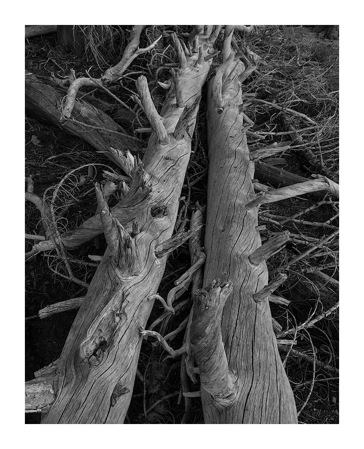
The shoreline of Sparks Lake is littered with fallen trees. Usually I step around them while prowling the shoreline for good lake compositions. In this case I turned my back to the lake and started to examine these logs. They seemed like perfect subjects for B&W so I decided to do some experimentation. I've shown this one to some of my friends and they liked it so I decided to post here to see your reaction.

I used Silver Efex Pro 2 for some processing and TK actions for resizing/sharpening.

Comments

12 comments
Comment posted by Bill Chambers on August 26, 2017 at 8:41 PM
I love this Igor.  Beautiful tones!  I'm not quite sure about the composition though.  I think in this particular case, a straight on composition might be a little better; would love to see one if you have it.  Either way, it's gorgeous.
 
Registered on April 10, 2005, 753 Posts, 21216 Comments
Comment posted by gary phillips on August 27, 2017 at 12:31 AM
I love this Igor.  The receding perspective works very well for me  It's as if they are perfectly content to be in this proximity forever.  Wonderful tones and detail.  I'm a little on the fence about the branch that has joined this couple.  For some reason, when I roll a crop from the top to just below the log and shadow top left, the impact of the branch lessens.  I'm intrigued by this image, nice work.
Registered on October 24, 2013, 185 Posts, 4136 Comments
Comment posted by Preston Birdwell on August 27, 2017 at 12:18 PM
I like the two large trees, but the composition feels a little busy to me. You might consider burning some of the branches on the left and on the right so as to accentuate the two main trees. The tones in the image look good to me.
--P
Registered on November 1, 2003, 471 Posts, 5188 Comments
Comment posted by Lon Overacker on August 27, 2017 at 12:45 PM
Igor,

Excellent!  What a great find and find the "reclining" perspective to work beautifully and effectively here. Great choice in the b&w as well; I find that b&w works well in simplifying a scene and often reducing extraneous clutter, as would be the smaller branches, twigs and surrounding forest debris.

These two are paired together beautifully - can I say a match made in heaven?  angel  The only suggestion I have would be to pull out even more emphasis on the pair of fallen beauties.  I think you could increase the tonal value/luminosity of the main trees while letting the rest stay or go darker.  I'm not thinking of a big swing, but a slightly measured tweak.  I do think the tonal values are good as presented, you just might experiment with a lighter presentation of the main trunks.

Great eye on this one.

Lon

 
Registered on November 24, 2006, 521 Posts, 19147 Comments
Comment posted by Doug Koepsel on August 27, 2017 at 1:10 PM
Igor, this looks good on the darker background.  My thoughts are just a few more points of brightness and contrast, And maybe just a small crop off the top as it looks a little busy up there. I like your scene with the two logs.
Registered on April 1, 2010, 196 Posts, 1592 Comments
Comment posted by Igor Doncov on August 27, 2017 at 2:11 PM
Here is the original image as shot. I had never intended to use the lake but because of the format of the image I had to include it in order to get all that I wanted in the image. I also saw this as a b&w from the start but now I'm not sure that the original color needed to be removed to be effective.
Registered on November 22, 2014, 189 Posts, 2733 Comments
Comment posted by Igor Doncov on August 27, 2017 at 2:52 PM
Thank you for your suggestions. They were useful. The observation that this looked better on a black background was interesting because I knew as soon as I added the white frame that it was a mistake. It made everything else look dark. So I'm adding an offwhite frame. The contrast issue I had played around with and chose the lower contrast to keep more detail in the highlights. Again, I think the white frame caused one to want more contrast. I made to the change to a higher contrast while keeping the shadows fairly dark.

I'm also not too happy with the title. To me the subject is more abstract and is really about comfort and balance.

Years ago I had decided that this was one of my favorite type of compositions, a composition that at one time looks like an abstract and at another time looks like a very recognizable subject with all of the emotional ties to it. I remember looking at those old calendars of the Antelope Slot Canyon images and decided that that's what made them special. But when they were shot completely out of context I liked them less. 
Registered on November 22, 2014, 189 Posts, 2733 Comments
Comment posted by scott lanz on August 27, 2017 at 6:28 PM
Well seen, processed and presented here, Igor. What you saw in and then pulled out of the original scene to produce this is remarkable. 
Registered on November 14, 2003, 840 Posts, 12902 Comments
Comment posted by Paul Breitkreuz on August 28, 2017 at 11:09 AM
Igor, I really like the first post here along with the original color version too, although cropping out the lake was a very positive move. Very nicely seen and photographed, as well as post processing.....laugh
Registered on February 25, 2006, 525 Posts, 8448 Comments
Comment posted by Nick Bristol on August 29, 2017 at 4:45 PM
This is excellent! All 3 of these look great to me and I probably like the last one best. Great job setting up the composition and then cropping out the water. The b&w processing is wonderful and I also like the color minus the water of course.  devil

Nick Bristol
Lone Rock, WI.
Registered on February 1, 2004, 752 Posts, 14140 Comments
Comment posted by John Williams on August 29, 2017 at 11:43 PM
Most excellent Igor; good eye! I prefer the original, but it is fun to see the one with the water to realize what you were starting with.
Registered on September 6, 2007, 221 Posts, 5985 Comments
Comment posted by Anil Rao on September 4, 2017 at 12:51 PM
Hi Igor,

This is a captivating photo on many levels. I am especially drawn to the choice of framing, which offers both visual symmetry and a nice sense  of mystery. While the full capture has obvious location context, your cropped version has eliminated them. Subtracting all the color adds to that effect. The end result is a graceful scene that poses more questions than providing answers. And, this is precisely why I am drawn to this photograph.
Registered on November 15, 2003, 234 Posts, 4923 Comments