Nature Photographers Network
This is the preserved archive of the original Nature Photographers Network. The community continues at naturephotographers.network.
Sky Scrapers + RPs
‹ PreviousLandscape GalleryNext ›

Sky Scrapers + RPs

by Preston Birdwell

Gallery: LandscapePosted August 26, 2017203 views11 comments
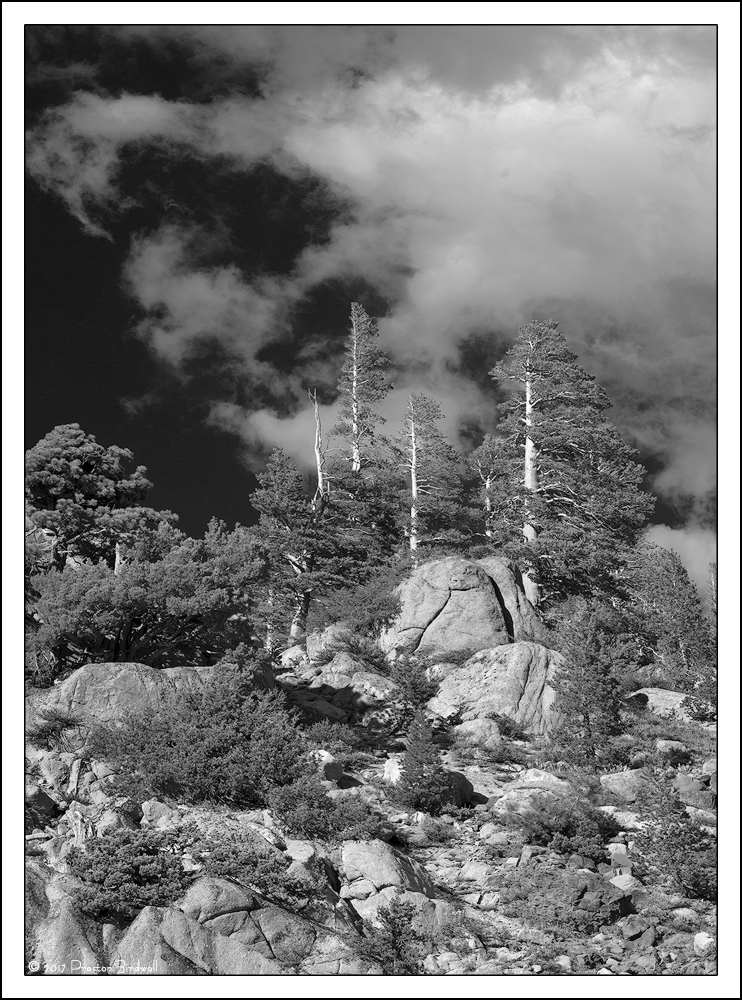
Lodgepole Pine and Western Juniper west of Sonora Pass.

Late afternoon sunlight and some nice clouds made for what I think is a nice scene. While I like the color version, I thought I would convert to B&W.

Nikon D-7100
Nikkor 18-140mm @ 65mm
f-11 @ 1/125, ISO 100
B&W adjustment layer, TK's masks, some burning in on the boulders
Cropped a bit from the top.

Please see the large version. Thanks!

Your thoughts are always appreciated. cool
--P

Comments

11 comments
Comment posted by Youssef Ismail on August 26, 2017 at 6:03 PM
Preston,
Those are my kind of skyscrapers!  Love the dark sky and the stark brightness of the tree trunks.  Nice.
Registered on November 1, 2003, 474 Posts, 5555 Comments
Comment posted by gary phillips on August 27, 2017 at 12:18 AM
Makes a beautiful b/w image, Preston.  I love scenes like this, but they are not always easy to convey the feeling of being there.  You have managed that very nicely.  My only suggestion would be to add a bit more contrast, not alot, just a little. Perhaps even darkening the trees and foliage to gain some separation from boulders and hillside. Really nice as is.
Registered on October 24, 2013, 185 Posts, 4136 Comments
Comment posted by Preston Birdwell on August 27, 2017 at 11:26 AM
Gary, thanks for your suggestion! Here is a version with the contrast bumped a bit.

I would appreciate any additional thoughts.
--P
Registered on November 1, 2003, 471 Posts, 5188 Comments
Comment posted by Lon Overacker on August 27, 2017 at 12:39 PM
Preston,

It's amazing how folks can interpret a scene differently when they are viewing the scene side by side!  I recall you mentioning the trees and of course we were cloud watching, but I didn't realize how zoomed in you were.  I have a much wider view, which turned in to a very ordinary mountain landscape, which I won't be processing... ;-(

So kudos on this capture, I like this very much!  B&W is a fitting choice here.  And before I saw Gary's comments or saw your repost, I was having similar thoughts.  The repost is terrific! 

I have just one additional suggestion and a small nit. First the nitpick.  There's a bright rock right in the center of the lower third of the frame. It's not an immediate eye magnet, but once spotted, my eye keeps returning there.  I think maybe a %20 Harley clone might help there. 

The other small suggestion would be to continue working the white values in the clouds.  You could take this a little further I think - more towards an AA sky? But honestly, it's a personal choice at the point.  I think what you've presented in the repost works beautifully.

Lon
Registered on November 24, 2006, 521 Posts, 19147 Comments
Comment posted by Igor Doncov on August 27, 2017 at 1:12 PM
I think that the repost is noticeably better than the original so that was a good suggestion. For me the sky feels too dark and got darker in the repost. I'm just wondering if that type of treatment of the sky is always a good idea. I don't find this to be a very dramatic composition and so a dramatic sky may not be required? Just a thought. I also agree that further tone separation in the clouds could give this more clout because there are large sections of clouds that are fairly monotoned.

I often have a hard time commenting on your images because you include far more in your compositions than I would. In this case the image is about the large boulders in right center, the pine trees above and the clouds beyond that. The inclusion of the rest diminishes the message. I would crop out about 1/4 of the left and a tad off the top and bottom. 
Registered on November 22, 2014, 189 Posts, 2733 Comments
Comment posted by Preston Birdwell on August 27, 2017 at 1:50 PM
Thanks for your comments everyone!

Lon: Your points are well taken about that rock and the tones in the sky.

Igor: I originally thought of cropping the left side, but doing so would have removed that nice downward-curving cloud which helps bring one's eye back toward the trees. As I mentioned in my original post, I did crop some of the clouds from the top to bring the trees further upward in the image. I do appreciate your thoughts, Igor.
--P
Registered on November 1, 2003, 471 Posts, 5188 Comments
Comment posted by scott lanz on August 27, 2017 at 6:34 PM
I like this, Preston, and I think there is interest throughout the frame, but I also agree with igor that the lodgepoll pines on the large boulders against the sky is where most of the interest and attractiveness is, at least for me. 
Registered on November 14, 2003, 840 Posts, 12902 Comments
Comment posted by Preston Birdwell on August 27, 2017 at 7:05 PM
I tweaked the contrast a bit in the clouds with a TK lights mask. I also used Harley's 15% cloning technique to add a little detail to the bright boulder that Lon mentioned. I also dodged the cloud just above the ridge on the very right side. I decided to leave frame as is.

Does anyone have any additional thoughts on this re-post? Thanks!
--P
Registered on November 1, 2003, 471 Posts, 5188 Comments
Comment posted by Paul Breitkreuz on August 28, 2017 at 11:04 AM
WOW, what post processing can do to improve things when the combination comes together. Preston, the first post was lacking on the eye grabbing tone more so then the composition. Which you've obviously tweaked into a really nicely finished product on the very last image you've updated here. The additional collective input paid off very well.
Very nice indeed with the overall post processing touches......laugh
Registered on February 25, 2006, 525 Posts, 8448 Comments
Comment posted by Eva McDermott on August 28, 2017 at 9:44 PM
Subtle differences but I like like your last post best Preston.
Registered on January 4, 2009, 1015 Posts, 13229 Comments
Comment posted by Harley Goldman on August 31, 2017 at 10:31 AM
The processing in the final version looks really good. While a solid image, it does not impact me as a PB portfolio image. 
Registered on November 19, 2003, 586 Posts, 11271 Comments