Nature Photographers Network
This is the preserved archive of the original Nature Photographers Network. The community continues at naturephotographers.network.
Droopin' Lupine +rp
‹ PreviousLandscape GalleryNext ›

Droopin' Lupine +rp

by Lon Overacker

Gallery: LandscapePosted August 26, 2017251 views10 comments
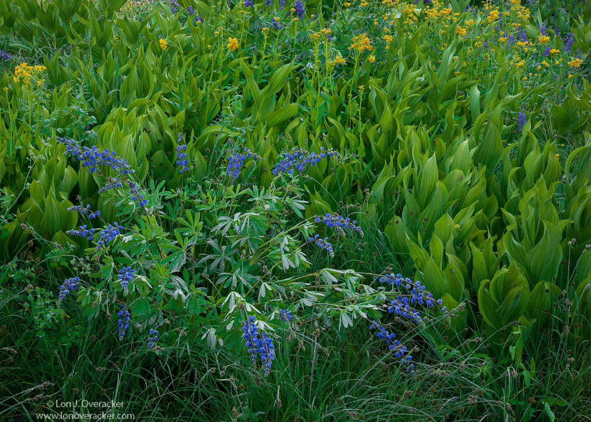
Full credit disclosure.  Preston came up with the title. ;-)  This is from the same general area of Preston's lupine/corn lily image.  After heavy, dowsing rains the night before, we came upon this little scene and Preston remarked how the lupines were drooping so much from the rainwater still weighing them down early the next morning. Hence, "droopin' lupines."  

While this could easily be considered Flora, I decided to post here because it's more of an "environmental" intimate landscape image.  I do promise though, I have another lupine image that I WILL post in Flora!

I'm curious to hear your thoughts on color and processing as well of course on composition. All comments and suggestions are of course always welcome!

This is a 3-image focus blend for detail.

Thanks!

Lon

 

Comments

10 comments
Comment posted by Ana on August 26, 2017 at 2:34 AM
Both the composition and the color/surface treatment remind me of a still life painting.  It's got that quality as if every stem had been perfectly arranged.  It's such a pleasure to look at this.
Registered on February 10, 2004, 191 Posts, 1446 Comments
Comment posted by Paul Breitkreuz on August 26, 2017 at 11:32 AM
Lon, I can't recall the last time I saw so much greenery in one frame, even though you stacked 3 collective images here.....sad

What's not to like about corn lilies or lupine scenes. Or better yet a scene with both. It did take me awhile to warm up to the a bit flattened lupine, but the understanding of the rain along with seeing the wet areas made it work for me just fine. Heck, even the dash of yellow (milk weed?), plant adds another contrasting colorful member here. Nice work........laugh

BTW: you placed a " ? " mark next to the term "supermoon" in the comment you left on my recent posted image from J-tree. I'd photographed that scene on 11-14-16 as it was advertised at the time to be the largest moon to be seen here on planet earth since 1948. Obviously the moon did not grow, just a proximity thing overall.....indecision
Registered on February 25, 2006, 525 Posts, 8448 Comments
Comment posted by Igor Doncov on August 26, 2017 at 4:02 PM
The greens are beautifully rendered but what I find interesting is how the blues stand out from the greens. I've shot these rascals and was never satisfied with my processing never reached a satisfactory level - nothing as good as this. It looks like a combination of saturation and luminosity that resulted in the separation. 

Personally I would prefer this without the yellow flowers. Somewhere this last year I read that the color yellow is the most dominating of colors and the viewer will be drawn to it wherever it lies. In this case it's pulling us to the edge of the frame. Although I have to say that due to the processing of the lupines the yellow is less dominant than it might be otherwise. The choice at this point is to drop their intensity or crop them out. I think they would have been fine dispersed around the lupine here or there. I feel the image is primarily about the lupine bush and the corn lillies on the right playing a supportive role. 

There is a wonderful sense of movement here as the lupines have a starburst effect and the corn lillies move left across the canvas like green flames that encircle the flowers.  
Registered on November 22, 2014, 189 Posts, 2733 Comments
Comment posted by Igor Hoveijn on August 26, 2017 at 4:42 PM
Great quality of light and perfect sharpness. I like this combination of blue and green. Comp-wise I would say that the lupines are well placed and the area they fill in relation to the rest of the frame is in a pleasant proportion. But agreeing with Igor D, I could do without the yellow flowers. For me they are a bit distracting making the image almost too colourful. But they were simply growing there and just cropping them out would imho spoil the proportions of the image. 
Registered on November 2, 2015, 18 Posts, 192 Comments
Comment posted by scott lanz on August 26, 2017 at 5:10 PM
Very nice image, Lon. I like the placement of the droopin lupine. The colors and detail are excellent, though both show much better in the larger version. The previous comments about the yellow flowers are interesting. As composed, I like the yellow flowers. Makes a nice medium floral landscape. I think a cropped version (cropping top and right side) to eliminate the yellow flowers and make the image all about the droopin loopin in the corn lillies would also work well. 
Registered on November 14, 2003, 840 Posts, 12902 Comments
Comment posted by Preston Birdwell on August 26, 2017 at 6:07 PM
I think you did a fine job with this, Lon. I was at first concerned about the darker area in the lower right corner, but that is balanced by a similarly dark area on the left. The tonal values (and color) of the vegetation is excellent. You did a great job processing this.

Personally, the yellow flowers add a warm component to an otherwise 'cool' image, and I like their splash of color. Cropping them out, I think, would harm the balance of the composition. You could reduce their luminosity as an alternative.

Fine image, sir, and I should add that the large version is a must-see for all the nice detail.
--P

PS: Glad to help with the title. enlightened
Registered on November 1, 2003, 471 Posts, 5188 Comments
Comment posted by Youssef Ismail on August 26, 2017 at 6:52 PM
Hey Lon!

While the lupine are set to catch one's attention, its the waviness in the corn lilies that really appeal to my eye.  

The last couple of years have been really lean photographically for me with moving to our own house and learning how to re-live with this new responsibility seems to have taken me away from the camera, but my eye is always at work.

I know you photograph with digital now, any regrets or wishes of going back to LF?
Registered on November 1, 2003, 474 Posts, 5555 Comments
Comment posted by gary phillips on August 27, 2017 at 12:09 AM
This is a wonderful visual journey, Lon.  The collar of corn lilies around the lupines is perfect and the addition of the top layer of mixed flowers makes a very nice flow.  Love the detail and luminance throughout the scene.  Nicely done.
Registered on October 24, 2013, 185 Posts, 4136 Comments
Comment posted by Lon Overacker on August 27, 2017 at 12:24 PM
Thanks for the comments and suggestions folks!  Interesting, I hadn't really considered the yellow flowers other than to know they added color and variety to the scene. But Igor, your point is well taken.  I've tweaked the image a little bit adding more layers to address the observations.  First I used a saturation painting layer (TK's) and selectively dropped the saturation in the area of the yellow flowers. The, thanks to Preston's recent tip in another post, I added a b&w layer, set it to Luminosity blending mode, then adjusted the luminosity of the yellow. Then I did a slight selective burn of the area.  All of these were very slight adjustments and honestly I'm not sure will show the difference posting here, but comparing side by side in PS, there is a difference.

Have a look and thanks for any additional feedback.

@Youssef, glad to see you post an image as well.  Hope you're settled in now in the house and location.  As far as the missing the large format, I absolutely miss so much of it.  Just the whole process and I actually miss being able to have critical focus right on the ground glass.  Now, with the tiny viewfinder and even live view, I rely totally on auto focus.  What I don't miss is the $$$/sheet. It just got too expensive.  The good news is, as they say, it's not the camera, it's the photographer - and the passion within the photographer.  While I'm not shooting as much, I still completely enjoy capturing beautiful images and of course being out there experiencing them.  thanks for asking!

 
Registered on November 24, 2006, 521 Posts, 19147 Comments
Comment posted by Nick Bristol on August 31, 2017 at 6:57 PM
Lon, I really like this image. Great job with the comp and the large version is a real treat to view. I don't really see much of a difference (at this size) in the two but they both look fantastic to me. I love the detail, beautiful color and the wonderful feel this has. Excellent work on this! Love it!!

Nick Bristol
Lone Rock, WI.
Registered on February 1, 2004, 752 Posts, 14140 Comments