Gallery: LandscapePosted August 25, 2017444 views13 comments
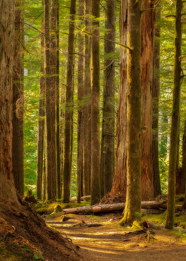
5D2, 70-200L, f16 @ 2.0, ISO 200, CPL, Tripod
Comments
13 comments
Comment posted by Preston Birdwell on August 25, 2017 at 3:16 PM
The light and composition is nice, Danny. However, this looks way to yellow to me. I suggest backing way off on yellow saturation, and darken the greens.
Here's a PS trick you can use for the greens.
Create a Black-White adjustment layer (the image will revert to grey scale)
Set the Blending Mode to 'Luminosity' (color will be restored)
In B&W layer's properties dialog, move the 'green' slider to the left to taste (this darkens the greens). You can adjust other colors as you see fit.
Give it a try and re-post, if you like.
--P
Registered on November 1, 2003, 471 Posts, 5188 Comments
Comment posted by Danny Laureys on August 25, 2017 at 7:28 PM
Changed white balance, less sat in the yellows, darken greens more.
Registered on January 5, 2008, 590 Posts, 1261 Comments
Comment posted by Lon Overacker on August 26, 2017 at 12:16 AM
Danny,
A beautiful redwood forest scenic. I was just in the redwoods 2 days ago and so this image feels fresh for me.
I like the "glow" of the original and I like the sense of the viewer being able to walk in to the scene, yet I don't see an actual path or trail.
After seeing the repost, I agree with Preston's assessment and I think you did a great job with those suggestions. I'm not sure what you did with your original processing, but I think the color balance of the repost, with the glowy-ness of the original would be a great combination. You're real close on this one; a beautiful redwood scenic.
The only other minor suggestion would be to deal with the light blue rectangular shape in the upper left area hugging the second to the left trunk. Not a big deal, but thought I would mention.
Lon
Registered on November 24, 2006, 521 Posts, 19147 Comments
Comment posted by Igor Doncov on August 26, 2017 at 4:21 PM
I remember looking at this a few days ago and also thinking it may look too yellow. But IMO the yellow works for the trunks but less so for the foliage. Overall I like the original more than the repost but that seems to be due to the added contrast that has been introduced. I liked the way the shadows were treated in the original and would suggest that they remain with that lighter tonal value. As Lon states - you're real close on this one.
Registered on November 22, 2014, 189 Posts, 2733 Comments
Comment posted by Igor Hoveijn on August 26, 2017 at 4:22 PM
I like the arrangement of the trees. The open space (path?) bending away around the trees on the left makes one wonder what is behind. It is where the light is coming from. This adds to the feeling of mystery caused by the golden light. If it is meant to look natural then the image is probably too yellow. But if you mean to convey a feeling of mystery or 'only' the impression it made upon you while taking the photo I would not change the colours. So I prefer the original. But I do agree with Lon Overacker about the blueish rectangular shape.
Registered on November 2, 2015, 18 Posts, 192 Comments
Comment posted by Marylynne Diggs on August 26, 2017 at 4:50 PM
What a great, glamour glow effect here, Danny. This is wonderfully composed. I like the light spilling through the trees. I would suggest maybe cloning/healing out the bit of blue sky hugging the left tree cluster. I love the vertical crop here. It accentuates the sense of height!
ML
Registered on December 14, 2010, 122 Posts, 1034 Comments
Comment posted by Preston Birdwell on August 26, 2017 at 6:16 PM
I prefer the re-post, Danny. You did a good job on it. I do agree with Lon's comment: "...the color balance of the repost, with the glowy-ness of the original would be a great combination". I think this would make a lovely print, and is certainly worthy of fine tuning.
--P
Registered on November 1, 2003, 471 Posts, 5188 Comments
Comment posted by Youssef Ismail on August 26, 2017 at 6:48 PM
Nice composition. I like the light in the original but the color of the repost. If you could combine the two this would really sing.
Registered on November 1, 2003, 474 Posts, 5555 Comments
Comment posted by gary phillips on August 26, 2017 at 11:59 PM
Beautiful image, Danny. Love the way the scene invites you to enter and enjoy. The suggestions are right on and wil make a wonderful print for sure.
Registered on October 24, 2013, 185 Posts, 4136 Comments
Comment posted by Daniel Rappaport on August 28, 2017 at 6:22 PM
Beautiful light. I'd stick with the original
Registered on September 9, 2009, 294 Posts, 2006 Comments
Comment posted by Danny Laureys on August 28, 2017 at 8:28 PM
I'm sticking with original one, that's how I imagined it, yes it's more yellow but I like the mood it gives out, thanks everyone for the input, really appreciate it.
Registered on January 5, 2008, 590 Posts, 1261 Comments
Comment posted by John Williams on August 29, 2017 at 11:44 PM
Agreed. The original is very nice Danny; it feels like a very late walk in the woods at the end of the day.
Registered on September 6, 2007, 221 Posts, 5985 Comments
Comment posted by Ed Cordes on September 11, 2017 at 8:23 AM
Very nice image. I like the warm colors tone.Congrats on the WP.
Registered on November 1, 2003, 451 Posts, 3366 Comments

Comments
13 commentsHere's a PS trick you can use for the greens.
- Create a Black-White adjustment layer (the image will revert to grey scale)
- Set the Blending Mode to 'Luminosity' (color will be restored)
- In B&W layer's properties dialog, move the 'green' slider to the left to taste (this darkens the greens). You can adjust other colors as you see fit.
Give it a try and re-post, if you like.--P
A beautiful redwood forest scenic. I was just in the redwoods 2 days ago and so this image feels fresh for me.
I like the "glow" of the original and I like the sense of the viewer being able to walk in to the scene, yet I don't see an actual path or trail.
After seeing the repost, I agree with Preston's assessment and I think you did a great job with those suggestions. I'm not sure what you did with your original processing, but I think the color balance of the repost, with the glowy-ness of the original would be a great combination. You're real close on this one; a beautiful redwood scenic.
The only other minor suggestion would be to deal with the light blue rectangular shape in the upper left area hugging the second to the left trunk. Not a big deal, but thought I would mention.
Lon
ML
--P