Nature Photographers Network
This is the preserved archive of the original Nature Photographers Network. The community continues at naturephotographers.network.
Sand Migration
‹ PreviousLandscape GalleryNext ›

Sand Migration

by gary phillips

Gallery: LandscapePosted August 8, 20176,691 views12 comments
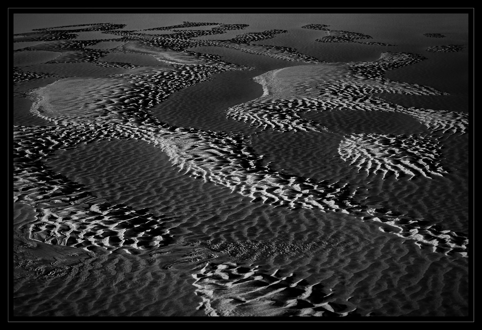
I have spent a lot of time working and reworking this image.  I guess the larger question is "Does it work?".  Sometimes you just can't get away from an image, even if you should.sad.  

iso 200, 70-200 @ 70mm, f/11, 1/160s, 

Your comments and suggestions are greatly appreciated.

Probably better large.

Comments

12 comments
Comment posted by Dan Kearl on August 8, 2017 at 1:48 AM
Best yet...
Great eye.
Registered on September 2, 2013, 209 Posts, 1514 Comments
Comment posted by scott lanz on August 8, 2017 at 7:42 AM
Fine image and a great series, Gary. I like seeing the bigger landscape view as part of the same series, including being able to see out to the open water. This one does not have quite the same visual impact for me as the first two, maybe because it is less abstract, but I like it especially as part of the series. 
Registered on November 14, 2003, 840 Posts, 12902 Comments
Comment posted by Mark Seaver on August 8, 2017 at 10:57 AM
The strong contrast in the waves of sand work very well here, Gary.  I also like how the scattered bright areas are distributed.  I'm having mixed feelings about the open water at the top.  Sometimes I like the context that it adds, other times I think I like the more abstract view with it cropped...  Regardless of that choice, it's a neat look at your "vision".
Registered on January 23, 2011, 1103 Posts, 17270 Comments
Comment posted by Nick Bristol on August 8, 2017 at 11:24 AM
Gary, I like this one a lot and it is right up there with your last post imo. This comp works great and I like the open area across the top edge. Really interesting shapes and patterns that I enjoy looking at. The Wisconsin River has been high all summer this year so I haven't been able to see any of these so far. After seeing your pictures it makes me want to try and photograph them again. Very nice series!

Nick Bristol
Lone Rock, WI.
Registered on February 1, 2004, 752 Posts, 14140 Comments
Comment posted by Marylynne Diggs on August 8, 2017 at 1:17 PM
This one works for me, Gary. I like the slim strip of open water, and the sand ripple shapes below seem to be flying toward it--(hence the title?) I can imagine a slight increase in contrast or perhaps just a lift of the mid-tone.  It works as part of the series, for sure.  On its own, I think so.
ML
Registered on December 14, 2010, 122 Posts, 1034 Comments
Comment posted by Igor Hoveijn on August 8, 2017 at 4:31 PM
It is almost inevitable to start comparing images of the same subject in a series, while each should be considered in its own right. This one has some strong global diagonal lines interrupted by the wild shapes created by the water level. The open water on top prevents it from 'going on forever' which is something I like. Compared to the previous two images it lacks some unity. The first one of the series shows a relatively simple shape, while the little sand ridge winding through the second image creates tension. Each of them works and they certainly do work as a triple. The low light beautifully accentuates the ripples and I like the contrast between the dry ripples and the ripples under water. If I were to choose only one, it would probably be the second. But if you have more like this...
Registered on November 2, 2015, 18 Posts, 192 Comments
Comment posted by Rick Turner on August 9, 2017 at 9:28 AM
Another killer Gary. Great eye and tones.
Registered on February 18, 2012, 534 Posts, 2755 Comments
Comment posted by Marylynne Diggs on August 9, 2017 at 11:14 PM
Not sure why my posts have an ad in them.  My apologies!
ML
Registered on December 14, 2010, 122 Posts, 1034 Comments
Comment posted by Mattia Oliviero on August 11, 2017 at 4:07 AM
It works, Gary, it works. I would really like to see your three images side by side from the more detailed to the broader hanged on a wall. I was also wondering which kind of colors might be hiding behind this b&w images. Great work!

Mattia
Registered on August 24, 2016, 43 Posts, 254 Comments
Comment posted by Igor Doncov on August 11, 2017 at 6:11 PM
Interesting abstract in that it's suggestive of many thing. To me it looks a bit threatening as I see stealth with approaching alligators. Graphically speaking I don't think this image is quite as strong as the previous two. The others were more abstract and distinctive in terms of texture and shading, more 'alert'. It's been really interesting seeing these interpretations of sand erosion. I would never had seen the possibiliies.
Registered on November 22, 2014, 189 Posts, 2733 Comments
Comment posted by Paul Breitkreuz on August 13, 2017 at 12:30 PM
Gary, is this stuff crawling around out there or is it just me?......sad

This has been a wonderful series and all the processing seems uniform between the group.......another very nice one indeed......laugh
Registered on February 25, 2006, 525 Posts, 8448 Comments
Comment posted by Anil Rao on August 14, 2017 at 1:51 AM
Another winner, Gary. I love the graphic (almost abstract) nature of the B&W tones. At the same time there is sufficient context, which allows me to enjoy the location. I have to say that this is a very clever and sophisticated composition. So much going on, yet there is an unmistakable sense of simplicity. 
Registered on November 15, 2003, 234 Posts, 4923 Comments