Nature Photographers Network
This is the preserved archive of the original Nature Photographers Network. The community continues at naturephotographers.network.
Kinsman Falls + repost
‹ PreviousLandscape GalleryNext ›

Kinsman Falls + repost

by Ed Lowe

Gallery: LandscapePosted August 3, 2017170 views12 comments
Nikon D800
Nikon 17-35 @ 26 mm
f 20 @ 2.5 sec.
ISO 800
CPL
tripod & cable release
White Mountains, NH

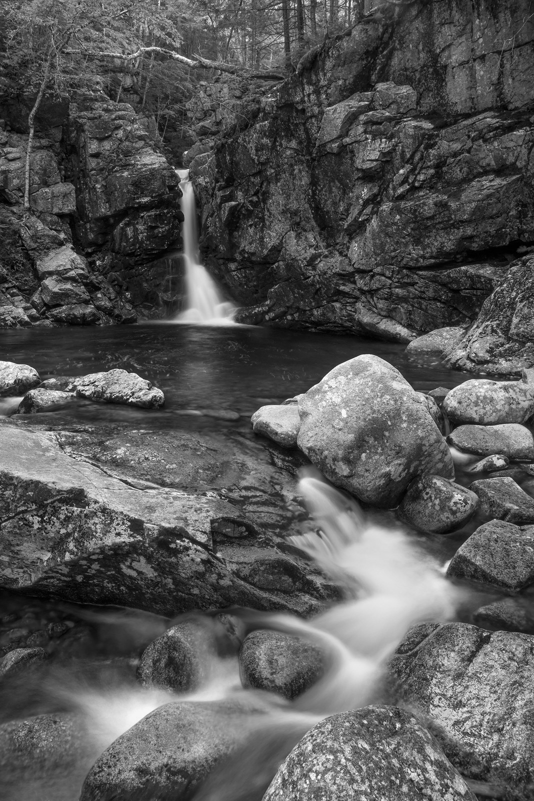
Another image from our trip to the White Mountains of NH. I decided to convert this to B&W as the scene had picked up a green cast; which I obviously did not care for; from the surrounding foliage. I played around with the color balance, but nothing looked right to me, hence the conversion.

As always thanks for taking a look and leaving a comment or suggestion.

Ed

 

Comments

12 comments
Comment posted by John Williams on August 4, 2017 at 1:03 AM
Lovely flow through this Ed; it plays well as a BW. I'm on the fence about that fallen log, but I like the depth the top of the image has so I agree with your decision to present as is.
Registered on September 6, 2007, 221 Posts, 5985 Comments
Comment posted by Paul Breitkreuz on August 4, 2017 at 5:56 AM
Ed, I can appreciate your conversion thoughts. Color cast and any shift in hues one way or another from what we saw or what "appears" natural can be a challenge to correct. Many times it's just a matter of actually seeing it ourselves when working on an image to decide how to manage the corrections. .

I like the scene with the small head end waterfall and overall flow towards us and ending at the base of our feet. Gives our eyes a direct path and understanding about your photographic intent here. Not having any issue with the fallen log at all that John mentions, but might have been more intrusive if it had been left as a color image. If a thought was to eliminate the log you could merely crop down on the scene and see how things looked. Scrolling up and down it does give a cleaner look to the scene. Although I liked seeing the upper deck space left as is giving us more insight to that area. Either way works for me......laugh
Registered on February 25, 2006, 525 Posts, 8448 Comments
Comment posted by Nick Bristol on August 4, 2017 at 8:53 AM
Ed, I like this in b&w so looks like it solved your green cast issue plus making for a very nice b&w image. The larger version looks especially nice and has great looking details and textures. This comp works very nice too. Nice job converting this!

Nick Bristol
Lone Rock, WI. 
Registered on February 1, 2004, 752 Posts, 14140 Comments
Comment posted by Richard Teller on August 4, 2017 at 2:49 PM
I like the composition of this a lot. The eye is pulled right through the image. Also the B&W conversion gives this a real orl world feeling. Very well seen and photographed. 
Registered on August 23, 2010, 1162 Posts, 6692 Comments
Comment posted by gary phillips on August 4, 2017 at 7:10 PM
Makes a beautiful b/w, Ed.  I might be inclined to crop just below the log, but that's a tough call because it works fine the way it's presented.  I love the ruggedness of this area.  Really nice work.
Registered on October 24, 2013, 185 Posts, 4136 Comments
Comment posted by Brian Schrayer on August 4, 2017 at 8:10 PM
This is a beautiful waterfall and I really like your composition overall.  The one minor nit is that in B&W the trees above the waterfall don't really have enough tonal separation and just appear a bit muddy.  I would suggest a crop just above the waterfall to more of a 4X5 aspect ration to leave out the trees altogether.  I think the trees would work in a color version, but in a B&W I would recommend cropping.  Your processing also looks good.

EDIT:  After revisiting this there is more tonal separation than I originally thought in the upper part of the frame.  However, I still think that I prefer the composition with the crop that I suggested. 
Registered on May 28, 2004, 114 Posts, 2890 Comments
Comment posted by Michael Lowe on August 5, 2017 at 2:51 PM
A fine shot, Ed. I'm with you on the B&W conversion. I liked mine in B&W as well. The fallen log doesn't bother me, but I'm wishy-washy about the trees. On the one hand, they place the falls and cliffs in their environment and give them a sense of scale. On the other hand, they do lack tonal range. Maybe some PS work would help them. devil
Registered on February 11, 2004, 777 Posts, 5252 Comments
Comment posted by scott lanz on August 6, 2017 at 10:29 PM
I like this as presented, Ed. The fallen log seems to go with the B&W, which conveys more the the rugged beauty, and I like the trees which gives this a sense of place.
Registered on November 14, 2003, 840 Posts, 12902 Comments
Comment posted by Anil Rao on August 8, 2017 at 2:20 AM
Very lovely. There is a full range of tones and the composition has a nice and graeful flow.
Registered on November 15, 2003, 234 Posts, 4923 Comments
Comment posted by Lucy VanSwearingen on August 10, 2017 at 12:27 AM
Interesting composition..I would like to throw a bit of light on the back waterfall and pool.  I think it will add more depth.
Registered on May 23, 2009, 800 Posts, 2042 Comments
Comment posted by Ed Lowe on August 10, 2017 at 2:28 PM
Thanks for your input everyone; always appreciated. Here is a repost using your suggestions. I lightened the trees to hopefully give them a little more tonal separation, cloned out the fallen tree rather than cropping and lightened the rocks around the falls to make it stand out more.

Ed
Registered on February 7, 2004, 414 Posts, 7115 Comments
Comment posted by Paul Breitkreuz on August 13, 2017 at 12:15 PM
Ed, after a revisit here the changes look good to me. Especially with the log removal.......laugh
Registered on February 25, 2006, 525 Posts, 8448 Comments