Nature Photographers Network
This is the preserved archive of the original Nature Photographers Network. The community continues at naturephotographers.network.
Sandstone Revisited #2
‹ PreviousLandscape GalleryNext ›

Sandstone Revisited #2

by Tony Kuyper

Gallery: LandscapePosted May 23, 20172,869 views11 comments
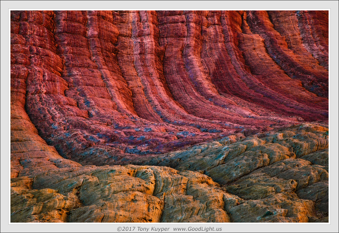
This is another image from the archive.  It's a bit misleading in terms of perspective.  What this is is an undulating sandstone surface shot with a telephoto lens and with six exposures focus-blended.  You can actually walk across this, as I recall, and the height variation is not at all what it appears to be in the image. 

The color is the remarkable thing and it's somewhat odd.  It only happens for a short time when the sun is illuminating rocks outside the frame and the sky is clear overhead.  And it's quite directional.  If you shoot this same scene from the opposite side, the colors just aren't there.  It's like there is color polarization, and you have to be aligned just right to see it.  Can't really explain it, but did enjoy the experience of seeing it.

I tried to "de-process" this a bit, but ended up coming back to this interpretation.  Images tend to have a mind of their own, and I've learned not to argue.

Comments

11 comments
Comment posted by Doug Koepsel on May 23, 2017 at 9:05 PM
"Images tend to have a mind of their own, and I've learned not to argue"  I like that thought Tony. 
This image initially has a deceptively larger scale to me, looking more like the base of a cliff, that the color contrast between the vertical top and horizontal bottom yield.
Registered on April 1, 2010, 196 Posts, 1592 Comments
Comment posted by Igor Doncov on May 24, 2017 at 12:30 AM
The composition is engaging enough and there is rich texture here but for me this is too overprocessed. When sedimentary earth has neon blue components then I think it's gone too far. Again, you can look at this as art that has little relationship to reality and appreciate it from that perspective. Perhaps the art gallery would be more appropriate for this image.
Registered on November 22, 2014, 189 Posts, 2733 Comments
Comment posted by Tony Kuyper on May 24, 2017 at 10:43 AM
"you can look at this as art that has little relationship to reality "

Perfect!  Definitely hold on to that thought, Igor.  It would probably best for this place if photographers continue to believe that it's not real.
 
Registered on November 1, 2003, 364 Posts, 22328 Comments
Comment posted by Nick Bristol on May 24, 2017 at 7:45 PM
Tony, I like how you saw and photographed this image. The focus stacking looks like it worked great to me (even though I have only tried it once or twice) and this composition really draws me in. I too would have thought this was a much larger scene as Doug mentioned. The comp and light here are just wonderful, the color maybe a bit over for my taste but I'm still enjoying this and have always appreciated the vision and quality of your images. Cool work!

Nick Bristol
Lone Rock, WI.
Registered on February 1, 2004, 752 Posts, 14140 Comments
Comment posted by gary phillips on May 24, 2017 at 10:32 PM
Interesting, for sure Tony.  Having just returned from a favorite spot that has been "discovered",  I'm glad this isn't "reaI".  I like that scale is almost impossible to estimate.  The colors may be strong, but that is very much in character with your images.  I like it.
Registered on October 24, 2013, 185 Posts, 4136 Comments
Comment posted by Mattia Oliviero on May 25, 2017 at 4:25 AM
Another great abstract, Tony. Colors, lines, and shapes are just gorgeous.Colors look like a little bit over saturated but I do not want to argue with an image's mind cool

Mattia
Registered on August 24, 2016, 43 Posts, 254 Comments
Comment posted by Harley Goldman on May 25, 2017 at 8:40 AM
I am really enjoying the light and composition. This has a really fine flow to it. I find the reds far too intense for my tastes, but the warm golden foreground is quite nice. 
Registered on November 19, 2003, 586 Posts, 11271 Comments
Comment posted by Harry Lichtman on May 25, 2017 at 6:30 PM
An interesting wave of color, especially like how the top transitions to the lower colors on the far left. I try to keep your sense of processing in mind when developing my recent birch abstracts, so thanks! Textures are fascinating in this. Lava like sandstone.
Registered on September 17, 2010, 304 Posts, 3507 Comments
Comment posted by Kathy Barnhart on May 25, 2017 at 8:05 PM
Dramatic landscape, dramatic colors. Very unique and pleasing colors. Textures and lines really stand out in this one.
Registered on November 11, 2011, 404 Posts, 1639 Comments
Comment posted by Ed Lowe on May 26, 2017 at 9:55 PM
I really like the lack of scale here along with the array of shapes and textures, Tony. The colors are a little bit to much for me, but it would be boring if everyone liked the same thing. cool Great work.

Ed
Registered on February 7, 2004, 414 Posts, 7115 Comments
Comment posted by Louis Pattis on May 29, 2017 at 2:17 PM
TK, o so nice, the psychedelic colors are back, love the treatment. Your work pushed me in a new direction in processing my South west images and it freed me from the every day norm,  in a more creative approach. Keep them coming.
Registered on March 30, 2012, 0 Posts, 164 Comments