Nature Photographers Network
This is the preserved archive of the original Nature Photographers Network. The community continues at naturephotographers.network.
Surreal Spring-Repost
‹ PreviousLandscape GalleryNext ›

Surreal Spring-Repost

by Harry Lichtman

Gallery: LandscapePosted April 30, 20174,011 views21 comments
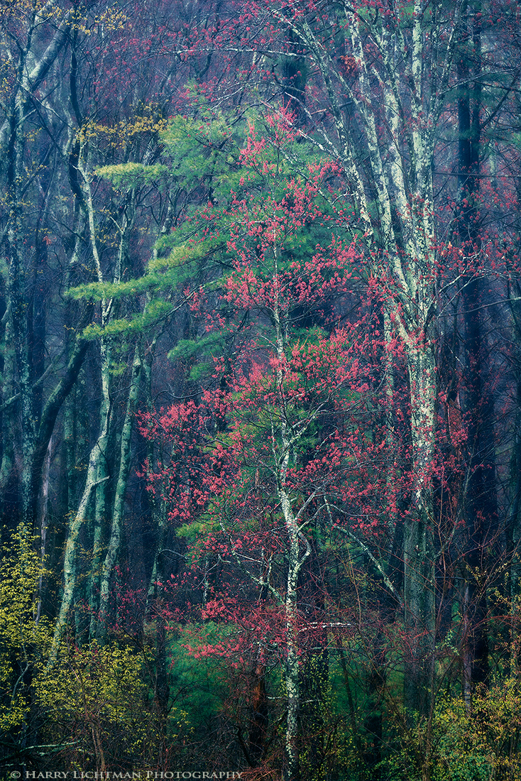
I have driven by this scene nearly every day for the last 20 years.  With spring buds out and very colorful blooms in southern NH, conditions made me stop to photograph them for the 1st time.  These trees are part of a much larger stand of trees about 100 meters away, but the way the red blossoms on this maple were contrasted by the pine tree behind really made it stand out.  A light rain was falling, so the colors were very saturated and the heavily lichened trees made them easily stand out even at that distance.  I set up my tripod in my car and shot through the passenger side open window to limit getting wet and wind disrupting the long lens.  I really liked the way Matt Anderson's recent image made use of the blues and reds, and thought the reds and greens of the tree buds and surrounding evergreens/new growth would be interesting if I went down that processing road.  So, I gave the shadow color balance a bit more cyan /blue than I normally would, and blurred those areas a little (the distant trees in the forest) so that the trees might stand out more.  The red buds and spring leaves I left unadjusted.  Contemplating a slight crop off the top.

Wondering how this resonates.

D810, 80-400mm @ 400mm, f9.5, ISO 64, 1/6th sec., polarizing filter

Comments

21 comments
Comment posted by Lon Overacker on April 30, 2017 at 2:09 PM
Resonates beautifully Harry!  I like how you processed this.  I don't think the blues in the background are too much, I think appropriate.  The blurring works too and would have noticed had you not mentioned it.

Love the mix of spring colors here, and even the inclusion of the white trunks.  I think this is balanced nicely.

If you're considering a top crop (to eliminate the leaves in the ULC?) I would consider an equip crop off the bottom.  While this is of course a vertical image, I think getting closer to the 4x5 ratio gets more comfortable for me (still influenced by years with that format.)  I also think there's yet another alternative crop - which is more severe, but I think cropping down just to the central, center elements and eliminating the spring green buds in the three corners might be an option.  Just a thought.

Beautiful as presented.

Lon
Registered on November 24, 2006, 521 Posts, 19147 Comments
Comment posted by Mark Seaver on April 30, 2017 at 4:43 PM
The glorious spring colors in the trees stacked on top of each other in this view look great, Harry.  I'm thinking that the blue/cyan in the background and sides is too much, but that a personal opinion.  I certainly encourage your experientation.
Registered on January 23, 2011, 1103 Posts, 17270 Comments
Comment posted by Dan Kearl on April 30, 2017 at 11:33 PM
This is one I might be tempted to blur a tad for an impressionist view.
Superb splashes of color...
Registered on September 2, 2013, 209 Posts, 1514 Comments
Comment posted by Gary Minish on May 1, 2017 at 1:04 AM
This is a very artistic type scene (very much a painted look) and it works pretty well for me.  On my computer it seems to have a pretty strong green caste (even the white tree bark on the background trees look green) but it fits the painted appearance so it's not a problem.  Good eyes to see the potential of the scene and a good job of capturing and processing it, Harry.
Registered on February 4, 2006, 625 Posts, 3583 Comments
Comment posted by Peter Richter on May 1, 2017 at 4:13 AM
Harry, this image is one of my favorites from your gallery so far. I really enjoy the subtlety of the scene and you present it in a consistent way to my eye.

Cropping the yellow leaves at the top as well as the brown twigs at the bottom might be an option, although the composition works fine for me as is.

Peter
Registered on November 10, 2010, 218 Posts, 2723 Comments
Comment posted by Harry Lichtman on May 1, 2017 at 7:09 AM
Thanks for the suggestions.  I have applied them to the repost:
1) Cropped off bottom and top
2) Reduced some of the greenish cast (moved the shadow color balance slider toward the magenta a little)
3) Added some surface blur to most of the image, except the main buds of the tree.

The bright greenish white areas of the near trees are lichen, so I left them as is.  The darker greens on the trees deeper in the woods are lichen too, so I left them as is.  Small versions it is difficult to make out the details in them.  Oh well!
Registered on September 17, 2010, 304 Posts, 3507 Comments
Comment posted by Daniel Rappaport on May 1, 2017 at 12:01 PM
Beautiful balanced comforting scene.  I thought for sure there was a redbud tree in there somewhere!
Registered on September 9, 2009, 294 Posts, 2006 Comments
Comment posted by Peter Richter on May 1, 2017 at 12:05 PM
Harry, the crop works perfectly for me. I will not comment on the effect of the added blur, as I think it cannot be discerned sufficiently in the rather small web version. But finally you nailed it I think!

Peter
Registered on November 10, 2010, 218 Posts, 2723 Comments
Comment posted by Igor Doncov on May 1, 2017 at 1:14 PM
Harry, the bright leaves in the llc and lrc are too strong. They're overpowering the image. I would either drop their luminosity or crop more off the bottom. The image is about the top/central area but feels bottom heavy. I do like the cropped version over the original one. Although I liked the bluishness of the original a bit more.
Registered on November 22, 2014, 189 Posts, 2733 Comments
Comment posted by Lon Overacker on May 1, 2017 at 3:40 PM
Harry,

Love the crop. Thanks for taking the time to tweak.  I think you've got it nailed.

Interesting element Igor brings up, and that would be the "top heavy" and "bottom heavy" concepts.  I liken this to the left-right viewpoint and how images can be perceived differently depending on how things are arranged left to right, or right to left.  Just like "balance" and odd/even things within an image.

To me, bottom heavy is more visually acceptable than top heavy.  With bottom heavy, I think of pouring water in a glass - it all goes to the bottom, of course.  Think of "Weebles wobble but they don't fall down" (sorry aging myself I'm guess many of you have no idea what I just said.)  Weebles were designed to be bottom heavy so they won't tip over.  On the flip side, too much "weight" up top in an image might make the viewer feel like the image is going to tip over or too much pressure is being put on the elements below.

Ok, that's getting a little in the weeds.  What I'm trying to say is that while I agree this is bottom heavy, I think in this case it's an asset and not a liability.  Most images benefit from a strong base.

That's my story and I'm sticking to it.
Registered on November 24, 2006, 521 Posts, 19147 Comments
Comment posted by Harry Lichtman on May 1, 2017 at 4:05 PM
Lon, I agree with the stronger base concept, similar when matting a print I guess.  And if a tree is the subject, maybe even makes more sense to me as it helps supports the rest of the image. Rarely have I seen a top heavy image work, ends up feeling out of balance. Unfortunately, I'm old enough to recognize the Weebles reference.sad
Registered on September 17, 2010, 304 Posts, 3507 Comments
Comment posted by Igor Doncov on May 1, 2017 at 9:46 PM
Well I have to defend my comments. It's not a question of top or bottom heavy. Aside from the yellow colors in the lower corners there is a very different sense in the upper 2/3rds than the lower part. The greens are more paler up above and not as rich. Even the blue trees are more defined lower down. The two areas are each good within their own area but to me they say different things and don't work together. If I crop off the image to just above the yellow leaves I don't get that tone gradient that's affecting the colors. Tone gradients look great in forests shot more wide angle where light is streaming from above but this is a different type of image, a tapestry of lines and colors,  where I would argue light should be evenly distributed. I don't know. Perhaps if I look at this long enough I'll see it differently but that's how it strikes me now. At this time I find the upper section with the dappled colors across those blue ghost trees more interesting with what's below, which I feel gets away from the theme of this image as I perceive it.
Registered on November 22, 2014, 189 Posts, 2733 Comments
Comment posted by Mattia Oliviero on May 2, 2017 at 3:09 AM
I love the mood of this image, Harry. Very nice colors and I like a lot the elegance of your composition.

Mattia
Registered on August 24, 2016, 43 Posts, 254 Comments
Comment posted by Harry Lichtman on May 2, 2017 at 6:33 AM
Thanks Igor for your perspective.  I do see what you are saying and the upper portion is definitely different than the lower area. When composing, I tired to have the yellow leaves at the bottom balance the image by including each side, and the lichen colored trees on each side of the maple in the center.  I think cropping too much makes the image feel squat, and I prefer the longer lines that a minimally cropped version affords.  It may have been difficult to have it all with this one I guess, but i do appreciate your insight to it.
Registered on September 17, 2010, 304 Posts, 3507 Comments
Comment posted by Harley Goldman on May 3, 2017 at 10:18 AM
Beautiful colors. I like the top crop in the repost, but for my money, I would leave the bottom as it was. For my eye, it give the image more depth and sense of the forest. Your 20 years of patience waiting for this scene paid off. 
Registered on November 19, 2003, 586 Posts, 11271 Comments
Comment posted by Harry Lichtman on May 3, 2017 at 10:36 AM
Harley,  you're too Lind. More like laziness! Always in a rush to get somewhere else.
Registered on September 17, 2010, 304 Posts, 3507 Comments
Comment posted by Eva McDermott on May 4, 2017 at 1:07 AM
I like this a lot Harry.  Very painterly with an almost abstract feel about it.
Registered on January 4, 2009, 1015 Posts, 13229 Comments
Comment posted by Sairam Sundaresan on May 4, 2017 at 12:16 PM
I wanted to comment on this, but then saw that most of the comments below already covered what I wished to say and more! I love this image Harry. It's really unique!
Registered on March 14, 2013, 100 Posts, 643 Comments
Comment posted by Bill Fach on May 6, 2017 at 3:56 PM
Harry: Well seen and rendered. I do prefer the crop but you have great raw material to work with. Superbly crafted image.>=))>
Registered on November 1, 2003, 1805 Posts, 26981 Comments
Comment posted by Kathy Barnhart on May 7, 2017 at 11:32 AM
I like the cropped image very much and don't find the bottom too heavy, nor the branches too yellow. Just right, as Goldilocks would say! Lots of interesting textures and colors here. It looks so much like a fall painting to this Californian. I love your story about passing it for 20 years and finally really getting it. A good reminder to us all!
Registered on November 11, 2011, 404 Posts, 1639 Comments
Comment posted by John Williams on May 7, 2017 at 11:22 PM
I'll provide a contrary vote and say I actually prefer the original. There's just so much beauty to get lost in.
Registered on September 6, 2007, 221 Posts, 5985 Comments