Nature Photographers Network
This is the preserved archive of the original Nature Photographers Network. The community continues at naturephotographers.network.
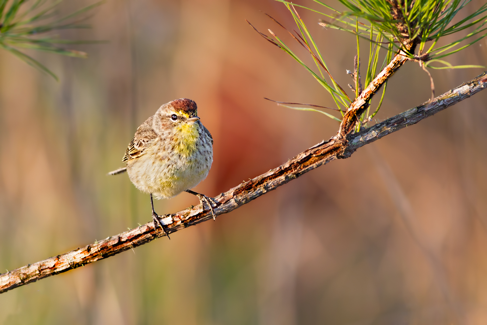
Palm Warbler/redo
‹ PreviousAvian GalleryNext ›

Palm Warbler/redo

by Barbara Graham

Gallery: AvianPosted April 28, 2017313 views6 comments
Gainesville, Florida
3/21/2017 – 8:11:32 AM
Canon EOS 7D EF400mm f/5.6L USM
1/320 sec;   f/5.6;   ISO 640
Manual;   Evaluative metering
LR5, PS6, Topaz DeNoise on background, Curves separately on background and bird and branch, Smart Sharpen on bird, 55% of full frame

This is from March 21 and is the last Palm Warbler image I have to date.  I know you guys have seen enough of them. :)  The last two at least that I posted a while ago I had trouble with sharpening in that everybody said there was too much sharpening (on the bird).  I did almost no sharpening on this one.  Do you think this one is okay as far as not looking oversharpened?

Please view the larger version.

Any feedback would be greatly appreciated.  Thank you!

Comments

6 comments
Comment posted by Dennis Plank on April 28, 2017 at 10:51 PM
This doesn't look oversharpened to me, Barbara.  In fact I think you could get away with a tad more.  It looks to me as if you had some pretty harsh light for this one which is really showing up in yhe perch and making it draw my eye from the bird.  You might try reducing contrast/saturation just on the perch to see if you like the result.
Registered on January 28, 2008, 1767 Posts, 23192 Comments
Comment posted by Barbara Graham on April 28, 2017 at 10:57 PM
Dennis, I don't know why, but I just couldn't figure out about reducing contrast/saturation on the perch.  That is exactly what it needed.  I think this redo is a lot better.  I also did a little more sharpening on the bird.  Thank you!!
Registered on July 27, 2010, 1310 Posts, 5035 Comments
Comment posted by Richard Ditch on April 29, 2017 at 12:55 AM
I agree with Dennis - the light was rather harsh and contrasty. And "sharpening" of an image is in reality simply increasing contrast on the pixel level. I also find the original to be overly bright.

The repost is better, but I'd start over at the raw conversion stage. I'd concentrate on keeping the lit side of the warbler looking natural, and letting the shadow side go darker. Pull down the highlights and whites in the histogram in the raw converter to keep the branch from blowing out. Bring the shadows back up if necessary in raw conversion.

Here's thre best I can do quickly on your jpeg, just to give an idea of the direction I think you should take this.
Registered on November 1, 2003, 1031 Posts, 12705 Comments
Comment posted by Philip Hodgkins on April 29, 2017 at 3:49 AM
I like both your redo and Rich's. Somewhere in between would be the best, IMO.
Registered on July 24, 2006, 2741 Posts, 12349 Comments
Comment posted by Dennis Plank on April 29, 2017 at 9:22 AM
I like what you did with the perch, Barbara, and I agree with Rich about the brightness-for some reason, I just couldn't put my finger on it.  I also agree with Rich that the Raw conversion is the best place to mess with overall brightness and contrast issues.
Registered on January 28, 2008, 1767 Posts, 23192 Comments
Comment posted by Jenaya Launstein on May 2, 2017 at 5:29 PM
A great pose from this little fella. Plus he chose a good perch too, how nice of him ;) . I thought the same as what Dennis said, but your repost is much better!
Registered on February 8, 2011, 254 Posts, 1302 Comments