Nature Photographers Network
This is the preserved archive of the original Nature Photographers Network. The community continues at naturephotographers.network.
A Link Between Worlds
‹ PreviousLandscape GalleryNext ›

A Link Between Worlds

by Sairam Sundaresan

Gallery: LandscapePosted April 12, 2017192 views5 comments
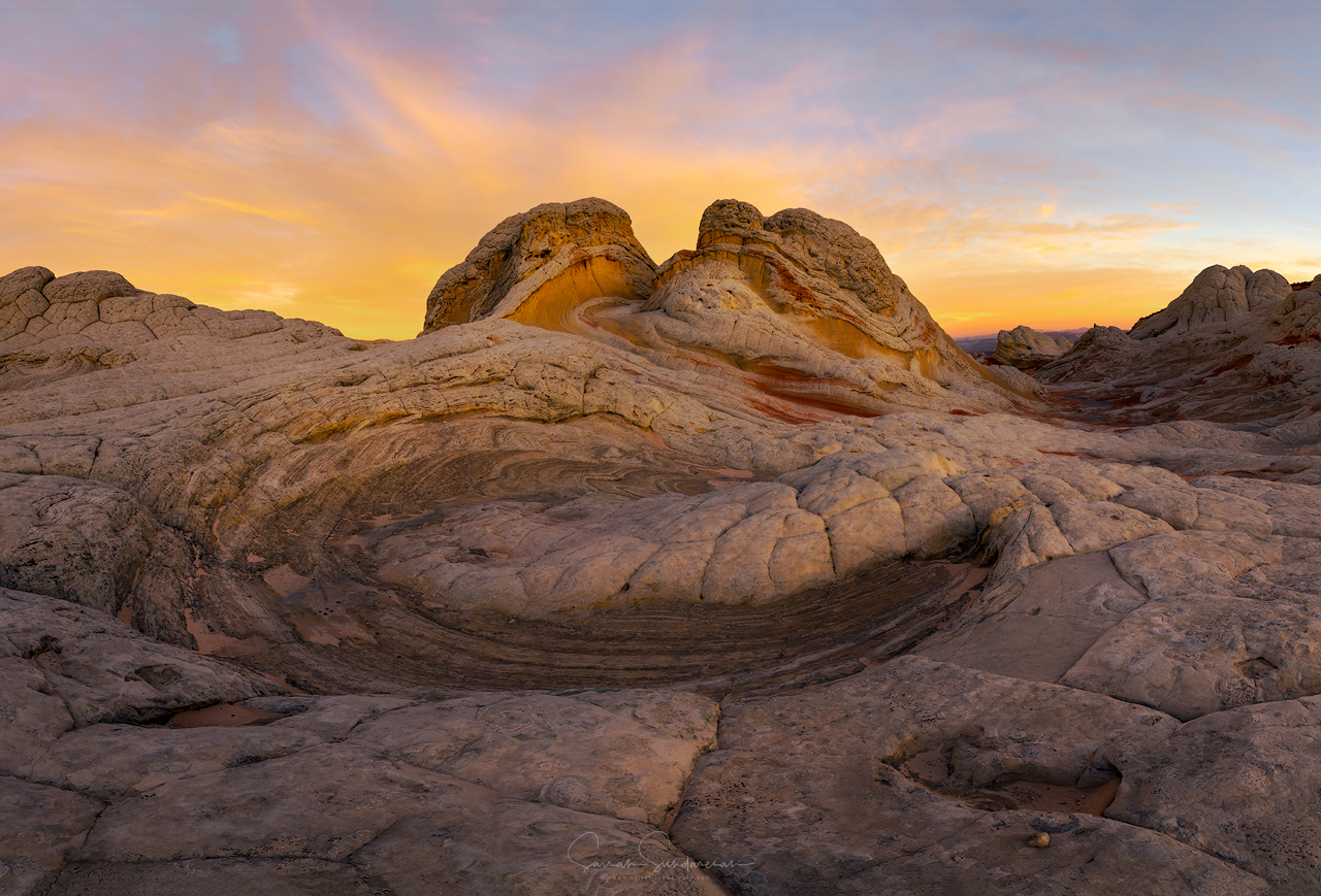
Late last year, I visited White Pocket for the first time. Instantly fell in love with the place. The phrase "That looks like Mars" gets overused a lot, but it really does describe White Pocket accurately. The rock formations are so amazing, with their varying textures and colors. Plus, you are dwarfed standing next to them. On this morning, I had witnessed a gorgeous sunrise and shot another comp which I will share in sometime. Before the colors in the sky went away, I ran around like a headless chicken to find another composition that would complement the light. I came to the spot you see here. This image is a stitch of 5 vertical frames at 16mm to accommodate the field of view. I stitched this manually to bring out the shapes and curves of the rock formation and not lose sharpness that comes with warping. 

Appreciate any thoughts you have on this. 

Please see Large :)

Comments

5 comments
Comment posted by Bill Leggett on April 12, 2017 at 8:23 PM
Terrific image.  The formations are fascinating and so is the sky. devil
Registered on July 21, 2004, 706 Posts, 3233 Comments
Comment posted by Harley Goldman on April 14, 2017 at 9:48 AM
Great take from White Pocket. Excellent light and sky. 
Registered on November 19, 2003, 586 Posts, 11271 Comments
Comment posted by Igor Doncov on April 15, 2017 at 12:52 AM
I  can see why you chose this subject. There is some really great color in that sediment and a lot of tonal variability. The light was changing and it looks as though you missed the optimum lighting opportunity in the fg. I would crop q bit off the bottom section to reduce the area of the image that lacks punch and bring in the sides to make it about the central swirlies. I would raise clarity to emphasize the richness in the strata. I would saturate the blues a tad in the sky. Optionally, I would saturate the orange a bit more to emphasize the primary color of the entire image, to let the viewer know better what you're trying to say.

I did a screen dump of this and played around with it and come up with the above suggestions.
Registered on November 22, 2014, 189 Posts, 2733 Comments
Comment posted by Vance Gese on April 16, 2017 at 6:29 PM
Love the forms of the rocks and the subtle S-like curve in the center of the image, which provides a wonderful abstract element to your composition, and draws the eye back through your composition.  The soft light is outstanding.  Had to have been a remarkable morning.
Registered on November 13, 2008, 298 Posts, 6629 Comments
Comment posted by John Williams on April 18, 2017 at 12:09 AM
This one's awesome Sairam. I love the comp, and that's some great color behind.
Registered on September 6, 2007, 221 Posts, 5985 Comments