Gallery: LandscapePosted March 10, 20173,026 views17 comments
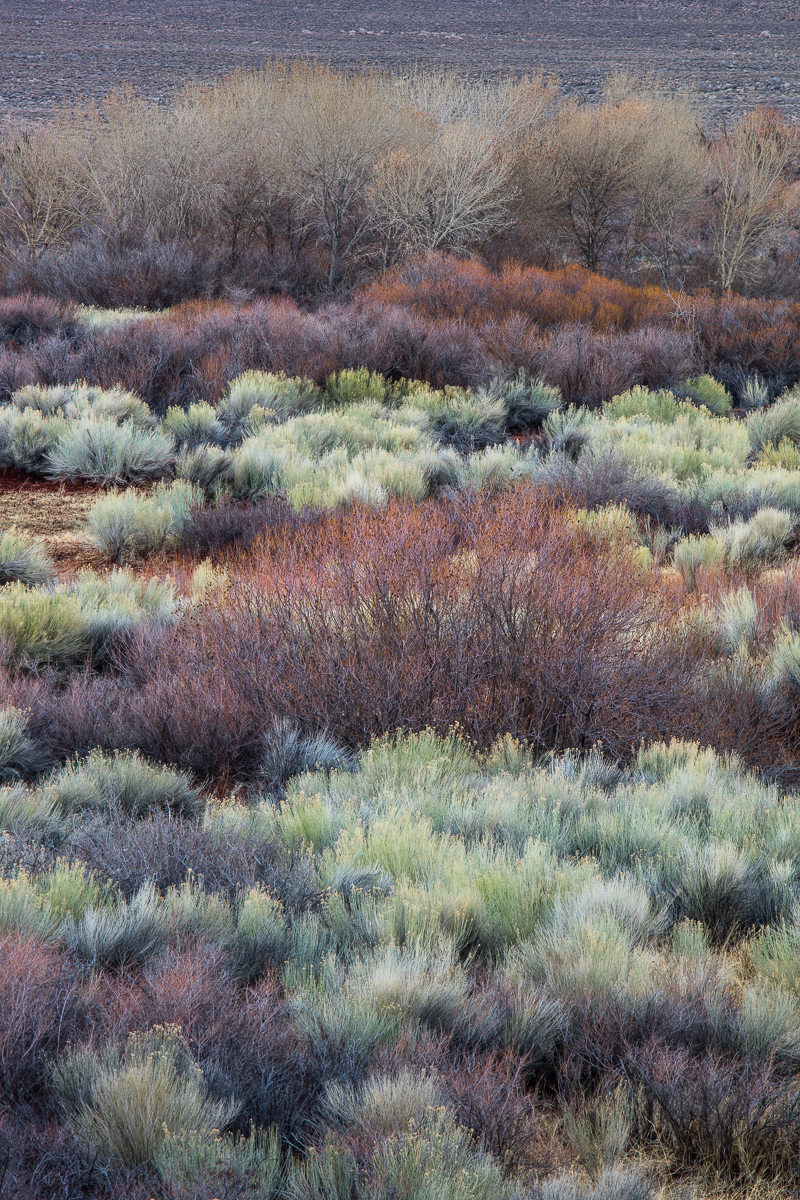
I made this image on the same evening as Harley's recent post from the Owens Valley. Comments, critiques and suggestions appreciated.
5DSR, 70-200 f/4 IS L @ 200mm.
Comments
17 comments
Comment posted by Skip Layman on March 10, 2017 at 1:10 PM
I love the subtle colors and layers in this! My only suggestion is to consider cropping from the top a bit to remove what looks to me like a plowed field.
Registered on November 1, 2003, 558 Posts, 1704 Comments
Comment posted by Harry Lichtman on March 10, 2017 at 1:13 PM
A colorful comp, beautiful winter colors. I wonder if you know how these areas look in the summer, do they lose their appeal? On the fence about the very top. Inclined to crop it off.
Registered on September 17, 2010, 304 Posts, 3507 Comments
Comment posted by Lon Overacker on March 10, 2017 at 2:28 PM
Dave,
Now we're talkin'! Love the range and tones of colors throughout. I like the position and inclusion of the larger bush in the center; it a good place for the eye to fall back to while exploring all the colors, details and texture.
I'm with Harry and unsure of the top. It's not a distraction but it almost looks like a plowed field (I know it's not.) It's not an image killer for me, and in fact at least the ground up top is somewhat uniform (like a sky might be,) so again, not a distraction. Just an observation.
Love the arrangements of color you manage to see and photograph. Love 'em.
Lon
Registered on November 24, 2006, 521 Posts, 19147 Comments
Comment posted by Peter Richter on March 10, 2017 at 2:44 PM
Dave, I really enjoy the interplay of colors, textures and layers. In my opinion cropping the field at the top would make for a more consistent look. Your image makes me want to explore this location.
Peter
Registered on November 10, 2010, 218 Posts, 2723 Comments
Comment posted by Ed Lowe on March 10, 2017 at 4:57 PM
Another beauty from the Owens Valley, Dave. The layers and colors are just gorgeous. My only suggestion would be the already mentioned crop from the top.
Ed
Registered on February 7, 2004, 414 Posts, 7115 Comments
Comment posted by Dave Dillemuth on March 10, 2017 at 5:39 PM
Thanks for the comments. Cropping the top seems to be a consistent thought. I played with that but think I personally prefer not chopping off the tops of the trees. I tried reducing the strip up top and gaining more separation by increasing the contrast and dodging the tree tops. Not sure reactions...
Harry,
The color of this foliage changes dramatically as spring progresses and IMO loses its photographic appeal.
Registered on December 10, 2015, 104 Posts, 1112 Comments
Comment posted by Igor Doncov on March 10, 2017 at 5:48 PM
Another vote for cropping the field out at the top.
Registered on November 22, 2014, 189 Posts, 2733 Comments
Comment posted by Lon Overacker on March 10, 2017 at 6:04 PM
Dave,
Excellent compromise! The slight crop and the darken of the tone up top resolves my comment. In fact, the tone at the top is now more in line with the rest of the image and colors. Well done! And thanks for taking the time and considering the feedback.
Lon
Registered on November 24, 2006, 521 Posts, 19147 Comments
Comment posted by gary phillips on March 10, 2017 at 9:52 PM
I can't get enough of these, Dave. Love the layers and colors. Your repost works very nicely in dealing with the space up top. Love this one.
Registered on October 24, 2013, 185 Posts, 4136 Comments
Comment posted by scott lanz on March 11, 2017 at 8:47 AM
Beautiful, Dave. I like this presented, and I understand not wanting to cut off the tops of the trees, but I could also see cropping the trees altogether, as an alternative. What I especially love about this image is the amazingly beautiful foreground.
Registered on November 14, 2003, 840 Posts, 12902 Comments
Comment posted by Harley Goldman on March 11, 2017 at 9:44 AM
Excellent layering of color and vegetation. I like the repost. It would not look right cropped in comparison. Beautiful.
Registered on November 19, 2003, 586 Posts, 11271 Comments
Comment posted by Bill Fach on March 11, 2017 at 11:33 AM
Dave: Love the color palette and textures here and I like your crop choice. Really well done. >=))>
Registered on November 1, 2003, 1805 Posts, 26981 Comments
Comment posted by Preston Birdwell on March 11, 2017 at 6:28 PM
The re-post gets my vote, Dave. It was a small, but significant change. The variety of tone and color is excellent.
--P
Registered on November 1, 2003, 471 Posts, 5188 Comments
Comment posted by Mark Seaver on March 12, 2017 at 2:23 PM
Yes, the colors in the shrubbery look familiar and again wonderful. The repost has a nice added pop. I always enjoy spring colors. They often rival fall colors but with a very different set of colors. Yes, you need to catch them early to get the biggest color changes.
Registered on January 23, 2011, 1103 Posts, 17270 Comments
Comment posted by John Williams on March 13, 2017 at 8:41 PM
The repost looks really good Dave. I love the beautiful colors and layers.
Registered on September 6, 2007, 221 Posts, 5985 Comments
Comment posted by Doug Koepsel on March 13, 2017 at 11:09 PM
Dave, I like the color differences in the brush. My thought/suggestions may run opposite in that I would reduce the contrast in luminosity mode to retain the saturation. I would go for a softer feel. Also, crop off the darker 5% on the bottom, off the top to the treetops, and some off the left to rid the bare patch.
Registered on April 1, 2010, 196 Posts, 1592 Comments
Comment posted by Nick Bristol on March 14, 2017 at 1:26 PM
Dave, The layers, colors and textures in this are absolutely wonderful. The repost looks fantastic!
Nick Bristol
Lone Rock, WI.
Registered on February 1, 2004, 752 Posts, 14140 Comments

Comments
17 commentsNow we're talkin'! Love the range and tones of colors throughout. I like the position and inclusion of the larger bush in the center; it a good place for the eye to fall back to while exploring all the colors, details and texture.
I'm with Harry and unsure of the top. It's not a distraction but it almost looks like a plowed field (I know it's not.) It's not an image killer for me, and in fact at least the ground up top is somewhat uniform (like a sky might be,) so again, not a distraction. Just an observation.
Love the arrangements of color you manage to see and photograph. Love 'em.
Lon
Peter
Ed
Harry,
The color of this foliage changes dramatically as spring progresses and IMO loses its photographic appeal.
Excellent compromise! The slight crop and the darken of the tone up top resolves my comment. In fact, the tone at the top is now more in line with the rest of the image and colors. Well done! And thanks for taking the time and considering the feedback.
Lon
--P
Nick Bristol
Lone Rock, WI.