Nature Photographers Network
This is the preserved archive of the original Nature Photographers Network. The community continues at naturephotographers.network.
Flowing Trees
‹ PreviousLandscape GalleryNext ›

Flowing Trees

by Mattia Oliviero

Gallery: LandscapePosted March 1, 20171,200 views11 comments
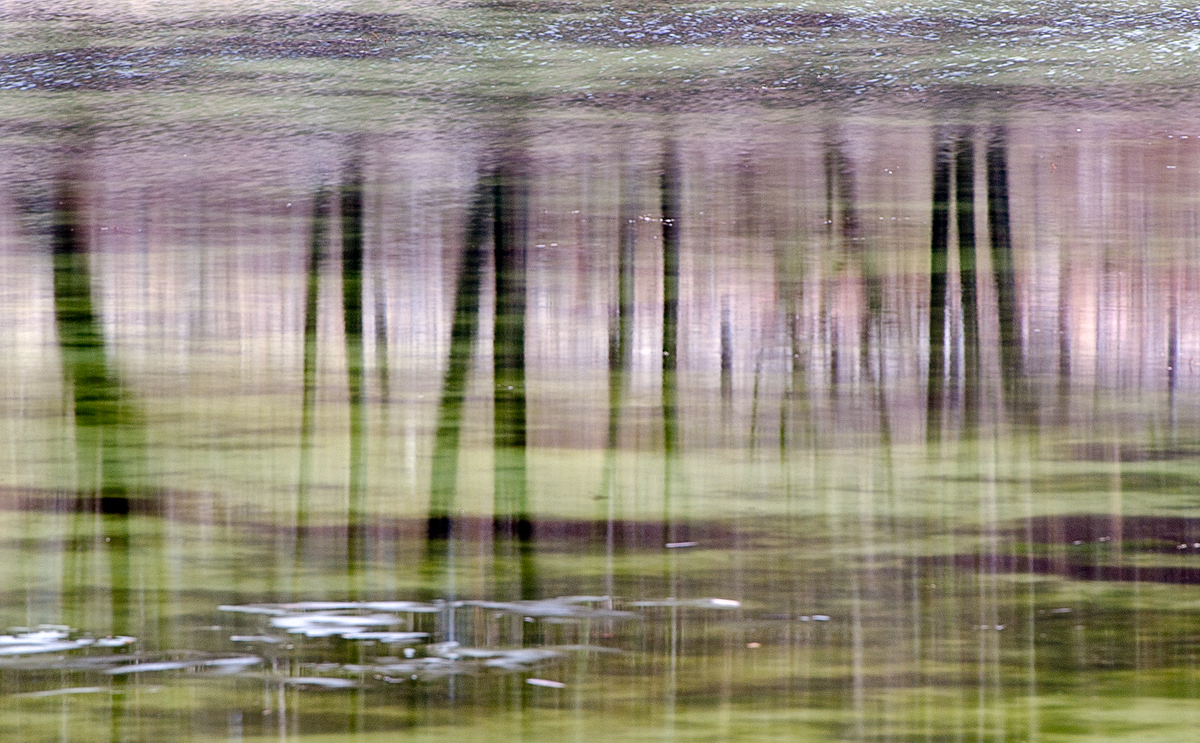
I was about to pack and going home when I saw this scene. The lake flow was making the reflections of these dark trees like an impressionist painting. The contrast with the green algae at the bottom of the lake encouraged me to take a picture with a relatively long time exposure to convey this idea. This is the result and I am really looking forward to hear you thoughts and opinions. Thank you.
Ps: the "thing" in the foreground is moving ice.

Nikon d7000
Tamron 70-300 @300mm
f13 - 1/3s- iso 100
tripod

Comments

11 comments
Comment posted by Harry Lichtman on March 1, 2017 at 6:58 AM
Very nice abstract you saw.  Colors are wonderful, the bright areas of ice don't seem to fit it as much - wondering if you have any images without it?  Well seen.

Love the repost. Glad you had one. But, I really like the top portion of the original. Any way you could stitch the top of the 1st image onto the re-post?  Best of both worlds.
Registered on September 17, 2010, 304 Posts, 3507 Comments
Comment posted by Mattia Oliviero on March 1, 2017 at 8:04 AM
Thank you Harry, here an alternative version without the ice but with different reflections due to blurred water.
Registered on August 24, 2016, 43 Posts, 254 Comments
Comment posted by Nick Bristol on March 1, 2017 at 8:11 AM
Mattia, This is a cool looking abstract. Reflections and colors are really nice and I like it without the ice even better. 

Nick Bristol
Lone Rock, WI.
Registered on February 1, 2004, 752 Posts, 14140 Comments
Comment posted by scott lanz on March 1, 2017 at 8:40 AM
I like this overall, Mattia, with the interesting impressionistic look, but then, impressionist or abstract reflections are one of my favorite subjects. My initial impression was exactly what Harry said. Specifically, until reading your posting comments,  I did not know what the white stuff was in the LRC (probably because it is moving), and I think the image is stronger w/o it, either by cropping the OP as captured in the repost. I think cropping the OP to more of a pano would work well. I like the repost a lot, but I could see toning everything down the upper 2/3s a pinch. 
Registered on November 14, 2003, 840 Posts, 12902 Comments
Comment posted by Eva McDermott on March 1, 2017 at 12:33 PM
I like your second post best Mattia.  It has richer color and is overall a stronger abstract.
Registered on January 4, 2009, 1015 Posts, 13229 Comments
Comment posted by Preston Birdwell on March 1, 2017 at 3:22 PM
I like both. The original has a nice sense of space, while the re-post homes in on the details. The color schem in both is quite different. Nicely done.
--P
Registered on November 1, 2003, 471 Posts, 5188 Comments
Comment posted by Prashant Khapane on March 1, 2017 at 6:07 PM
yes, repost is much better. Love the abstract
Registered on November 1, 2003, 492 Posts, 4580 Comments
Comment posted by Doug Koepsel on March 1, 2017 at 10:13 PM
I like your combo of lavender and green colors. An inclination would be to clone out the cluster of white spots against the dark tree reflections in the upper middle.
 
Registered on April 1, 2010, 196 Posts, 1592 Comments
Comment posted by Aaron Feinberg on March 2, 2017 at 6:45 AM
I love almost everything about this.  The ice actually distracts me as i want to see the abstract without it.  Very arty and awesome colors.  Did you do another w/o?  Or maybe a longer exp?  Nicely seen!

aF

p.s. just saw the repost after writing this and yea...way better.  awesome!
Registered on October 26, 2009, 399 Posts, 2789 Comments
Comment posted by Bill Leggett on March 2, 2017 at 10:32 PM
Great eye for finding this, and for your presence of mind to take advantage of longish exposure.  The second post works quite well.
Registered on July 21, 2004, 706 Posts, 3233 Comments
Comment posted by gary phillips on March 3, 2017 at 2:28 PM
The repost does it for me, Mattia.  Love the color combo.  Quite an amazing abstract.
Registered on October 24, 2013, 185 Posts, 4136 Comments