Nature Photographers Network
This is the preserved archive of the original Nature Photographers Network. The community continues at naturephotographers.network.
POP - 2nd HM
‹ PreviousEPA 2017 GalleryNext ›

POP - 2nd HM

by Ed Williams

Gallery: EPA 2017Posted February 25, 2017891 views19 comments
Here to Infinity + Repost

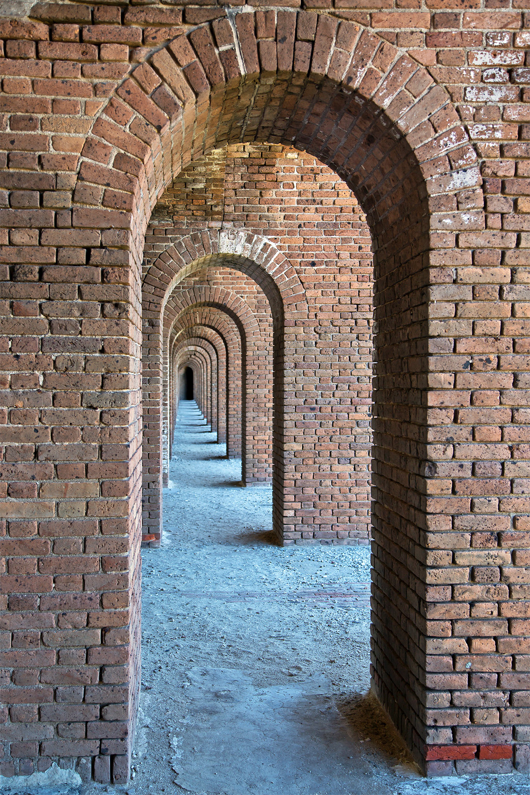
This is another shot from the inside of Fort Jefferson on Garden Key in the Dry Tortugas National Park, Florida. The doorways just seemed to go on forever as you look down through them. The shady side lighting was much better on this side than the bright sunny outer side of the fort. Canon 5D3, f5, 1/60 sec, iso 100, Handheld, slight crop for straightening.

Comments

19 comments
Comment posted by John Tobias on February 25, 2017 at 11:43 PM
Good eye to see this image!  I like that you have details from front to back.  Well composed.  Thanks for sharing.
Registered on September 12, 2009, 2120 Posts, 6455 Comments
Comment posted by Richard Teller on February 26, 2017 at 6:35 PM
Nice implied leading line, good use of repeating patterns and I like the oof area at the end of the doorways. It gives the feel of going on forever. Well seen and photographed. 
Registered on August 23, 2010, 1162 Posts, 6692 Comments
Comment posted by Paul Breitkreuz on February 27, 2017 at 10:25 AM
Pure excellence here, Ed. I really find these type of scenes of long hallways and or archways like this fairly simple, but very captivating. I particularly like the "infinity" depth to this one. This one is topping my overall personal list for this style of image.......devil
Registered on February 25, 2006, 525 Posts, 8448 Comments
Comment posted by Craig Moreau on February 27, 2017 at 11:49 AM
Ed, this is taking me back to my visit to Dry Tortugas a decade ago. It's a great place, and well-captured here. I like the the slightly off-center look down the hallway and the repeating forms. If I were to get very picky, I might desaturate the bricks on the lower right of the first archway column, and lower left on the second. They grab my eye a bit, but not a big deal.
Registered on April 21, 2015, 64 Posts, 584 Comments
Comment posted by Ed Williams on February 27, 2017 at 3:40 PM
Craig, "I might desaturate the bricks on the lower right of the first archway column, and lower left on the second."

I really thought about desaturating those bright red bricks Craig. It does show they are in the process of preservation and reconstruction, using new bricks to hold things in place, so I left them there. I will see if I can tone them down a bit. Thank you for the suggestion, and thanks everyone for your comments.
Registered on December 28, 2010, 636 Posts, 3499 Comments
Comment posted by Richard Sandor on March 1, 2017 at 11:25 AM
Ed: a very well seen and well taken image. The only thing I would suggest would be to crop just above the two red bricks on the right. Fine otherwise. Richard
Registered on January 12, 2014, 453 Posts, 1625 Comments
Comment posted by Paul Breitkreuz on March 2, 2017 at 8:43 AM
Ed, after a review here of the ideas regarding the bright red bricks I might take a different approach for change. There is the one small chunk of brick on the second arch at the base of the left side, and then of course the two at the base of the front arch right side.
What I might do is try to color the bricks to look the same as the others. You can use the color picker from an adjacent brick for proper color. Anyway, not to simplify things there are steps needed to bring the bricks down from the bright red to make it look natural for coloring, but not a big deal in the end. The second arch should not be any issue to repair as a dark brown brick color could be used there easily. The front ones will require more work to make them look natural.  
Just a thought on the change idea.....enlightened
Registered on February 25, 2006, 525 Posts, 8448 Comments
Comment posted by Tony Kuyper on March 3, 2017 at 9:37 AM
Wonderful repetition here, but also nice warm/cool contrast.  It does seem to go on forever.
Registered on November 1, 2003, 364 Posts, 22328 Comments
Comment posted by Harley Goldman on March 4, 2017 at 10:28 AM
Great perspective and scene. Agree about the red bricks, but that should be an easy fix if your decide to change it. Excellent image!
Registered on November 19, 2003, 586 Posts, 11271 Comments
Comment posted by Preston Birdwell on March 6, 2017 at 7:25 PM
This is wonderfully composed and processed. Normally, I might take some exception to cyan level here, but in this case it creates a fine color contrast to the brickwork. Well done, Ed.
--P
Registered on November 1, 2003, 471 Posts, 5188 Comments
Comment posted by Ed Williams on March 7, 2017 at 12:42 AM
OK, here goes with some minor modifications. I tried to clone down the bright red bricks and tone down the cyan a touch. Not sure if this gets there or not. Hope it is close. Thank you for all of your comments and suggestions. This has been fun.
Registered on December 28, 2010, 636 Posts, 3499 Comments
Comment posted by Paul Breitkreuz on March 7, 2017 at 8:55 AM
Ed, the repost........devil
Registered on February 25, 2006, 525 Posts, 8448 Comments
Comment posted by scott lanz on March 7, 2017 at 3:24 PM
Excellent image, Ed. Congrats on the WP. devil
Registered on November 14, 2003, 840 Posts, 12902 Comments
Comment posted by SandyRichardsBrown on March 7, 2017 at 4:52 PM
Excellent eye to have envisioned this mage.
Well-executed, and interesting subject.
The one little rea of smudging on the left of the far window could be cleaned up a bit.
I like the red brick, but the blue of the gravel seems a little out of place. Toning that back to the gray it likely was might work better.
Still, Congrats on a fine WP.
Sandy 
Registered on November 24, 2003, 3937 Posts, 12909 Comments
Comment posted by Paul Breitkreuz on March 7, 2017 at 8:53 PM
Ed, well deserved WP on this very fine image......devil
Registered on February 25, 2006, 525 Posts, 8448 Comments
Comment posted by Bill Fach on March 11, 2017 at 12:49 PM
Ed: Well seen and superbly composed and captured. I do prefer the repost but this is certainly a winner in every respect. Congrats on the WP. >=))>
Registered on November 1, 2003, 1805 Posts, 26981 Comments
Comment posted by SandyRichardsBrown on February 4, 2018 at 8:48 PM
Ed - Major congrats on the 2017 yearly pick!
Wonderful image!
Sandy
Registered on November 24, 2003, 3937 Posts, 12909 Comments
Comment posted by Ed Williams on February 5, 2018 at 12:16 AM
Thank you to everyone for selecting this for recognition. Sandy, thank you for your kind recognition.
Registered on December 28, 2010, 636 Posts, 3499 Comments
Comment posted by Paul Breitkreuz on February 6, 2018 at 10:57 AM
Ed, congratulations on the 2017 EPA selection for this image. I noticed my other previous comments on this scene and can only say it truly was an impact type image overall....laugh
Registered on February 25, 2006, 525 Posts, 8448 Comments