Nature Photographers Network
This is the preserved archive of the original Nature Photographers Network. The community continues at naturephotographers.network.
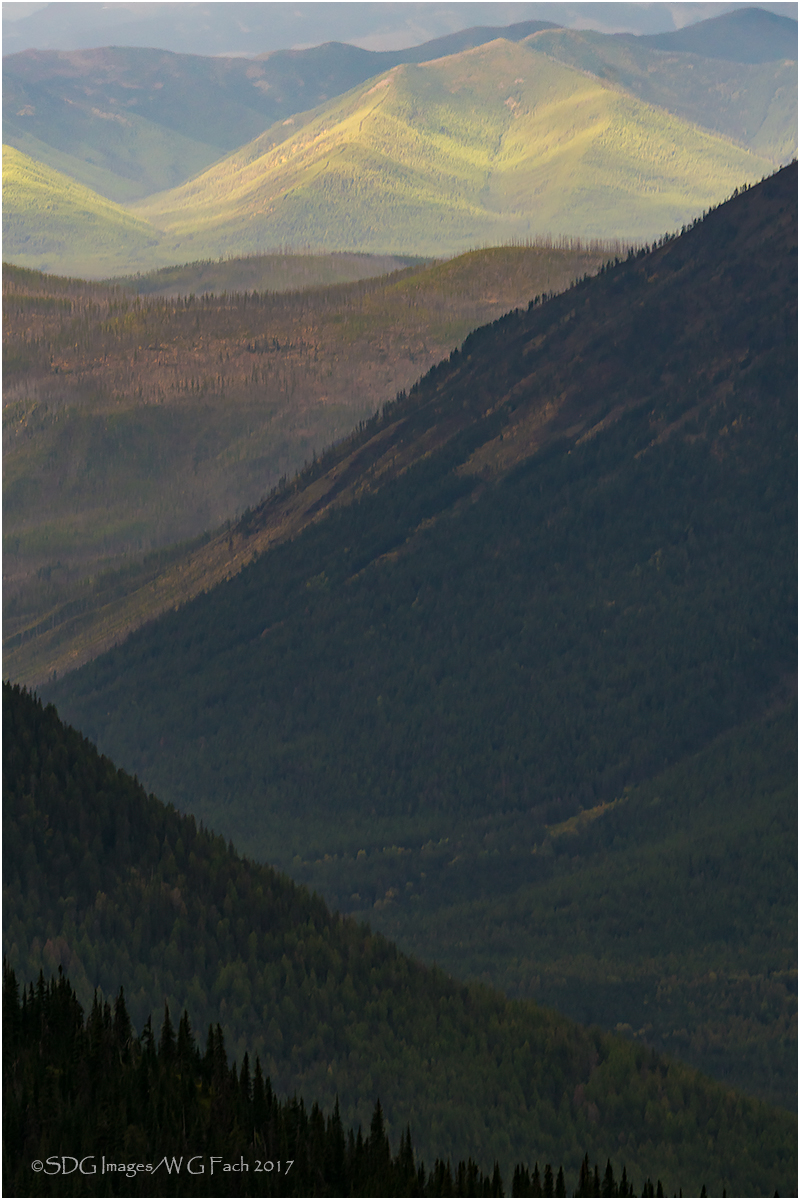
Long View 3a
‹ PreviousLandscape GalleryNext ›

Long View 3a

by Bill Fach

Gallery: LandscapePosted February 16, 2017228 views8 comments
Sony A77II
Sony 70-400G @ 140mm, CPL
ISO 400, 1/60 @ f8
Many thanks to all who have commented on my Long View series. This is the color version of the most recent conversion. Hope you enjoy at least a little the pleasure I experienced with the capture and then the processing and posting.>=))>

Comments

8 comments
Comment posted by Lon Overacker on February 16, 2017 at 11:37 PM
Bill,

Thanks for posting the color version.  I'm really enjoying this one.  I think the color makes a big, big difference here.  The contrast worked in the previous version, but with this the colors are adding to that contrast.  I also think the graphic nature of this is increased as well.  This just might be my favorite of the entire series.

To be consistent though... I'm still looking for that breathing room up top. ;-)

Lon
Registered on November 24, 2006, 521 Posts, 19147 Comments
Comment posted by Igor Doncov on February 17, 2017 at 12:35 AM
I also like this color vision much more.  Aside from the color the distant mountains have greater definition  ow. The closest ridge now. The left ridge now has two ridges which help give it a more three dimensional the the previous one. I would add more sky above the distant mountains. Good job. 
Registered on November 22, 2014, 189 Posts, 2733 Comments
Comment posted by gary phillips on February 17, 2017 at 5:46 PM
This image has some real nice depth, Bill.  I have to agree with Lon and Igor about a bit more room up top.  There is an odd tint to the bands of light on the background ridge.  Maybe it's my monitor needing calibration, as no one else mentioned it.  Very nice.
Registered on October 24, 2013, 185 Posts, 4136 Comments
Comment posted by Preston Birdwell on February 17, 2017 at 7:16 PM
I like this color version and the composition. I do agree with Lon regarding a little more breathing room at the top. I like the various competing diagonals and the sunlight on the far slopes.
--P
Registered on November 1, 2003, 471 Posts, 5188 Comments
Comment posted by Barbara Graham on February 17, 2017 at 10:48 PM
Bill, I think these colors are beautiful, and I really like the move in color and focus from the foreground to the background.
Registered on July 27, 2010, 1310 Posts, 5035 Comments
Comment posted by Genny K. on February 17, 2017 at 11:03 PM
I definitely like this color version better.  That's just me; I live in a colored world, and I've never been very good at B&W!!!!
What I like in this is that warm sunshine on that far hill.
I sure like all the different ridges in this, it gives it a real feeling of vastness. Looks like there is plenty of sharp detail in there, too.
Nice.
Registered on June 5, 2006, 132 Posts, 2001 Comments
Comment posted by Brian Schrayer on February 18, 2017 at 4:57 PM
I remember when you posted the first image in this series that you were drawn to the layers in the scene.  This image captures that nicely - and yes, it does remind me of the layers in the Smokies.  The added element of color gives more definition to the layers which is something that I felt was lacking in the B&W version.  Perhaps just a bit wider perspective, but with the same vertical framing would improve this as the comp feels a bit tight.
Registered on May 28, 2004, 114 Posts, 2890 Comments
Comment posted by Mark Seaver on February 19, 2017 at 11:17 PM
Terrific, triangular layers, here, Bill.  The touch of yellow/green in the distance is a great contrast to the dark moody tones in the foreground.
Registered on January 23, 2011, 1103 Posts, 17270 Comments