Nature Photographers Network
This is the preserved archive of the original Nature Photographers Network. The community continues at naturephotographers.network.
Autumn Mosaic (+Repost)
‹ PreviousLandscape GalleryNext ›

Autumn Mosaic (+Repost)

by Brian Schrayer

Gallery: LandscapePosted February 8, 20173,860 views16 comments
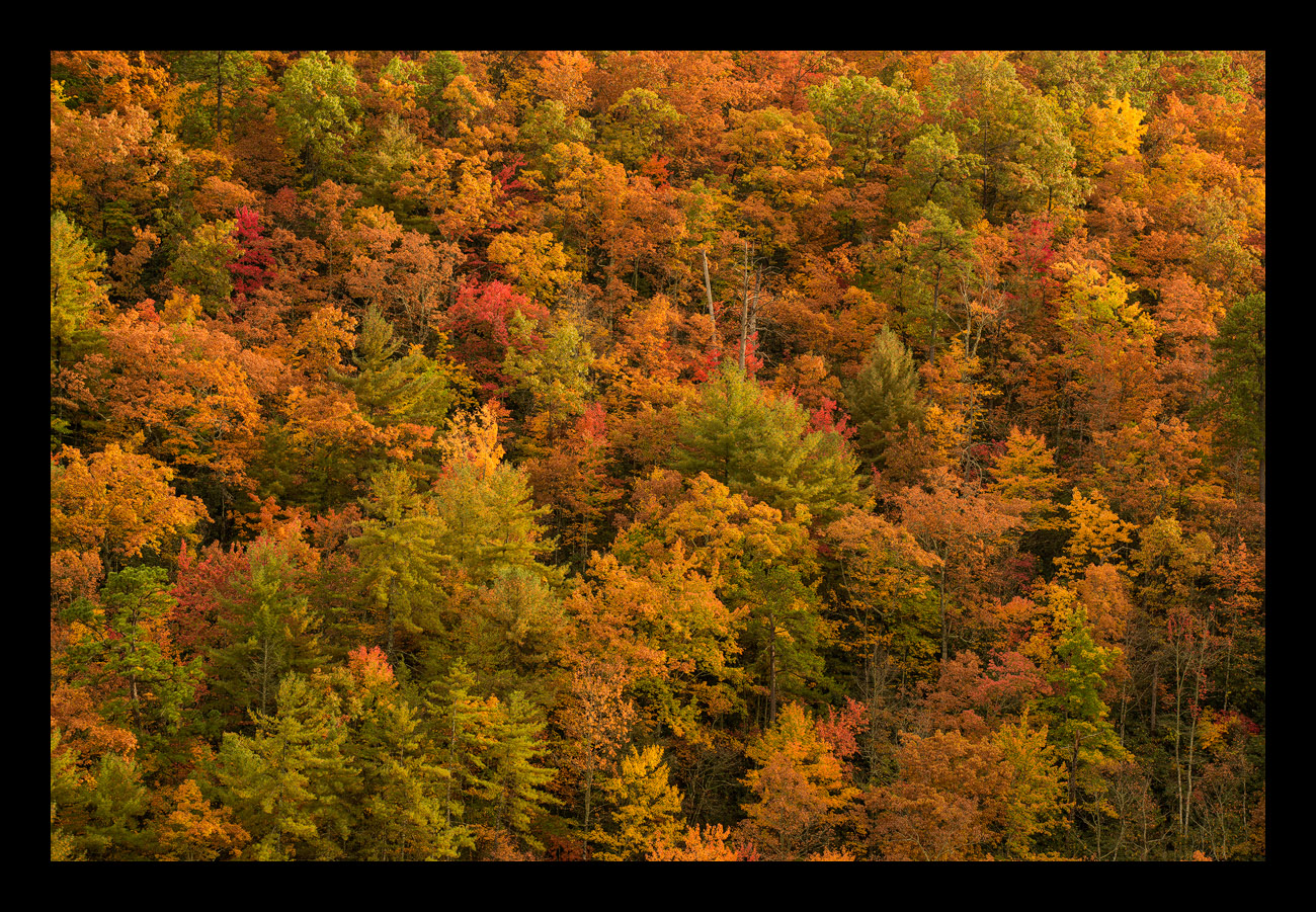
Here's an image I captured along a dirt road that leads out of Cades Cove in GSMNP.  The color was intense due to passing rain showers and diffused light. 
Thank you for all of your comments on my previous images and as always all comments and critiques are welcome!  crying

Of course this is the type of image where it is easy to get color overload.  While I try to process my images carefully so that they are believably vibrant it is easy to get carried away with saturation on an image such as this.  Please feel free to comment if it feels like I took it too far. 

Capture info:
135 mm
f/8 @ 1/125 sec
ISO 800 (not sure why I boosted the ISO)

Processing Info:
TK's luminosity masks (midtone contrast, dial back brightest of highlights), focused saturation mask (reduce saturation in the highest saturated areas), focused vibrance mask (increase vibrance in lightly saturated areas), selective color adjustments to darken the blacks in the green and yellow color channels. 

Comments

16 comments
Comment posted by Ian Wolfenden on February 9, 2017 at 6:15 AM
It is quite saturated but works well for me, Brian.  I really like the intensity of the colour and the abstract feel which nevertheless retains a full sense of a forest scene.
Registered on May 18, 2007, 1108 Posts, 7647 Comments
Comment posted by Harley Goldman on February 9, 2017 at 9:04 AM
This is really well done. I like the almost abstract blast of color. I find the colors look spot on, not too saturated at all (in the large version, the website seems to automatically oversaturate the smaller version). Very nicely done. 
Registered on November 19, 2003, 586 Posts, 11271 Comments
Comment posted by Craig Moreau on February 9, 2017 at 10:24 AM
Brian, the color and saturation looks good to me. I love the various stages of fall color. I might try a crop of the right and bottom to minimize the less colorful area in the LRC and the brighter orange trees that just peek up over the bottom of the frame.
Registered on April 21, 2015, 64 Posts, 584 Comments
Comment posted by Nick Bristol on February 9, 2017 at 7:07 PM
Brian, This looks absolutely believable and makes me think of the colors in Upper MI. The kind of image that makes me thing about the fall season again...cool I kind of like Craig's small crop suggestions and think it would make this beautiful image even a bit better. Nice work on this!

Nick Bristol
Lone Rock, WI.
Registered on February 1, 2004, 752 Posts, 14140 Comments
Comment posted by Aaron Feinberg on February 9, 2017 at 8:27 PM
Well this is badass.  Color looks right on to me....maybe a bit more overal contrast in total but that is personal taste.  Awesome catch!  Guess I need to keep GSMNP on the list for fall color.  End of Oct?

aF
Registered on October 26, 2009, 399 Posts, 2789 Comments
Comment posted by Brian Schrayer on February 9, 2017 at 8:34 PM
Aaron, the higher elevations typically hit their peak around mid October while the lower elevations tend to peak toward the end of October.  The Blue Ridge Parkway is also a great option and it typically peaks in early to mid October.  This year the color was unusually slow turn due to unseasonably warm and dry weather.  While the fall color in GSMNP is not quite on par with New England it is still very vibrant and colorful.
Registered on May 28, 2004, 114 Posts, 2890 Comments
Comment posted by Dave Dillemuth on February 9, 2017 at 9:25 PM
Wonderful explosion of fall color, Brian. I find the saturation level quite believable. Processing looks good. Only suggestion would be to play with the color balance to reduce the overall yellow cast and bring out the range of other colors in the foliage. 
Registered on December 10, 2015, 104 Posts, 1112 Comments
Comment posted by Lon Overacker on February 9, 2017 at 9:51 PM
Brian,

Beautiful job isolating this composition of autumn color.  I think the soft light really lets the colors speak for themselves; a nice variety and distribution of those colors as well.

I think the saturation and color is good too - although there's one red tree in the UL that you could adjust, but even so, I think it's fitting with the scene.

No other nits or suggestions.

Lon
Registered on November 24, 2006, 521 Posts, 19147 Comments
Comment posted by scott lanz on February 10, 2017 at 9:06 AM
The diffused light is excellent, Bryan. I'll also 2d (actually, 3d, I think) Craig's slight crop suggestion. I might also boost contrast and exposure a bit just to give this more pop, but that's subjective. 
Registered on November 14, 2003, 840 Posts, 12902 Comments
Comment posted by gary phillips on February 10, 2017 at 12:14 PM
Beautiful frame filling fall colors, Brian.  I do like the crop suggestions, but either way you go, you can't go wrong.
Registered on October 24, 2013, 185 Posts, 4136 Comments
Comment posted by Richard Teller on February 10, 2017 at 1:36 PM
I have been to Cades Cove many times and it never fails to give me something to shoot. I used to live in Murfreesboro. The fall colors there are spectacular and you captured them very well.
Registered on August 23, 2010, 1162 Posts, 6692 Comments
Comment posted by Brian Schrayer on February 10, 2017 at 10:01 PM
Thank you for all of your constructive comments.  I have posted an updated version based on your suggestions.  I adjusted the overall color balance to remove some of the strong yellow color cast and this vastly improved the greens.  I also cropped it a little from the bottom and right side.  Finally, I brightened the image just a little.  Thank you for looking again.
Registered on May 28, 2004, 114 Posts, 2890 Comments
Comment posted by Preston Birdwell on February 11, 2017 at 1:11 PM
The saturation and processing look good to me, Brian. I like the mood and the various splashes of color. Nice detail, too.
--P
Registered on November 1, 2003, 471 Posts, 5188 Comments
Comment posted by Doug Koepsel on February 12, 2017 at 10:16 AM
Brian, I think that the changes you made were good.  Perhaps you might try adding a decent dose of brightness still, and also a little contrast in luminosity mode so as to help define the individual trees but not increase the saturation.
Registered on April 1, 2010, 196 Posts, 1592 Comments
Comment posted by Sairam Sundaresan on February 12, 2017 at 6:58 PM
The repost is certainly a step in the right direction. I really love the arrangement of colors here.
Registered on March 14, 2013, 100 Posts, 643 Comments
Comment posted by Ryan Shain on February 13, 2017 at 7:53 PM
Hi Brina,

Yeah super easy to load up on the vibrance and saturation, and you did a good job with the changes made in the repost. I might sill try to add some tonal contrast or a tad bit of clarity in it, but personal preference. Overall, this image is just awesome bro, and I love the balance between the greens, oranges, and reds through ot this fine capture.

Some fine work
Registered on February 20, 2007, 226 Posts, 4571 Comments