Nature Photographers Network
This is the preserved archive of the original Nature Photographers Network. The community continues at naturephotographers.network.
Water Wiggle + RP
‹ PreviousLandscape GalleryNext ›

Water Wiggle + RP

by Preston Birdwell

Gallery: LandscapePosted February 8, 2017271 views15 comments
Thanks you for your comments on my recent image!
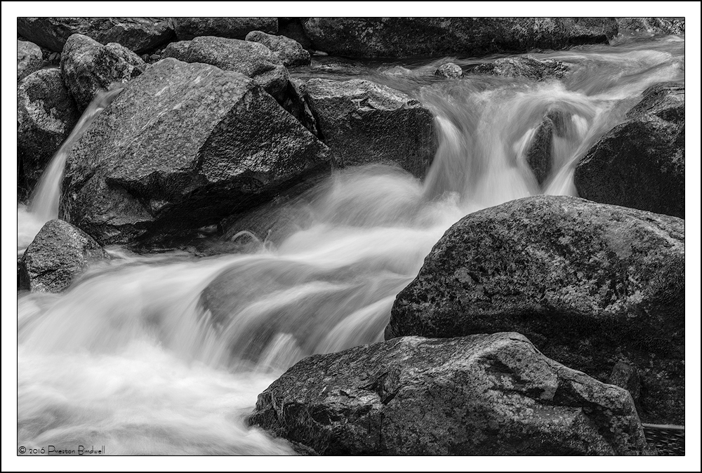
I liked how the water wiggled around these boulders on Bridalveil Creek in Yosemite. I thought this would look nice in B&W, since it was made in deep shade and there was not much color. I am curious as to what you think about the composition and the tonal values.

Nikon D7100
Nikkor 18-140mm @ 85mm
ISO 100, 1/2 second @ f-16
B&W Adjustment Layer and TK's masks
November 2016

Please see the large version. Thank you.

Your thoughts are always appreciated! cool
--P

Comments

15 comments
Comment posted by Harley Goldman on February 8, 2017 at 6:49 PM
Real nice look at the creek. Nice composition. I might experiment with brightening the light/lights in the water? But very well done, PB.
Registered on November 19, 2003, 586 Posts, 11271 Comments
Comment posted by Nick Bristol on February 8, 2017 at 7:06 PM
Great looking b&w image, Preston. Nice composition with wonderful water movement through the frame and great textures. I like your processing on this. Nick
Registered on February 1, 2004, 752 Posts, 14140 Comments
Comment posted by Lon Overacker on February 8, 2017 at 7:44 PM
Like a lot PB.  I think the tonal values and range are excellent. Might agree with Harley on bringing up the whites, but that's real minor. 

I like the flow and texture of the water as well as the balance between rock and water.  Nicely isolated and composed.

The only suggestion I can think of is playing with contrast, especially in the rock.  But at this point we're talking personal choice, preference, etc., not fixing anything.  The contrast might be a little high, but again, it's all about personal choice.

Well done sir.

Lon
Registered on November 24, 2006, 521 Posts, 19147 Comments
Comment posted by gary phillips on February 8, 2017 at 9:45 PM
The tones look exceptional to me, Preston. I really like the balance between flow and rock. Beautiful stream b/w.  Love it.
Registered on October 24, 2013, 185 Posts, 4136 Comments
Comment posted by Brian Schrayer on February 8, 2017 at 11:05 PM
I like your composition with the intersecting diagonal lines:  one obvious (the flow of the water) and the other less obvious (connecting the rocks in the opposite corners).  Great tone and texture make this work well in B&W.
Registered on May 28, 2004, 114 Posts, 2890 Comments
Comment posted by Chris Chamberlain on February 9, 2017 at 5:31 PM
Really like it! Nice comp. it's the contrasts/tones/sheen on the rocks that I like most. It really gives a nice visual sensation that might not be there otherwise in low/flat light. I could see the highlights on the water brought up a little more.
Registered on March 13, 2007, 500 Posts, 8365 Comments
Comment posted by Dave Dillemuth on February 9, 2017 at 8:58 PM
Beautiful, Preston. Excellent comp. The flow curving through the frame works great. Processing looks good but I'm inclined to agree with tweaking the white point to brighten the highlights in the water.
Registered on December 10, 2015, 104 Posts, 1112 Comments
Comment posted by Genny K. on February 10, 2017 at 2:26 AM
I like the flow and your processing is spot on.  The texture of the rocks comes through nicely.  I am probably the only one who will say this, though, and that is that is feels just a tiny bit tight for me.  I want to look more at where the water is coming from in the upper right, but that is right up against the corner, and the rock in the FG feels cut off.  I know it has to end somewhere, but I wanted to encompass just a bit more.  That is a tiny nit, though.  The comp is great.
Registered on June 5, 2006, 132 Posts, 2001 Comments
Comment posted by Patricia Brundage on February 10, 2017 at 7:25 AM
Think the composition and tonal values are spot on.  Also a great job on the shutter speed for the water.  Once there is some green moss or some underlying color would be a great spot to return to.
Registered on March 23, 2006, 1111 Posts, 6531 Comments
Comment posted by Preston Birdwell on February 10, 2017 at 6:10 PM
Thanks for your helpful comments! I tweaked the contrast in the water and rocks using a couple of TK's lights and mid-tones masks. What say you?
--P
Registered on November 1, 2003, 471 Posts, 5188 Comments
Comment posted by Harley Goldman on February 11, 2017 at 9:47 AM
Repost looks good. 
Registered on November 19, 2003, 586 Posts, 11271 Comments
Comment posted by Paul Breitkreuz on February 11, 2017 at 1:06 PM
Really liking the repost here, Preston. The composition was perfect from the start.........laugh
Registered on February 25, 2006, 525 Posts, 8448 Comments
Comment posted by Tom Falley on February 12, 2017 at 1:13 PM
Preston:

I like to make a lot of images like this one. Small but really interesting scenes of the ever fascinating flowing water.  The tonal range looks just right and would make a really rich high range print!

Cheers:   Tom
Registered on November 21, 2014, 189 Posts, 454 Comments
Comment posted by Bill Fach on February 12, 2017 at 2:42 PM
Preston: Love the comp and the improvements in the repost. Marvelous vision and capture. >=))>
Registered on November 1, 2003, 1805 Posts, 26981 Comments
Comment posted by Lon Overacker on February 14, 2017 at 12:43 AM
I think you nailed it Preston!  Thanks for taking the time to rework and repost.  Bingo.
Registered on November 24, 2006, 521 Posts, 19147 Comments