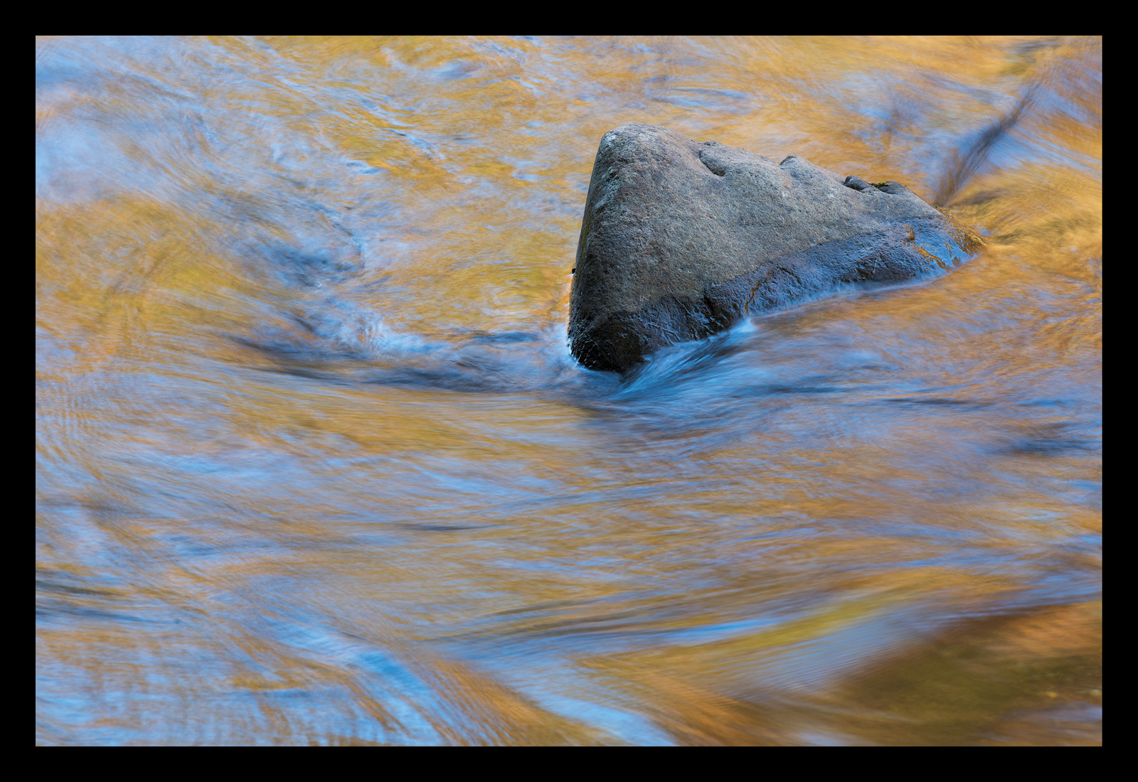
Here is another image from my trip out to the Smokies in the fall. This was taken along the Little River. I was drawn to the warm / cool contrast as well as the sweeping lines as the water was flowing around this rock.
The cyan may be a bit strong for some tastes, but I experimented with various color balance settings and this is where I landed. I felt that a more neutral color balance removed the warm / cool color contrast which drew me to the scene in the first place.
As always all comments and critiques are welcome!

Capture Info:
165 mm
f/16 @ 1/4 sec
ISO 100
Processing Info:
TK's luminosity and vibrance masks; slight crop from full frame to remove distracting area along top of image.

Comments
8 commentsI like all the texture and movement in the water. The water creates such a nice amount on interest for myself. The golden colors along with the blues are very nice. I may reduce them just a tad, but I kind of gravitate like more blue in my images. The rock is very thoughtfully placed, and I really like this scene overall.
Fine work
Love these intimate little autumn stream images. I find that getting the colors right for these scenes can be pretty problematic. My thought of the blue/cyan is that the color is present - it must be because it's reflecting sky - just like the yellows are reflecting from trees... So it really becomes a matter of degree. And more than that I think it's selective. For me, I would back off the cyan, but mostly around the base of the rock, in the water line. That's where it's mostly visible. But being mixed in the water with that blue/gold combo - that always works for me! ;-)
The only other suggestion I have would be to use the burn tool around the left side and selectively around the water just to perhaps squeeze a little more contrast out. But that's pretty minor.
good stuff!
Lon