Nature Photographers Network
This is the preserved archive of the original Nature Photographers Network. The community continues at naturephotographers.network.
Stokksnes - no rocks
‹ PreviousLandscape GalleryNext ›

Stokksnes - no rocks

by Alberto Patiño

Gallery: LandscapePosted December 29, 2016166 views10 comments
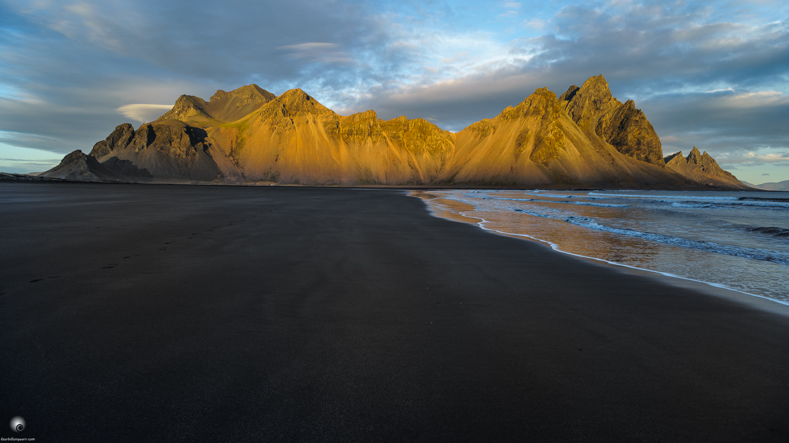
Thanks for all the comments and kind words! This one was made about 40 meters in front of the other one, hence no more rocks. I tend to prefer the one with the rocks, but would like to hear opinions. Large is better.

Same setup: Olympus OM Zuiko 18mm, Sony A7, tripod..

Comments

10 comments
Comment posted by scott lanz on December 29, 2016 at 7:16 AM
I much prefer the previous version with the rocks, Alberto. While the light on hills/cliffs and the sky are still beautiful in this version, for me there's too much empty space in the foreground. Maybe if more water was in the foreground (if this was possible), or maybe if the footsteps on the left were centered and used as a leading line, but, as is, I'd probably crop most of the foreground and turn this into a pano. Just my opinion. I do appreciate you posting this version, as I'll be interested in seeing other opinions.  
Registered on November 14, 2003, 840 Posts, 12902 Comments
Comment posted by Sharron Sims on December 29, 2016 at 12:57 PM
Beautiful light on the cliffs. I personally like the empty space in the foreground. It pulls me in - I feel as if I were walking on the beach toward those cliffs.
Registered on April 28, 2014, 54 Posts, 166 Comments
Comment posted by D.A. Edwards on December 29, 2016 at 1:08 PM
I also prefer the previous version, Alberto, for the FG interest. I sure would have been tempted to try a third option (which would have involved getting my feet a bit wet) by taking a few steps to the right and using the leading edge of the water action as a leading line into the scene.
Registered on October 8, 2014, 226 Posts, 1187 Comments
Comment posted by Harley Goldman on December 29, 2016 at 1:46 PM
I prefer this version. The open lined negative space along side the waterline nicely pulls me into the scene. Very nice!
Registered on November 19, 2003, 586 Posts, 11271 Comments
Comment posted by David Schoen on December 29, 2016 at 1:59 PM
I like each view for different reasons.   This one is clean and draws one in to the warmly lit mountains in the background.  The other one shows an original view of an icon in Southeast Iceland.  Each has their merits.  They are both detailed with superb color.  Point of view is clearly an individual taste.   But why not have it both ways?
Registered on November 6, 2006, 1213 Posts, 4587 Comments
Comment posted by Dan Kearl on December 29, 2016 at 7:46 PM
I prefer this one. Simpler and cleaner. I think a pano crop to just below the water would look nice.
Registered on September 2, 2013, 209 Posts, 1514 Comments
Comment posted by Brian Schrayer on December 29, 2016 at 7:49 PM
I definitely prefer your previous post, but that has less to do with the rocks than the nice warm light reflected in the water.  In the large version there are some subtle lines that work well as leading lines.  I think this would be stronger if the water was featured more prominently in the foreground.
Registered on May 28, 2004, 114 Posts, 2890 Comments
Comment posted by Dave Dillemuth on December 29, 2016 at 8:35 PM
Well this is very nice as well, Alberto. If I must choose I would have a slight preference for the first.
Registered on December 10, 2015, 104 Posts, 1112 Comments
Comment posted by Igor Doncov on December 29, 2016 at 9:58 PM
Amazing headland. The light, texture, and colors are really great on it. I, too, prefer the previous image. The large contiguous featureless beach feels like it needs a bright shell of something to add interest. Perhaps this subject just comes out better at high tide when shot from this perspective. 
Registered on November 22, 2014, 189 Posts, 2733 Comments
Comment posted by Lon Overacker on December 30, 2016 at 1:43 PM
Alberto,

I'm enjoying this pretty much equally, although I might give an edge to the one including the rocks.  But these are two different images.  there is detail and texture in the sand of the large view and I think the negative space works; at least it's not a negative for me.  I do agree with other comment that it may have worked better perhaps if there were either no foot prints, or the ones that were present were more in the middle for that lead-in element.

Regardless, the light striking the mountains, combined with the sky and reflected light/color in the surf - makes for a beautiful seascape.

Lon
Registered on November 24, 2006, 521 Posts, 19147 Comments