Nature Photographers Network
This is the preserved archive of the original Nature Photographers Network. The community continues at naturephotographers.network.
Amber Waves of Grain
‹ PreviousLandscape GalleryNext ›

Amber Waves of Grain

by Lon Overacker

Gallery: LandscapePosted December 11, 2016239 views11 comments
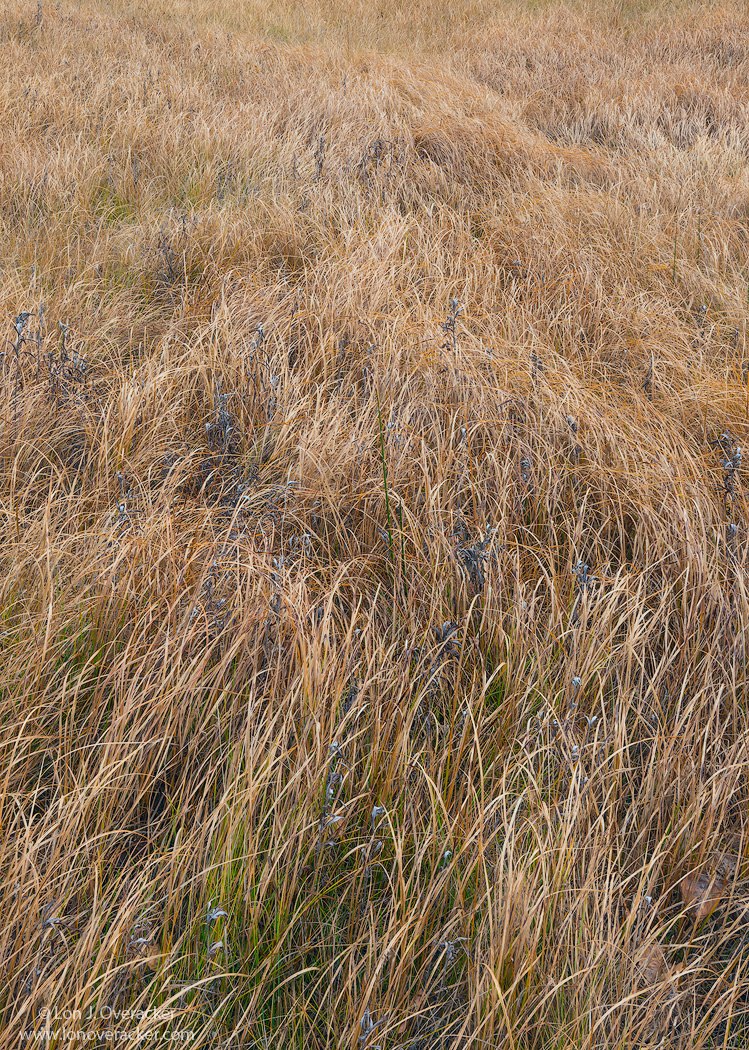
Ok, not really really grain.... but close enough to amber and I did try to accentuate the waves to create a flow through the image. In fact, Tony had mentioned this previously and I did use some selective dodging and burning - dodging a little along the tops of the ridges, while burning down the low spots. This was done subtly, but I hope effectively.

As always your critique and feedback always welcome!  Thanks!

Lon

Nikon D800E
Tamron 24-135mm @50mm
4-image focus stack @f/16

Comments

11 comments
Comment posted by Genny K. on December 12, 2016 at 12:33 PM
I like seeing the "waves" in this; that really makes it work for me.The colors work, too.  Whatever the small bits of darker vegetation (seed heads of some sort?) are in there, they add to the overall impact. I definitely get the feeling of movement in the grass when I look at this.
I bet this is good in a really big version, where you can see all those little details, in addition to seeing that flow of the waves.  Nicely done.
Registered on June 5, 2006, 132 Posts, 2001 Comments
Comment posted by Nick Bristol on December 12, 2016 at 2:49 PM
I like the waves in this too which seem to add a lot to the image for me. The colors are wonderful along with the nice textures. It feels like the grain is moving but yet it is very sharp and that is a wonderful combination. Nice work on this Lon.

Nick Bristol
Lone Rock, WI.
Registered on February 1, 2004, 752 Posts, 14140 Comments
Comment posted by Preston Birdwell on December 12, 2016 at 3:36 PM
<div>You did a fine job on this, Lon. I like the implied motion. The color and porcessing look great, and the detail is excellent.</div> <div>--P</div>
Registered on November 1, 2003, 471 Posts, 5188 Comments
Comment posted by Vance Gese on December 12, 2016 at 7:43 PM
Wonderful movement created by your processing, Lon, leading the eye front to back in such a subtle manner.  Really enjoy the textures and tones, and the intricate details.  Remarkable seeing as always, as is your gift.  One would almost think you were still working with the 4x5.
Registered on November 13, 2008, 298 Posts, 6629 Comments
Comment posted by scott lanz on December 12, 2016 at 10:15 PM
Very nice, Lon. I particularly like the detail and color in the foreground, but I also like the way the grasses lead the eye from near to far. 
Registered on November 14, 2003, 840 Posts, 12902 Comments
Comment posted by Michael Lowe on December 13, 2016 at 3:17 AM
The others have already said what I was going to say. devil
Registered on February 11, 2004, 777 Posts, 5252 Comments
Comment posted by Mattia Oliviero on December 13, 2016 at 9:29 AM
Very nice image, Lon. Great details and well seen. I like a lot the tiny green spot of grass in the FG which breaks the grain pattern. Maybe I wish it was more eye-catching.

Mattia 
Registered on August 24, 2016, 43 Posts, 254 Comments
Comment posted by Lon Overacker on December 13, 2016 at 11:43 AM
Thank you so much for your comments!  Especially Vance.  That means a lot to say it looks like it's still 4x5... :-)  Yeah, when I look at a scene, or look for a scene... it really doesn't matter what hardware is being carried on my shoulder... 

Thanks again
Registered on November 24, 2006, 521 Posts, 19147 Comments
Comment posted by Mark Seaver on December 13, 2016 at 1:17 PM
Lon, this does look like a 4x5 shot.  The wave actions looks great and the colors in the grass are wonderful.  The very top does seems a bit softer, but I think that less contrast, not reduced sharpness.  You might try for a bit more contrast in your processing up there.
Registered on January 23, 2011, 1103 Posts, 17270 Comments
Comment posted by Marylynne Diggs on December 13, 2016 at 5:21 PM
Hi Lon,
This one doesn't do much for me.  It is incredibly detailed, but the wave action isn't pronounced or directional enough, and the texture isn't enough for me on its own.  It's probably just me, but it seems like it needs more simplicity if it's an abstract or more context (i.e. sky, horizon) if it's a landscape image.

ML
 
Registered on December 14, 2010, 122 Posts, 1034 Comments
Comment posted by Harley Goldman on December 16, 2016 at 5:34 PM
I am a bit with MaryLynne on this one. Lots of nice detail, but I seem to not find a good point of focus or flow through the image. 
Registered on November 19, 2003, 586 Posts, 11271 Comments