Nature Photographers Network
This is the preserved archive of the original Nature Photographers Network. The community continues at naturephotographers.network.
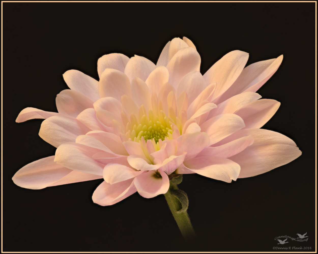
Crysanthemum II
‹ PreviousFlora GalleryNext ›

Crysanthemum II

by Dennis Plank

Gallery: FloraPosted December 9, 2016177 views7 comments
The same flower as my last post but with a dark bg and a slightly different angle.  This is a 10 image stack.  The flower was pretty much vertical when I took the image, so I gave it a little tilt in processing and faded out the end of the stem.  I didn't care for some of the harsher textures in the petals as it seemed to clash, so I softened them slightly.

5DIII, EF180 f/3.5L Macro, tripod and cable release, 10 image stack.  All images taken at f/16, 1/4 sec, iso 500.  Stacked in Zerene Stacker with post processing in LR5 & CS6.  Cropped to a 4x5 format for composition and content aware fill used on the edge triangles after I tilted it.

Comments and criticisms are always appreciated.

Thanks,



Comments

7 comments
Comment posted by Jim Gavin on December 9, 2016 at 4:12 PM
My preference: the first one. I have a bias toward the more pastel floral images.  I do like this image, but in a close decision choose the first. Both are excellent.
Registered on August 14, 2008, 293 Posts, 1250 Comments
Comment posted by Barb Pflaum on December 9, 2016 at 10:48 PM
I also prefer the first one, although this one is very nice too. I like the color and tilt of the flower and I like how you faded out the stem.
Registered on January 14, 2009, 316 Posts, 2724 Comments
Comment posted by SandyRichardsBrown on December 9, 2016 at 11:55 PM
Just Gorgeous - what more needs to be said?
Sandy
Registered on November 24, 2003, 3937 Posts, 12909 Comments
Comment posted by Philip Hodgkins on December 10, 2016 at 8:11 PM
I think you have been thinking. As the BG is nonexistent, you can use the stacking to solely enhance detail, hence the f/16. Good planning and the results show it. 
Registered on July 24, 2006, 2741 Posts, 12349 Comments
Comment posted by scott lanz on December 11, 2016 at 8:19 AM
Nicely done, Dennis. I prefer the first version of this subject, but this is well done in all respects. 
Registered on November 14, 2003, 840 Posts, 12902 Comments
Comment posted by Giuseppe Guadagno on December 11, 2016 at 12:28 PM
Dennis, I like better this version because it is for me more impressive and with a bigger distance from the background. I love the softness too.
Registered on February 3, 2007, 827 Posts, 5052 Comments
Comment posted by Bill Fach on December 11, 2016 at 3:34 PM
Dennis: I like this one pretty much equally to the first. I like that I can see more of the center here. Excellent job of working the subject in different ways.>=))>
Registered on November 1, 2003, 1805 Posts, 26981 Comments