Nature Photographers Network
This is the preserved archive of the original Nature Photographers Network. The community continues at naturephotographers.network.
Inevitable
‹ PreviousLandscape GalleryNext ›

Inevitable

by Lon Overacker

Gallery: LandscapePosted December 3, 2016186 views15 comments
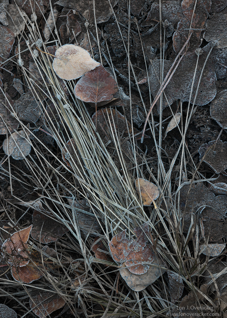
Thanks for your comments on my last post.  This one was taken about 10 minutes prior to my other leafscape.  This has a much darker (mood) and somber look than previous even though these images were taken fairly close together. Dark and somber to me because of the underlying layer of decomposing leaves and forest litter.  Even though the original raw file is quite close to this, in processing this I did want to try and tell that story.  I'm wondering if I was successful.  And since this is slight departure from reality I thought I would disclose a couple things.  First, there were some green blades of grass, so I de-saturated and attempted to remove some of the color to this. In fact, I also brought in a very low opacity b&w layer and painted around, mostly where the decomposing leaves were, and keeping most of the color in the pair of prominent leaves.  There are still hints of color throughout, so I don't think this would have been noticed had I not disclosed it.  I can post the original if anyone is interested.

I'm also going to post a significant crop and ask you which one you prefer.  The cropped on I think shows the decomposing layer better. I also dampened the color/brightness of the long grass stalks.  The original is also slightly cropped since I managed to include one of the legs of the tripod...

Your thoughts, critiques and suggestions always welcome.  Thanks!

Nikon D800E
Tamron 24-135mm at 78mm
F/16, 2 image focus stack

Comments

15 comments
Comment posted by Lon Overacker on December 3, 2016 at 4:38 PM
cropped.  I also removed a bit more cyan which I think is present on the edges of the leaves where there is frost.
Registered on November 24, 2006, 521 Posts, 19147 Comments
Comment posted by Harley Goldman on December 3, 2016 at 4:43 PM
This is really nice, Lon. Fine intimate comp. The hint of cyan works well. I might like it brightened just a bit, but that might not work with the mood you are after. 
Registered on November 19, 2003, 586 Posts, 11271 Comments
Comment posted by Paul Breitkreuz on December 3, 2016 at 5:36 PM
Lon, both work as posted for me. A change up and excellent POV.  And, both have their own look and feel to convey. The true bottom line is an extremely somber or finality to the debris on display. The brighter leaf is the exception to group and a real plus.
I'm not normally a big fan of vertical over horizontal or square layouts, but here I like the full scale vertical layout and the all inclusive first image.......laugh
Registered on February 25, 2006, 525 Posts, 8448 Comments
Comment posted by Dave Dillemuth on December 3, 2016 at 8:18 PM
Wow, I like this a lot. Certainly conveys a strong mood (somber as you say) and is unique from most of the intimate, warm leaf scapes being posted. Both images work but I think the comp. of the crop is a bit stronger. As for the rendering, I think I prefer the first version with the stronger cyan. 
Registered on December 10, 2015, 104 Posts, 1112 Comments
Comment posted by scott lanz on December 4, 2016 at 7:59 AM
I like the vertical, Lon. Graphic and somber, but with an understated beauty. I alos like the long lines and interest added by the grasses. The cropped version is too dark and somber for my takes, but this is subjective, of course.
Registered on November 14, 2003, 840 Posts, 12902 Comments
Comment posted by Jake Alletson on December 4, 2016 at 8:36 AM
These are both insightful images of a well-seen miniature landscape that has a story to tell.  For my money I would take the uncropped version.  I feel it is more stark and conveys the mood more strongly.
Registered on May 3, 2016, 12 Posts, 163 Comments
Comment posted by Preston Birdwell on December 4, 2016 at 2:25 PM
This conveys the mood I would expect in a deeply shaded place. For me, I prefer the vertical frame because it shows the flow of the grass. I think the bright lights could be brought up just a wee bit, though. I love the frost and the mood, Lon.
--P
Registered on November 1, 2003, 471 Posts, 5188 Comments
Comment posted by Sairam Sundaresan on December 4, 2016 at 2:29 PM
The frost coated leaves tell such a wonderful story of change and transition. Really like this Lon. The choice of a muted color palette really brings in the "Winter is Coming" feeling.
Registered on March 14, 2013, 100 Posts, 643 Comments
Comment posted by Nick Bristol on December 4, 2016 at 2:30 PM
Lon, I'm really enjoying this intimate scene. I like the first (vert) one by far the best of the two. That comp is flawless imo and I love the look and feel it has. Wonderful work!

Nick Bristol
Lone Rock, WI.
Registered on February 1, 2004, 752 Posts, 14140 Comments
Comment posted by gary phillips on December 4, 2016 at 5:22 PM
I'm gonna vote for the vertical, Lon.  I think the wider view and luminosity of the grasses helps to deliver your message of inevitability as the leaves in the top right begin their decay.  Nicely done.
Registered on October 24, 2013, 185 Posts, 4136 Comments
Comment posted by Igor Doncov on December 5, 2016 at 12:09 AM
Lon,

I think the composition is very strong in this image. The fan spread effect of the grass from lrc diagonally holds all the leaves well together. For some reason the wide white frame holds the composition well. Probably because it provides strong boundaries for the elements. On an emotional level, however, I don't feel the sense of decay and decomposition that you say you are trying to convey. I think that's because it's too clean in design. Perhaps a few gnarly twisted roots instead of perfect straight lines to convey that message. That's my overall impression. On the nitpicky side of things I would add a bit more space on the left to give that left center leaf more room to breathe. And yes, the vertical is a more interesting comp than the 2nd one. 
Registered on November 22, 2014, 189 Posts, 2733 Comments
Comment posted by Lon Overacker on December 5, 2016 at 12:43 AM

I don't feel the sense of decay and decomposition that you say you are trying to convey. I think that's because it's too clean in design

Excellent observation Igor - I think you're right and on to something.  While we don't really do journalism here, If I really wanted to portray decomposition, I would try for such a pretty, well manicured image.  Great point.  Said another way, the "fanning" of the grass stalks makes for a nice composition, but maybe falls short on telling the story as I intended.  I appreciate the insight. thanks for the comment.

Registered on November 24, 2006, 521 Posts, 19147 Comments
Comment posted by Mark Seaver on December 5, 2016 at 7:22 AM
You've created a fine, chilly, winter look here, Preston.  I much prefer the original post with the strong diagonal of the grasses connecting the two clusters of leaves and the subtle change from lots of grass to scattered stems across the frame.
Registered on January 23, 2011, 1103 Posts, 17270 Comments
Comment posted by Bill Chambers on December 5, 2016 at 9:37 AM
Lovely composition and subject matter.  The subtle coloration is nice but I might have been tempted to go to B&W.  I tend to lean toward the report by just a slight amount.
Registered on April 10, 2005, 753 Posts, 21216 Comments
Comment posted by Harry Lichtman on December 6, 2016 at 1:43 PM
I find the original post a little more pleasing to my esthetics.  The long grasses work well for the vertical orientation.
Registered on September 17, 2010, 304 Posts, 3507 Comments