Nature Photographers Network
This is the preserved archive of the original Nature Photographers Network. The community continues at naturephotographers.network.
Sand Beach # 1 + repost
‹ PreviousLandscape GalleryNext ›

Sand Beach # 1 + repost

by Ed Lowe

Gallery: LandscapePosted December 3, 2016169 views11 comments
Nikon D800
Nikon 17-35 @ 22 mm
f 22 @ 0ne sec.
ISO 200
tripod & cable release
Acadia NP, ME

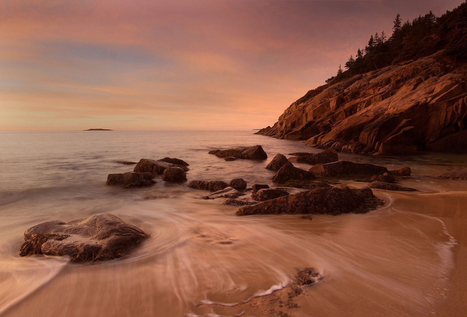
This was the only sunrise; or sunset for that matter; that we had any decent color on our trip to Acadia. I have gotten so that I prefer to head over to Sand Beach for sunrise as it usually is no where near as crowded as Cobble Beach. The only drawback is that you do not get to see the sunrise along the horizon in October as it rises behind Great Head. You can still come away with some wonderful compositions if you take the time to look.

As always thanks for taking a look and leaving a comment or suggestion.

Ed



Comments

11 comments
Comment posted by Lon Overacker on December 3, 2016 at 3:01 PM
Ed,

A lovely  and quiet seascape.  The large view is so much better! The original post in the thread just looks a little flat to me. The larger view has more life and color. Speaking of color, it would be easy to take the sky too far; I like what you've done with the processing.  No nits from me.

Lon

 
Registered on November 24, 2006, 521 Posts, 19147 Comments
Comment posted by Brian Schrayer on December 3, 2016 at 3:59 PM
This is beautifully  composed with great lines in the foreground tide while the receding rocks lead my eye out to sea.  I think that I would prefer this with a slightly cooler color balance, but that is subjective.
Registered on May 28, 2004, 114 Posts, 2890 Comments
Comment posted by Paul Breitkreuz on December 3, 2016 at 5:23 PM
I love this scene and image overall, Ed. The composition and color works well for me as is. I might be tempted to bring a bit more punch or brightness to the scene, but that just might be my eyes at this point in time......cool
Registered on February 25, 2006, 525 Posts, 8448 Comments
Comment posted by Nick Bristol on December 3, 2016 at 5:44 PM
What a beautifully quiet and peaceful feeling this has. Nice composition and the soft light and color is wonderfully inviting.

Nick Bristol
Lone Rock, WI.
Registered on February 1, 2004, 752 Posts, 14140 Comments
Comment posted by Dave Dillemuth on December 3, 2016 at 9:12 PM
This is very nice, Ed. Well composed and some beautiful light. Processing looks very natural but my personal preference would be to raise the white point a bit and bump up the vibrance a touch.
Registered on December 10, 2015, 104 Posts, 1112 Comments
Comment posted by scott lanz on December 4, 2016 at 8:24 AM
I like the soft, dreamy look of the image, Ed. Excellent use of the receeding lines in the water in the LRC. I could see playing with the color balance to make the water and rocks less warm, but I can't say this would be better. Very nice as is.
Registered on November 14, 2003, 840 Posts, 12902 Comments
Comment posted by Preston Birdwell on December 4, 2016 at 2:28 PM
Works for me, Ed. The light and color are wonderful. Nicely done!
--P
Registered on November 1, 2003, 471 Posts, 5188 Comments
Comment posted by Ed Lowe on December 4, 2016 at 6:58 PM
Thanks for your thoughts everyone. Here is a repost with your suggestions of a bit more vibrance, a reduce in warmth, and raising the brightness a bit with levels. Let me know what you think of the corrections.
Lon: I got a little lazy and just posted a larger version, I guess that was the reason for the smaller version being a bit flat.

Ed
Registered on February 7, 2004, 414 Posts, 7115 Comments
Comment posted by Mark Seaver on December 5, 2016 at 7:07 AM
Ed, I like this view and the muted colors.  There's a very strong 19th century landscape (almost Hudson River) painting feeling due to the nearly monotone color.  You've got fine movement in the foreground water and that little island makes a great balance for all of the corner-to-corner partition of the land.  The extra color in the repost also looks good, but detracts somewhat from the sense of this being a 19th century painting.  The larger view is wonderful.
Registered on January 23, 2011, 1103 Posts, 17270 Comments
Comment posted by Paul Breitkreuz on December 5, 2016 at 8:41 AM
Ed, I find both images have a different feel about them as Mark S. has pointed out. When I first saw the repost yesterday I thought maybe a bit too much there. Just glad I waited for fresh eyes this morning for a revisit here. The repost works very nicely IMO. Both images work as different looks of photographic art and personal appeal.....cool
Registered on February 25, 2006, 525 Posts, 8448 Comments
Comment posted by Lucy Aron on December 21, 2016 at 10:29 PM
The water and rock are so gorgeous I find my eye somewhat distracted by the sky.  I'd love to see this image in monochrome—sepia perhaps or b & w.
Registered on February 25, 2011, 189 Posts, 1160 Comments