Nature Photographers Network
This is the preserved archive of the original Nature Photographers Network. The community continues at naturephotographers.network.
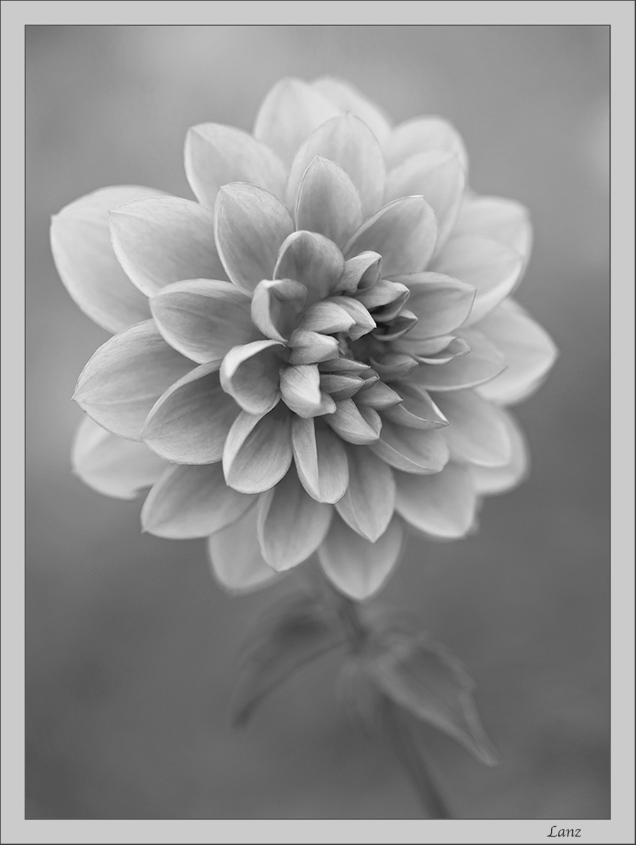
Dahlia in BW
‹ PreviousFlora GalleryNext ›

Dahlia in BW

by scott lanz

Gallery: FloraPosted November 21, 2016169 views7 comments
As mentioned in a previous image, I am interested in developing some non color floral images. I know it seems a little strange to decolorize  flowers, and I will say that it's difficult finding subjects that seem to work, but here's no 2 - a dahlia taken back in 2013. D600, 150 f2.8 @ f4, iso 500, 1/640. Thanks for looking. Thoughts on this one?

Comments

7 comments
Comment posted by Michael Lowe on November 22, 2016 at 8:32 AM
Wonderful shot. Nothing strange at all about decolorizing flowers. Then the concentration can be on nature's great designs.
Registered on February 11, 2004, 777 Posts, 5252 Comments
Comment posted by Tony Kuyper on November 22, 2016 at 1:43 PM
Absolutely lovely, Scott.  Black and white creates the perfect mood.
Registered on November 1, 2003, 364 Posts, 22328 Comments
Comment posted by Giuseppe Guadagno on November 23, 2016 at 4:09 AM
All the middle tones of light for a delicate image that I love. The proof that a floral photo can be beautiful in B&W too.
Registered on February 3, 2007, 827 Posts, 5052 Comments
Comment posted by Mark James Ford on November 23, 2016 at 2:30 PM
Well, well, well, I surprised myself here the thumbnail does not do the image justice at all.  A wonderfully subtle BW image which needs to be looked at in the largest view.  Composition is spot on - i wasn't sure whether there was enough contrast in the image but that's why one needs to look at the large view ... degree of the stem is spot on for me and the background is an interesting addition. Nice!
Registered on January 16, 2015, 60 Posts, 430 Comments
Comment posted by Bill Fach on November 23, 2016 at 3:56 PM
Scott: The larger version is a must see. wonderful tonal range and the POF/DOF choice is just right for my tastes. Superior work. >=))>
Registered on November 1, 2003, 1805 Posts, 26981 Comments
Comment posted by Dennis Plank on November 23, 2016 at 4:50 PM
I like it, Scott.  The relatively low contrast in the petals works very well with the shallow dof.

devil
Registered on January 28, 2008, 1767 Posts, 23192 Comments
Comment posted by Philip Hodgkins on November 25, 2016 at 11:00 PM
I usually like b/w that is punchy, but I'll make an exception for this one. The subtle tonality definitely fits the shallow DOF.laugh
Registered on July 24, 2006, 2741 Posts, 12349 Comments