
Nature Photographers Network
This is the preserved archive of the original Nature Photographers Network. The community continues at naturephotographers.network.
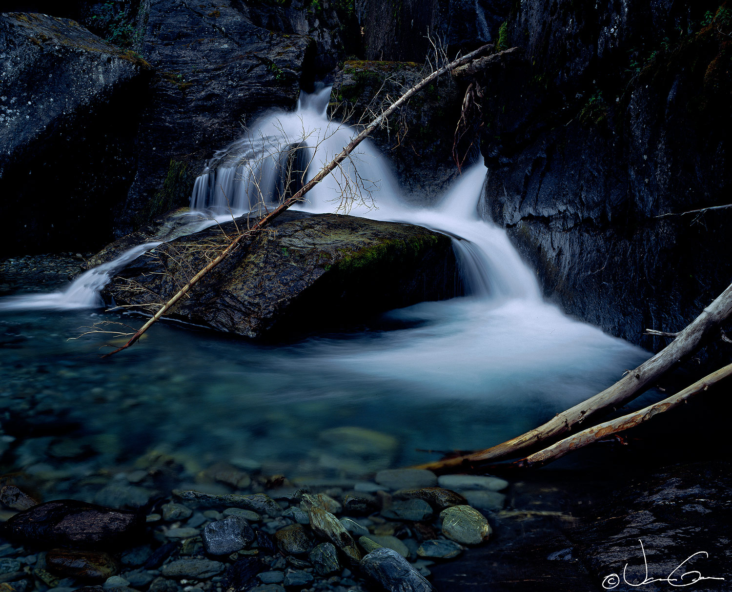
Cascade, Liberty Falls
‹ PreviousLandscape GalleryNext ›

Cascade, Liberty Falls

by Vance Gese

Gallery: LandscapePosted November 17, 20161,640 views12 comments

Thank you for all the great comments on the last image.

This small waterfall is just below the larger Liberty Falls which is near Chitina, Alaska.  The small falls, the crystal clear water and the beautiful colors in the rocks drew me to this scene.  The old spruce snag laying across the falls has been pointed out to be a major distraction but I thought it added a nice line to the image.  Would appreciate your thoughts and comments.

4x5, 120mm, Ektachrome 64 (pre Velvia days), polarizer.  Flat bed (M1) scan, Tony Kuyper's masks and such.


Large image attached.


Thanks.

Comments

12 comments
Comment posted by Ana on November 17, 2016 at 8:14 PM
I love this; there's something to like in almost every corner.  Overall, the color palette is lovely, muted but the blues have an almost jewel tone and the whites really stand out.  Very fresh mood to this.
I really like those rocks in the foreground and how they merge into the water.  The foreground trunks do a good job of drawing my eye there, as does the fan of the white water.  I don't find the trunk distracting; I think it adds something.  It helps that it's very slender and works well with the line of the foreground trunks; there's a nice circulation between those two lines.  The only thing I do find a bit distracting is the darkness of the rocks in the upper left.  I love how that little sheen in the rocks on the right side rescue it from being too dark and I wish there was a little texture on the left as well.
Registered on February 10, 2004, 191 Posts, 1446 Comments
Comment posted by Igor Doncov on November 17, 2016 at 8:15 PM
An incredible image. Can't imagine how anyone could possibly object to the snag across the falls. It's luminous preciseness amongst all that darkness is what makes the image for me. Most waterfall images are immersed in cyanic green these days, so these deep blues are refreshingly different. A real gem. The two logs on the right play a great supporting role. 

PS. I misunderstood which snag was offensive. The snag crossing the falls is fine. The one hanging below it could be argued as being intrusive but that's really being picky and I'm not sure that it doesn't add an element of interest. Maybe darken it's highlights?
Registered on November 22, 2014, 189 Posts, 2733 Comments
Comment posted by gary phillips on November 17, 2016 at 9:18 PM
Beautiful work, Vance.  I love the deep blues of the Ecktachrome.  I think one of the amazing features of this image are the foreground rocks, which do in fact, look like gem stones.  Such wonderful depth. The snag does not bother me, but, not having it there would also be very nice.  The left wall, that appears very dark, opens up perfectly in the large view.  Just incredible richness to the tonal values throughout.  Very, very nice.
Registered on October 24, 2013, 185 Posts, 4136 Comments
Comment posted by Paul Breitkreuz on November 18, 2016 at 9:14 AM
Vance, this is a wonderful scene. I really like the POV and the overall somber mood here.
The Ektachrome 64 with added 2 stop loss Polarizer did an amazing job in this dark low light area. To be honest it is astounding it came out this well and no visual noise too. Well done on the technical scale with the 4x5......
devil

As far as the debate on the snag, I do not see any issue with the one being mentioned at the waterfall area at all. However, the tiny snag poking in on the middle RHS is an item I would remove with a cloning or more simply with a Content Aware. To me that would be an item on a large print I'd eliminate for sure....laugh  
Registered on February 25, 2006, 525 Posts, 8448 Comments
Comment posted by Nick Bristol on November 18, 2016 at 9:16 AM
Vance, I absolutely love this image. A beautiful mix of light, shadow and color. The deep tones are very appealing to me and and the snag across the falls really works here, as does the two logs. All that being a very important part of this composition in imo. Beautiful work and so interesting to view...large version for sure! I shot so many images on Ektachrome 64 in days gone by.

Nick Bristol
Lone Rock, WI.
 
Registered on February 1, 2004, 752 Posts, 14140 Comments
Comment posted by Harley Goldman on November 18, 2016 at 10:22 AM
Real pretty waterfall, Vance. While I am enjoying the deep rich colors of the submerged rock, overall it seems a little too blue to me. But reading the other comments, I am off by myself in left field (again sad). Sweet image. I never used Ektachrome. I got into 4x5 in the Velvia days. I sure did love the original Velvia 50! 
Registered on November 19, 2003, 586 Posts, 11271 Comments
Comment posted by Ed Lowe on November 18, 2016 at 10:38 AM
Ordinarily I do not care for fallen trees in a waterfall scene, but I think in this case it works, Vance. Being relatively small I think it gives the image a delicate counterpoint to the power of the falls. I hope that makes sense. I could see the one intruding branch about half way on the right edge of the frame being cloned out as it does grab my eye. I love the blues that Ektachrome produced. Excellent work.

Ed
Registered on February 7, 2004, 414 Posts, 7115 Comments
Comment posted by Mark Seaver on November 18, 2016 at 5:06 PM
Vance, this is a lovely, moody look at this little falls.  I like all of the snags.  That's how the world often looks and in this case they all contrast so well with the overall darkness of the rocks.  Removing the two on the right would leave a very dark image.  Those subtly colored rocks at the very bottom are great additions and the misty flow contrasts so well with the dark rocks.
Registered on January 23, 2011, 1103 Posts, 17270 Comments
Comment posted by Lon Overacker on November 19, 2016 at 12:29 AM
Hi Vance,

A dark, yet it's got a light, almost mystical mood to it.  One can't help but be drawn in to this.  I like this a lot.  Of course, it tugs at me emotionally since the large format is just a memory now.. ;-)

I would have first guessed Velvia given the shadows. but the clean whites and the aquas in the water make for a beautiful color image.

The fallen spruce doesn't bother me at all, in fact adds to the scene, just as you are thinking.  I also think it logs on the right work together with the spruce adding those diagonal lines.  Paul had a good idea of cloning out the smaller branch intruding on the right.

Great stuff Vance!

Lon
Registered on November 24, 2006, 521 Posts, 19147 Comments
Comment posted by John Williams on November 19, 2016 at 12:41 AM
Lovely Vance; I like the rich darkness. The color and clarity of the foreground rocks is superb in the larger version; very nice. I think the snag works fine here; it actually adds nice contrast.
Registered on September 6, 2007, 221 Posts, 5985 Comments
Comment posted by Albert Darmo on November 19, 2016 at 12:11 PM
Hi  Vance crying  I too  love  the  beautiful   deep  colors  in  this  image.  i  think  Igors  comment  tells  it all.


Albert Darmo
Registered on November 25, 2008, 1386 Posts, 11978 Comments
Comment posted by Jim Jirka on November 21, 2016 at 10:23 AM
Vance,
This has a wonderful tranquil feel to me. I like how the tree is propped up against the rock. Gives a bit of interesting detail to look over.
Registered on November 1, 2003, 254 Posts, 1620 Comments