Nature Photographers Network
This is the preserved archive of the original Nature Photographers Network. The community continues at naturephotographers.network.
Shimmering Ensemble
‹ PreviousLandscape GalleryNext ›

Shimmering Ensemble

by gary phillips

Gallery: LandscapePosted November 16, 20167,027 views18 comments
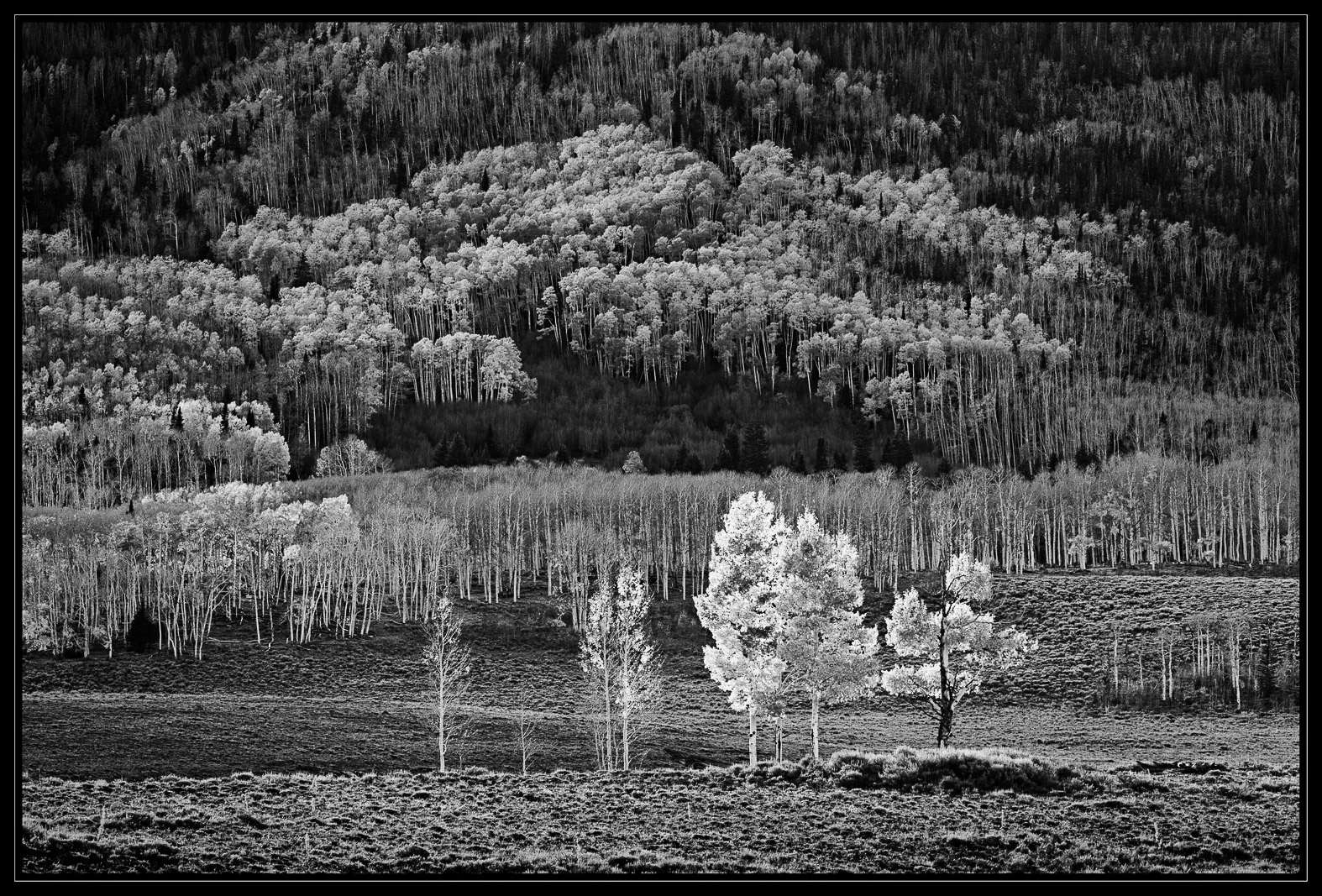
Harley introduced me to some of his favorite fall places a month or so ago.  I know it's blasphemy to convert colorful images but I really like the quality of light here more than the color.  So I hope you will forgive me.  At any rate, I thank Harley for showing me some of his secret spots.  

70-200mm @ 200mm, f/11, 1/25

I would appreciate your comments and critiques.

Better large

Comments

18 comments
Comment posted by Preston Birdwell on November 16, 2016 at 11:16 PM
This is, quite simply, superb! devil
--P
Registered on November 1, 2003, 471 Posts, 5188 Comments
Comment posted by Jeffrey Sipress on November 17, 2016 at 12:03 AM
Striking!
Registered on February 17, 2004, 236 Posts, 1197 Comments
Comment posted by Lon Overacker on November 17, 2016 at 12:38 AM
Gary,

What a grand and spectacular scene!  And this scene renders quite appropriately in b&w.  The contrasts really show off "autumn" - especially with the prominent tree up front.

As glorious a scene as this is, I think the processing is just a tad on the heavy side.  I'm not quite sure how to describe it - especially since I'm no b&w expert.  This may be a terrible analogy, but akin to a color hdr image that's a little too hdr and less natural - only in b&w.  Wish I could express it better - especially after your kind words on my commenting! ;-)

Lon
Registered on November 24, 2006, 521 Posts, 19147 Comments
Comment posted by Ana on November 17, 2016 at 8:43 AM
I really like how the few bright trees stand in contrast to the more somber trees on the hill behind them.  It's a great capture of that time in the fall when things are almost too blindingly colorful to really appreciate.  The textures that I enjoy most here are the foreground trees and bare ground they are standing on, and also the trees with foliage halfway up the hill and into the distance; the dark triangle and bare trees just in front of it are holding my eye a bit when I would really like to enjoy the bright trees.  That might be due to compression making those bare trees look a bit grainy or maybe it's the abrupt line between light and dark so close to the top of the bright tree.  I can see the darkness is necessary; the image wouldn't be as successful without that darker area for contrast, it's just something I noticed.
Registered on February 10, 2004, 191 Posts, 1446 Comments
Comment posted by Paul Breitkreuz on November 17, 2016 at 9:11 AM
A really stunning look here in B&W, Gary. No thoughts for change at all. I can only praise the outcome overall.....laugh
Registered on February 25, 2006, 525 Posts, 8448 Comments
Comment posted by Nick Bristol on November 17, 2016 at 9:36 AM
Gary, Excellent work with the comp here and the light looks wonderful. It is a very cool image to look at for sure. It does seem to have a bit of a grainy overall look and I'm not really sure what that is. Maybe just contrast or web sharpening and compression. I think I'm seeing the same thing as Lon did but not sure what it is. Still a b&w scene that I quite enjoy. Nick
Came back for another look. Actually I think the background is fine so just the foreground land mostly and front trees seem to be the issue. I believe it might be from the contrast between the dark and lights, so I think I agree with Harley.
Registered on February 1, 2004, 752 Posts, 14140 Comments
Comment posted by John Williams on November 17, 2016 at 9:39 AM
I have no problem with making a colorful photo into a BW. I think many, myself included, don't do that often because it's hard to visualize.

The foreground group set out from the background works well Gary. The dark center spot competes with them a bit though. I'm not sure what I'd do differently though. Maybe play with reducing the background contrast some???
Registered on September 6, 2007, 221 Posts, 5985 Comments
Comment posted by Harley Goldman on November 17, 2016 at 10:21 AM
Very sweet, Gary!  This works beautifully in B&W.  I am getting a slight feeling of what Lon what saying and I am having trouble figuring out exactly what is giving me that impression. It might be the highlights in the ground cover in the very foreground. because everything else looks spot on. Back off those highs just a bit and see what happens? Pretty minor stuff, though. It is a beauty just the way it is. 
Registered on November 19, 2003, 586 Posts, 11271 Comments
Comment posted by scott lanz on November 17, 2016 at 11:06 AM
I recognize as one of Harley's hot spots, but you made this uniquely your own, Gary. The comp, light and detail are all exceptional.   devil
Registered on November 14, 2003, 840 Posts, 12902 Comments
Comment posted by Mark James Ford on November 17, 2016 at 1:12 PM
Hi Gary, a great BW rendition and a good eye to spot this considering the colours that must have been there. I agree with just making the foreground grass ever so slightly less contrasty and I might lighten the bottom left corner ever so slightly so that the cross over to the grass is not so strong. Very minor points in an excellent image!
Registered on January 16, 2015, 60 Posts, 430 Comments
Comment posted by Mark Seaver on November 17, 2016 at 5:15 PM
The various degrees of "glow" work well here, Gary...I guess I'll forgive your blasphemy for going b&w... enlightened  Those foreground trees stand out very well while your b&w treatment emphasizes nicely the shapes and textures of the trees climbing the mountain.  Overall, I'd say this is quite different and quite dramatic.
Registered on January 23, 2011, 1103 Posts, 17270 Comments
Comment posted by Igor Doncov on November 17, 2016 at 5:48 PM
The large version brings out the tonal richness of this images, particularly those wonderful stands of trees in the distance. I have some issues with the main foreground trees. Rather than look like fall they look ghostly to me. I would tone down those whites so that they 'fit' better with the rest of it. Incidentally, they look fine the way they are if you're trying for a more surreal composition, but I don't think that's the goal. That's just my view of things. I think it's really an incredible image otherwise.
Registered on November 22, 2014, 189 Posts, 2733 Comments
Comment posted by Vance Gese on November 17, 2016 at 6:33 PM
Stunning image, Gary.  The luminosity of those foreground trees really makes this image; the somewhat darker background trees and hillside further adds to that glow.  Incredible, masterful, black and white photographic art in my opinion.
Registered on November 13, 2008, 298 Posts, 6629 Comments
Comment posted by David Schoen on November 17, 2016 at 8:04 PM
I think this is really pleasant.  The layering of the trees with respect to shape and tonality works very well as a black-and-white.  Who needs color anyway?
Registered on November 6, 2006, 1213 Posts, 4587 Comments
Comment posted by Tony Kuyper on November 17, 2016 at 11:08 PM
Monochrome is the foundation of photography, IMO, and getting back to it is paying homage to the roots of the art.  This does a particularly good job of that.  I can't imagine this looking better in color.
Registered on November 1, 2003, 364 Posts, 22328 Comments
Comment posted by Ed Lowe on November 18, 2016 at 12:42 PM
This is cool; almost looks like an IR image, Gary. The luminosity of the FG trees compliment the darker ones in the BG beautifully. There is something just a tad off for me and I can not quite figure out what it is. Maybe try Harley's suggestion of the FG highlights. Either way I like what you came up with.

Ed
Registered on February 7, 2004, 414 Posts, 7115 Comments
Comment posted by Alberto Patiño on November 18, 2016 at 10:57 PM
B&W works for me - great image! The leaves on the closest aspen are a bit too bright for me, and tend to distract from the beautiful groves in the background.
Registered on December 2, 2014, 278 Posts, 1736 Comments
Comment posted by Jim Jirka on November 20, 2016 at 4:01 PM
Wonderful eye to recognize this and make it into a B&W. Just looks a tad crunchy.
Registered on November 1, 2003, 254 Posts, 1620 Comments