Gallery: LandscapePosted May 22, 201687 views12 comments
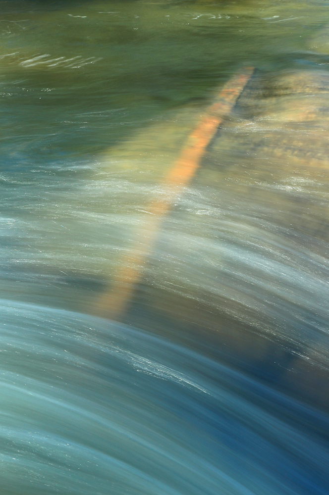
Another shot from a couple of weeks ago from just a few yards below my previous Landscape posting. I took a dozen or so versions of this and had a hard time choosing one.
Comments
12 comments
Comment posted by Mark Seaver on May 22, 2016 at 2:57 PM
The flow works well here, Dave, but my favorite part is the color shift from subtle blues to gentle greens across the frame. The "orange thing" running diagonal holds this view together very well.
Registered on January 23, 2011, 1103 Posts, 17270 Comments
Comment posted by Ed Lowe on May 22, 2016 at 3:08 PM
What a lovely intimate landscape, Dave. I like the subtle lighting along with the gradation of colors in this scene. Great choice on the SS BTW; it created some very nice lines in the water. The highlights are also a nice touch.
Ed
Registered on February 7, 2004, 414 Posts, 7115 Comments
Comment posted by Brian Schrayer on May 22, 2016 at 5:45 PM
I often struggle with how to critique abstract images, but I will try here. Overall, I like what you have done with this. First of all, I like the blue / green color palette. Compositionally, the lower 2/3 of the frame has a lot of visual energy coming from the fast flowing water flowing over the rocks while the upper 1/3 of the frame really lacks energy due to the slower moving water over the deeper pool. At first I wasn't sure about this because it creates visual tension, but the more I think about it the more I think it works as the tension seems to provide balance to the image. I considered a crop of the top 1/3 of the image, but because I like the blue / green gradient I don't think I would recommend cropping it. I find the submerged log to be a bit distracting because of the way that it cuts through the composition which tends to pull my eye. Also, it is a hard diagonal line that interrupts the flow of what are otherwise gently flowing contour lines. I realize that there is not much that you could do about that log, and this is all very subjective. I haven't read other comments and will be interested to hear other's thoughts. As I stated at the beginning I like what you have done with this overall.
Registered on May 28, 2004, 114 Posts, 2890 Comments
Comment posted by D.A. Edwards on May 22, 2016 at 8:27 PM
Thanks for the thoughtful comment, Brian. For some context the photo above show that the log is actually a red-colored dike slicing through standard Sierra granite. The water is a few inches deep, maybe 3 feet wide. In this shot, the dike extends between my legs and behind me for another 30-40 feet or so (and also on the opposite bank.)
The moving water ties the entire frame together. A half semi-transparent, half translucent.warm accent color slices through the cool, blue/green morning water. It has its own gentle arc and is pretty much at right angles to the arcs in the water. To my eye, the dike makes the image; without it, it's fairly ordinary. Maybe it's the architect in me...
Registered on October 8, 2014, 226 Posts, 1187 Comments
Comment posted by Harley Goldman on May 23, 2016 at 10:36 AM
Nice abstract. I am enjoying the water flow and the gradients of light and color. I go back and forth about the dike under the water. I find it jangles my senses in an otherwise tranquil scene. It both works and disrupts in doing so.
Registered on November 19, 2003, 586 Posts, 11271 Comments
Comment posted by Richard Teller on May 23, 2016 at 11:11 AM
Very good comments made already. I like the color shift from top to bottom, the move from the more quiet water at the top to the fast moving wat at the bottom and I also like the play of light.
Registered on August 23, 2010, 1162 Posts, 6692 Comments
Comment posted by Roel Wijtmans on May 23, 2016 at 11:52 AM
I really like the gradient and the motion in the water, but the upper half of the dike is a bit too strong in its orange for me. I think if that would be toned down a bit it would work better for me. I like the idea, but the bright orange of that part is just too strong an eye magnet for me.
Registered on September 30, 2012, 116 Posts, 2257 Comments
Comment posted by Igor Doncov on May 23, 2016 at 2:06 PM
Your second image may be better than the original. Have you considered that? If you crop the second removing the log up to the flowing water I think you come up with a more interesting image. The blues in that water image together with more visual variety in the flow makes it more interesting.
Registered on November 22, 2014, 189 Posts, 2733 Comments
Comment posted by gary phillips on May 23, 2016 at 2:20 PM
I like this one, Dave. I agree with you that the orange dike makes the image. The colors are really pleasing and the water's mesmerizing effects are very well represented. Nice.
Registered on October 24, 2013, 185 Posts, 4136 Comments
Comment posted by D.A. Edwards on May 23, 2016 at 2:32 PM
I am enjoying the discussion and suggestions for alternatives and tweaks. It validates my determination that NPN is the best source on the net for both displaying my work and getting useful feedback to take into the field with me.
Registered on October 8, 2014, 226 Posts, 1187 Comments
Comment posted by Dave Dillemuth on May 23, 2016 at 9:55 PM
Very intriguing abstract. The colors are very appealing and the SS is working great to convey the power of the flowing water. Well seen.
Registered on December 10, 2015, 104 Posts, 1112 Comments
Comment posted by John Williams on May 27, 2016 at 8:28 AM
Glad you posted what the orange is. I was really struggling to figure that out. Nice mix, with interesting contrasts above and below.
Registered on September 6, 2007, 221 Posts, 5985 Comments

Comments
12 commentsEd
The moving water ties the entire frame together. A half semi-transparent, half translucent.warm accent color slices through the cool, blue/green morning water. It has its own gentle arc and is pretty much at right angles to the arcs in the water. To my eye, the dike makes the image; without it, it's fairly ordinary. Maybe it's the architect in me...