Dental Geology + Repost
by Marylynne Diggs
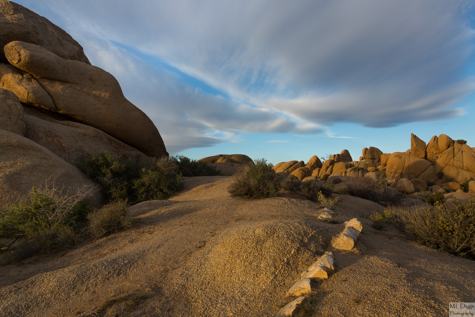
This is another shot from near my campsite in Joshua Tree National Park. Playing with color here, you know, just to keep my hand in it. This is a line of toothy rocks that often fringe the big rocks at the Jumbo Rocks area.
Canon 5D3 with 24-105mm at 24mm
ISO 125, f/13, 1/60s
Processed in LR just for some slight contrast, profile corrections, etc.
I'm interested in everyone's thoughts on this one: is the composition pleasing? Does the foreground rock take up too much space and steal the show from the clouds? I have a vertical composition and a higher camera angle too, but I like the foreground of this one, I think.

Comments
13 commentsMaybe open up the left side a tad?
Harry: The rocks in the background are also rocks at the Jumbo Rocks area of Joshua Tree. Both these rocks and the tree and rock in the "Joshua's Prayer" post were right near our campsite (I think it was campsite 22 or 23.
Let me know if you like either of these new comps better. Not sure either are worth working on further. It might just be that I never got my feet in the perfect place.
ML
--P
You did some very nice work photographing this. I think the original works quite nice and I really do enjoy looking at it. I don't mind the rock on the left because of it's interesting shape and nice light. My eye travels back through the scene nicely. I also like the vert image you posted very much. That comp works especially nice for me.
Nick Bristol
Lone Rock, WI
The first and third horizontal comps work best for me, with the 3rd being the winner for me. In the first one, I'm visually torn between the foreground and the sky. The same is true in the vertical comp. Also in the vertical comp, at least one half of the cloud isn't really adding much - although it's one terrific cloud. Also, and I'm sure it's the light and the moment, but the middle rocks in the vert comp are flat; I think because they've lost the light a bit.
So, the third one comes together for me because the general framing works so well. All the warmly lit rocks frame the sky beautifully - and the sky is much more interesting here. And the balance between sky and rocks seems just right.
Certainly a great example how just a small change in viewpoint/angle can change what is emphasized in a comp.
Lon
The light was indeed changing quickly, and I was stuck between a rock and a campsite (not my own) so moving right wasn't possible. The more I look, the more I like the original. I wonder if a slight crop off the left would bring more focus ro the dike, the rock pointing at cloud, and the cloud.
Thanks as always for the feedback. I couldn't fo this without y'all.
ML